Guess what I got in the mail yesterday?
My Manderin in Summertime fabric! And I love it. I am going to do two large pillows of it on my bed.
Now I need your help trying to decide what to do with this….
Ughhh… It’s gross right now. I want to reupholster the cushions and add some pillows.
So what I need help with is what fabric to reupholster it in.
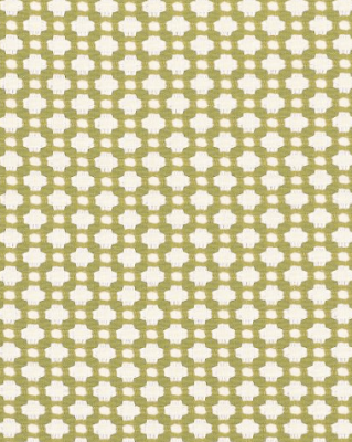
I was originally thinking of my beloved betwixt.
The only thing I’m not loving about it is how it kind of blends into the settee wicker and it doesn’t offer a lot of contrast.
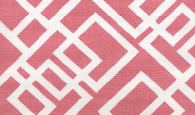
So on the other end of the spectrum is this! Which would be a lot of pink but very “me”.
Thoughts?
I'm a new follower of your blog and I LOVE it! Totally the pink! Go with it 🙂 I love the design on it and I love that it pops/brings out that pink in the other fabric! It would look great on that bad boy!
My vote is for the pink too. Very pretty!
Lock Pink all the way! Im sure it would look so good! Would your husband be okay with pink?
The pink lattice! Totally! I agree you the green pattern is cute but it will get lost in the caining. Go bold girl! Haha <3
I would go with the pink! Love your choices!!!
Pink is my first choice! It's more unexpected. Love 'em both!
PINK!!!
Pink all the way. Great fabric.
I love the pink and think it really complements the floral pattern, perfectly…can't wait to see!!!
the pink would tickle my fancy, but the green is quite chic too. decisions…..are the hardest part. what about using the pink to pipe with or using the pink and then the green to pipe with?
pve
Awesom inspiration fabric for the pillows! Pink for sure on the settee, love the green , but the pattern is too small. Enjoy your week-end!
Cathy
i also vote for the pink! the green, like oyu said, would blend with the settee's woven back and sides. also, i would suggest getting a firmer cushion that goes across the entire thing, rather than the two softer cushions. i think the one firmer cushion would clean it up nicely, too.
go for the betwixt! i LOVE betwixt and think the pattern would compliment the furniture piece so well. i love how it's bright, but will blend well with the room. i think it will make the mandarin in summertime pillows pop much more, rather than having them compete with the pink. either way though, the room's gonna look amazing!
I'm gonna be the odd man out here and say go with a flat bench at the foot of the bed vs the settee. It just doesn't seem to fit with the bed IMHO.
Ellen
Love the pink! I would paint the piece white. The last comment was a good point; you could refurbish this piece in an outdoor fabric and perhaps use it on a porch or outdoors in the summer if you chose to move it out of the room? Maybe it's just the photo, but it almost looks like those pillows weren't meant for the piece and it originally was one long more narrow cushion? Maybe I'm overthinking this. LOL. Love the pink!!! 🙂
It depends on what is going on in the rest of the room, but I say pink!
Definitely 100% the pink!!! And I love love the pillow fabric- fabulous.
pink! pink! pink! 🙂
Ooh love the pink! So fresh and fun 🙂 Can't wait to see it finished!
I love the manderin in summertime for the settee. I realize that wasn't one of the options but it looks like they were made for each other.
My husband would never agree to pink! I think the pink fabric is lovely, go for it!!
Paint it white! I prefer the pink fabric, too.
Love the pink too Kirsten!!!
Love the pink and I'm glad you're not painting it. Sometimes it's better to leave things natural!
Pink for SURE. BUt you know me… pink is my thing!
The new fabric is lovely and perfect!! I am obsessed with a good floral print and you scored a lovely one.
I'm not totally drawn to either settee fabric you posted, but if I had to pick, it would definitely be the pink!
Good luck, K! xo
Love the pillow fabric. As soon as I saw the green, I thought to myself "pretty, but the pattern competes with the back of the settee", and I immediately thought "how about pink with green piping"…then I scrolled down and saw the pink fabric you were thinking about. LOVE IT!!!
I like the pink one better too. It offers more 'pop' and the green pattern looks like wicker itself (as I think you may have mentioned yourself), so that might really blend in the chair (unless of course you want to go with blending later on 😀 )
🙂 I think Ashley Schmutz needs credit too, she is out numbered by us pinky's!
I totally agree. I love the pattern the pink fabric has and it doesn't get lost with the pattern of the chair. Can't wait to see it!
Out of the two options, I would choose the pink. But like others said, my husband would not be so happy with that choice. What about pulling a different color from the pillow fabric? Like teal or royal blue with white design? It would still be fun and bright, but not scream bachelorette room.
Have you ever considered spray painting the settee white? I think it would look really clean and fresh. If you ever did, I would go with the green fabric. If not, the pink. I love them both! I'm sure whatever you do, it will look a-mazing!
I'm going to say the green. I think I am definitely in the minority, but the pink will take too much attention away from the bed. And the bed should be the center piece.
I say the pink! I don't know what the rest of your room looks like but either way I think a fun pop of pink would be beautiful and it does also tie in with your Manderin in Summertime fabric.
Pink Rocks! I think you should paint the woven bench white!!
Pink will add punch and contrast with the natural material of the piece. Pop of color – love it!
I am a fan of the pink (as most other readers seem to be, too!). The green fabric is fabulous and needs to be used somewhere for sure, but the texture difference of the pink fabric/setee design is better. Can't wait to see pictures!
The pink is awesome, not just because it's pink, but the pattern rocks.. i want it =)
I would say the pink fabric, I think it will nicely pick out the same tone from the Mandarin Summertime fabric 😉
Yay for the pink! And I totally love the fabric for the pillows.. beautiful!
I think pink, but I would paint it white as well. It will pop more with a such a drastic change. Love your blog!
The pink is really fun.
Love the pink – you are right about the other one i think it blends in too much xx
I love your blog!! I have used the Schumacher green fabric before on a project and loved it. I think the pink will give you more punch. I also love the shaped of the trellis with the bamboo. What does your bedding look like?
I love the pink, but what does your husband think about it? Mine would definitely protest. It's fun though!
Definitely the pink. Maybe you could spray paint the settee white, too?
Can't wait to see the "after"!
turnuptherad.blogspot.com
pink all the way I think the fabric is so pretty
I used that fabric in my kitchen for roman shades on my french doors and window! I absolutely love it! I paired it with a bright lime/apple green and white geometric on my bench.
~Rachel
http://www.silverliningdecor.blogspot.com
Weird!! I just clicked on the link for the fabric, and the other post where you have shown several different coordinating swatches is the green geometric I used in my kitchen! Great minds think alike 😉
They are both gorgeous but I personally LOVE the pink! Can't wait to see what you decide on!
I just had pillows made of the betwixt fabric! Love it.
I think pink also for the settee. Great choices.
Mary Ann
Oh pretty please pink!!
Is the wicker staying wicker or are you painting it white? Sorry if I missed this…
If its going to be white, I actually like bewixt better!
The pink the pink!!!
PINK!
How about pulling out the blue. I think it would look great with the camel color of the settee. I think this fabric is cool and I like it with the floral:
Schumacher's london bridge in Prussian.