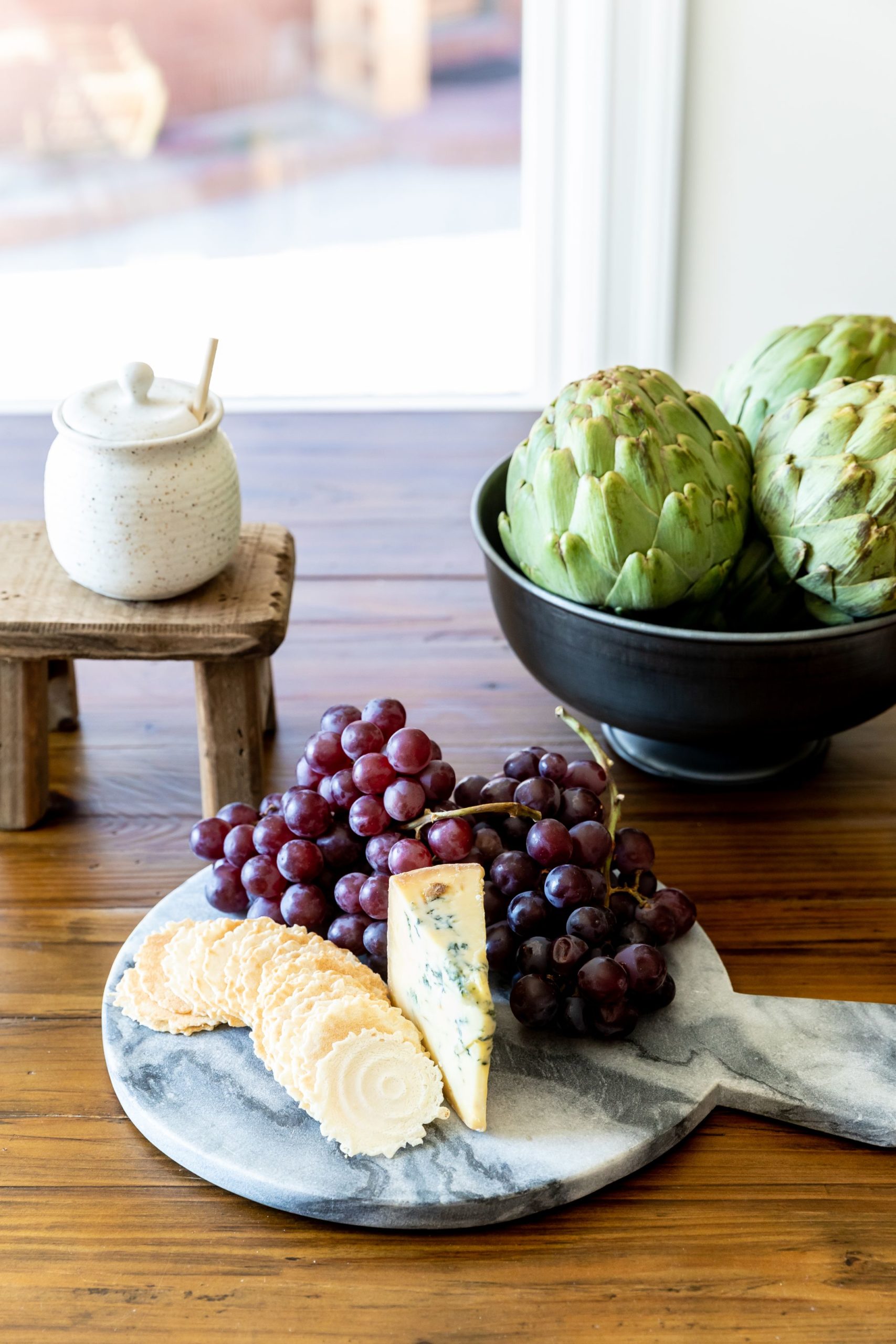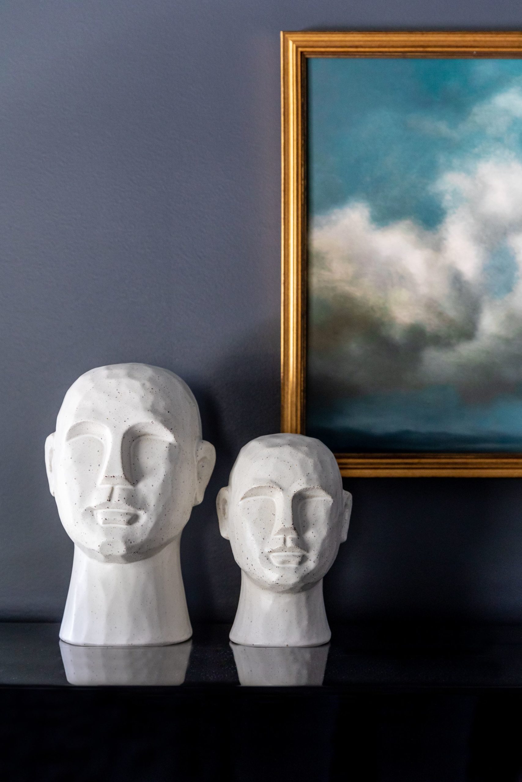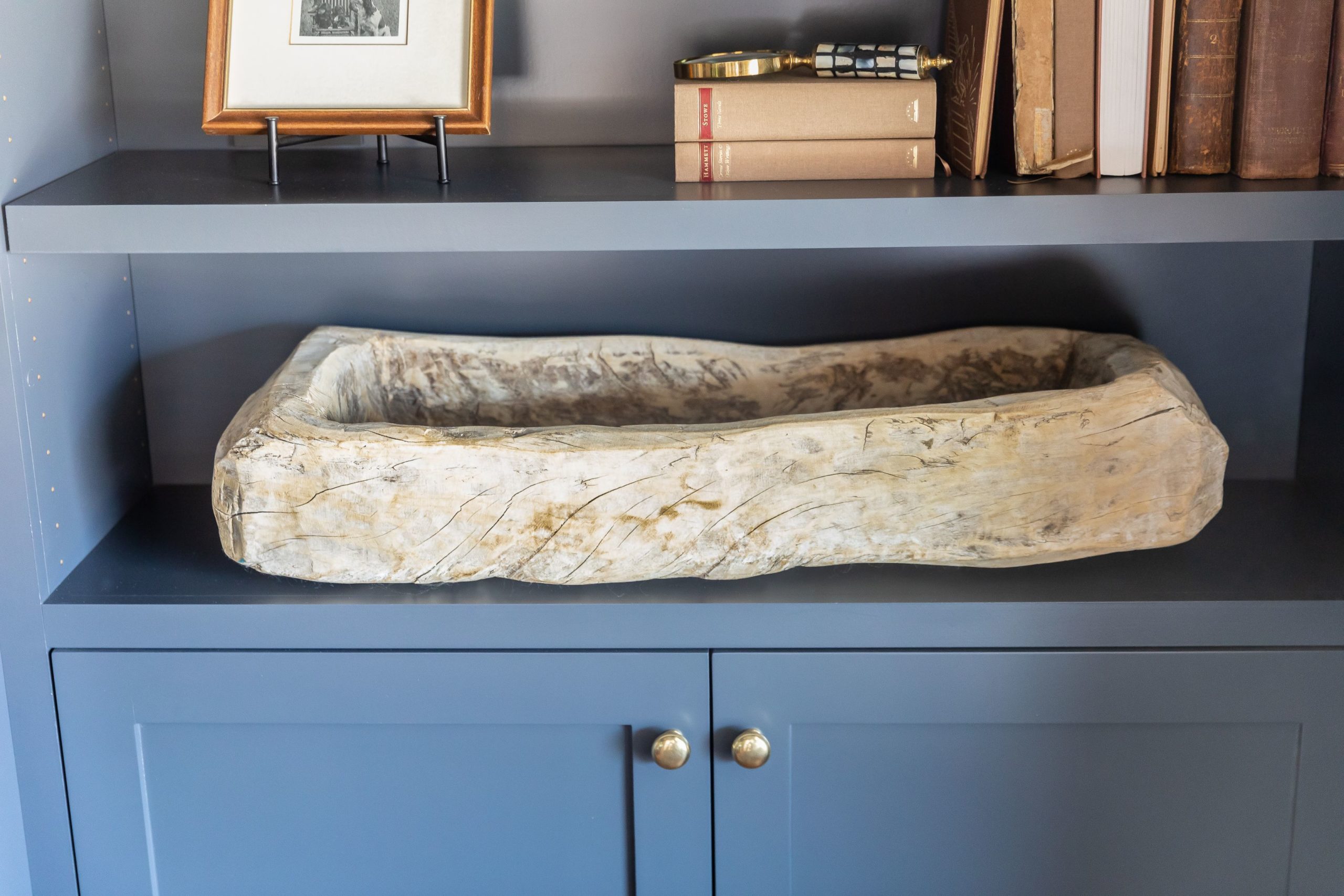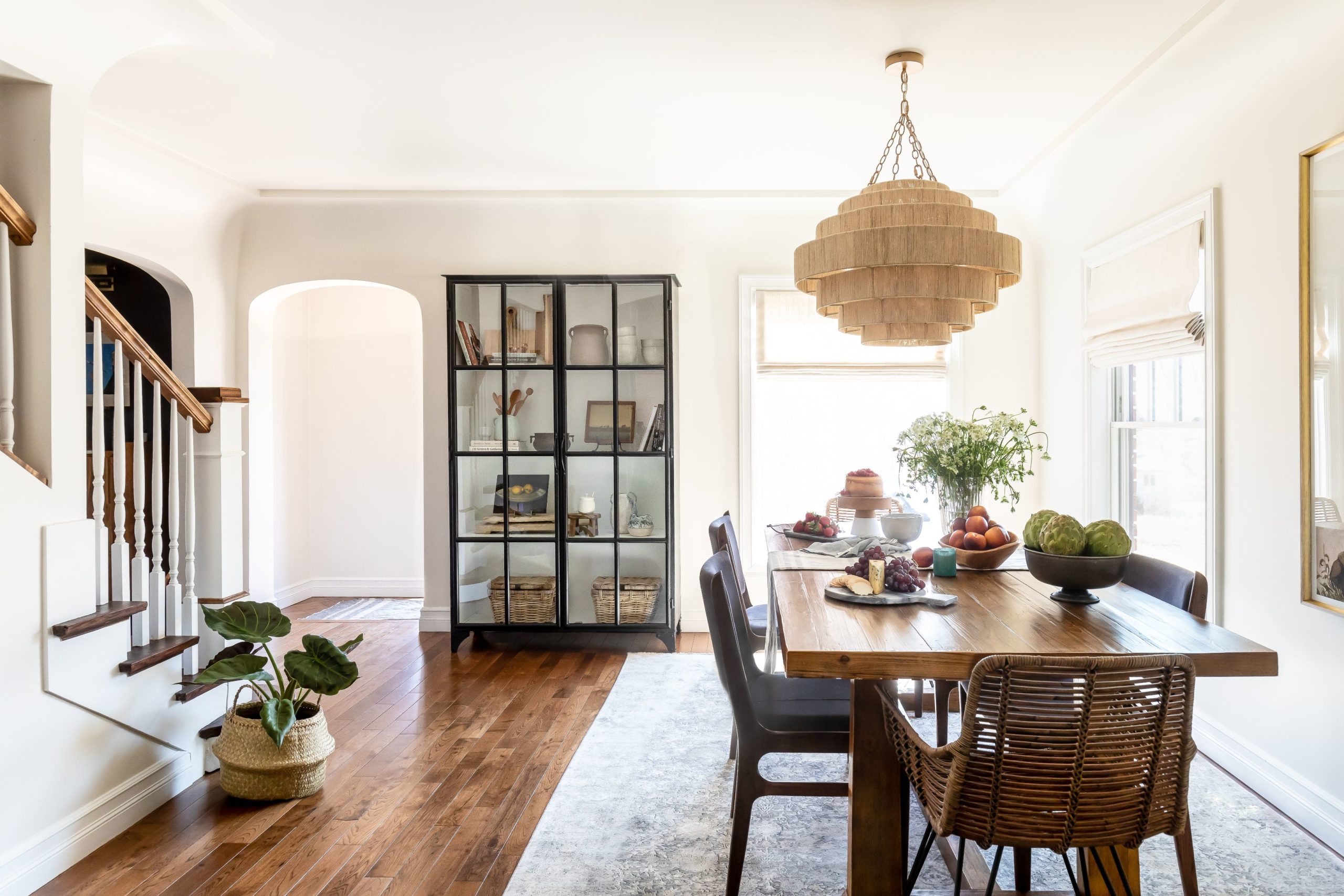
We had a client reach out to us a year ago looking for some small updates on her historical home in the Harvard-Yale area of Salt Lake City. Her home was beautiful as-is and full of character with curved ceiling transitions, cozy gathering spaces and gorgeous wood floors. Our sweet client is full of life and has a coastal transitional style that wasn’t quite reflected with her previous furniture. We came in with some fun ideas on how to liven up the home she already had.
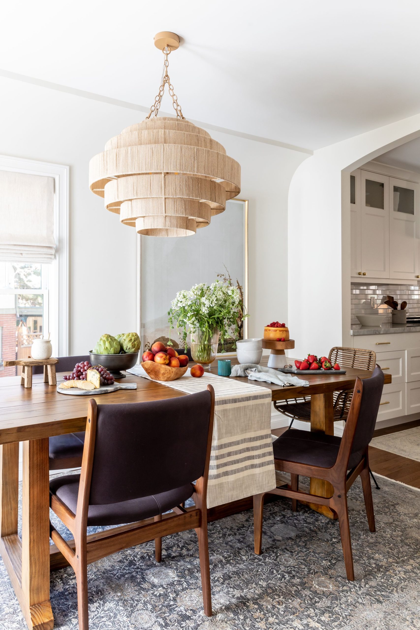
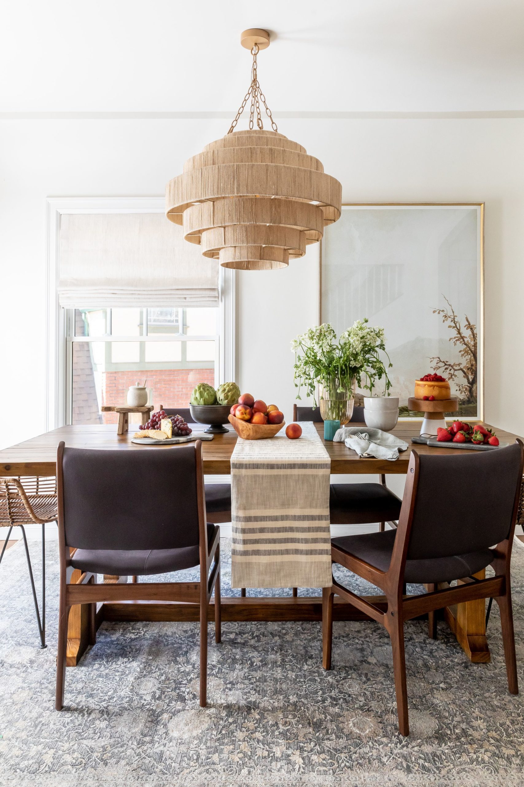
The dining area is adjacent to the entry and one of the first things you see when you come in the house. We wanted a focal point to ground the space as it blends into the kitchen and living room. The light fixture does just that! It’s a beautiful piece that catches your eye right away. The Odette Dining Chair is a great piece and perfect for young kids with it’s darker fabric.
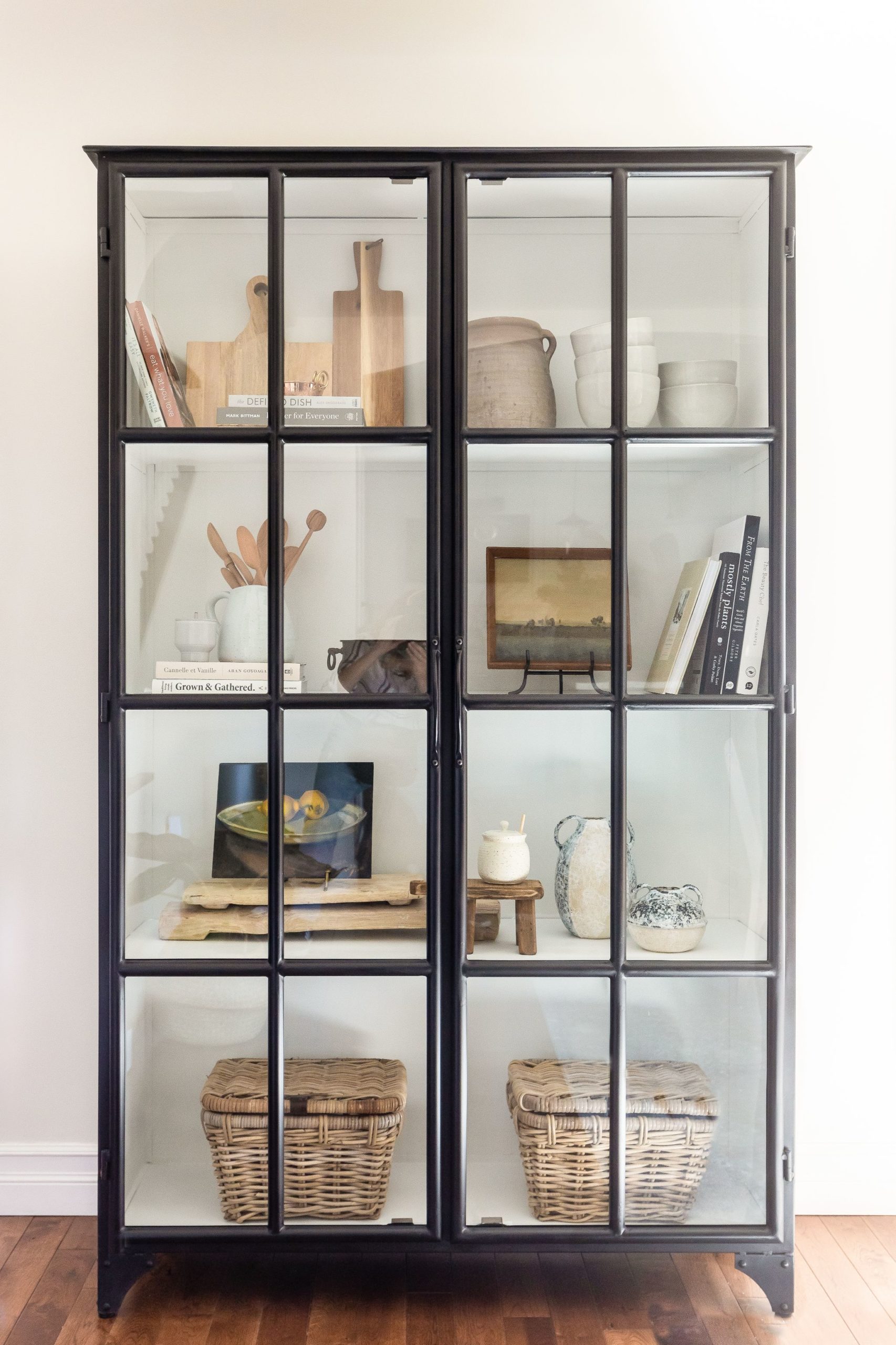
To the left of the dining table we had just enough wall space for a feature storage piece. The James Cabinet is just what we needed to highlight some accessories that are both beautiful and a functional. We had such a fun time pulling pieces that our client uses everyday mixed in with some special vintage finds and great items from House of Jade Home.
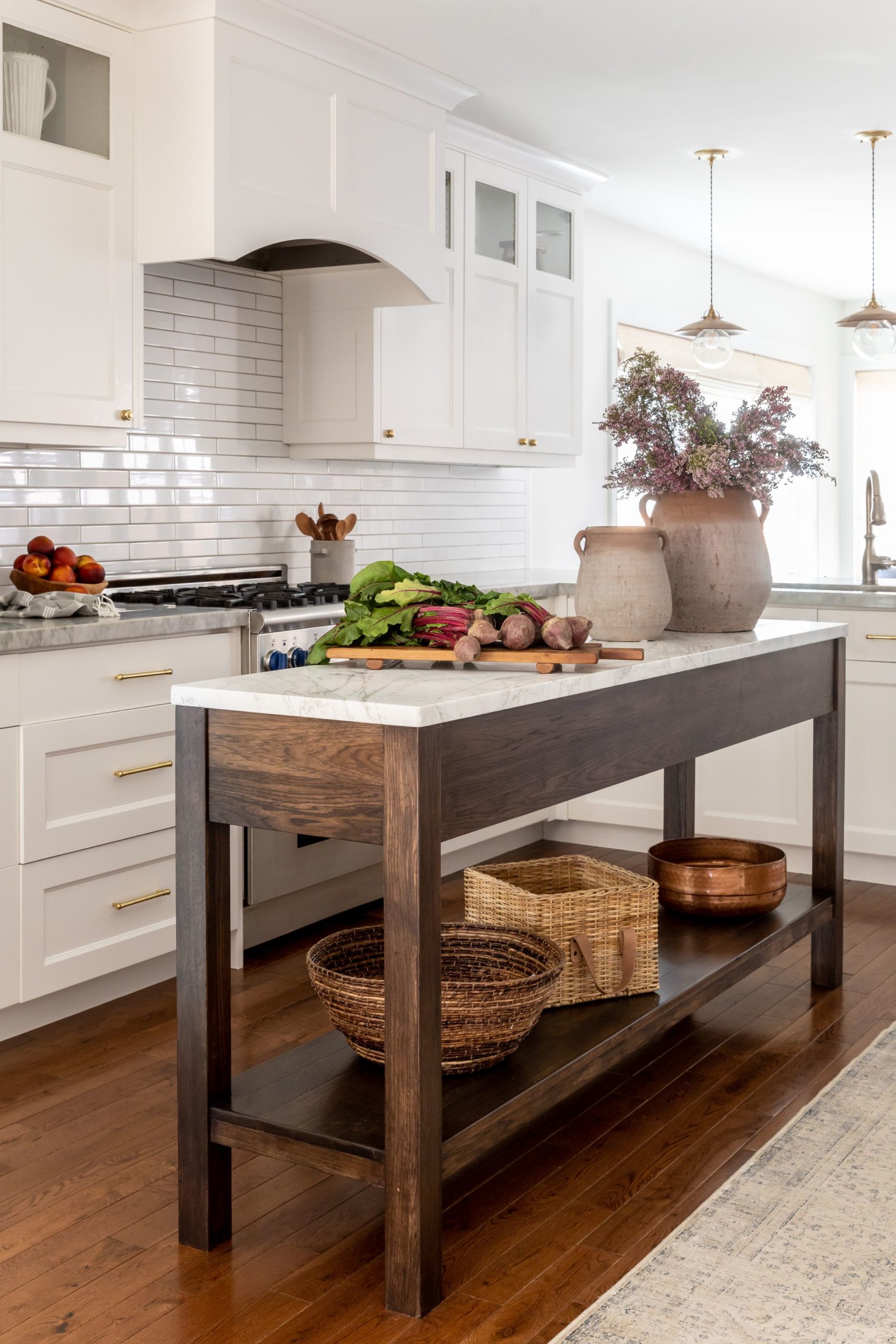
The home already had a nice kitchen but it was lacking a little in character . We designed this custom island to warm up the white kitchen and also give our client a little additional storage. In a smaller space sometimes people feel like they need to keep the room as open as possible but by adding this island the kitchen actually feels bigger and grander.
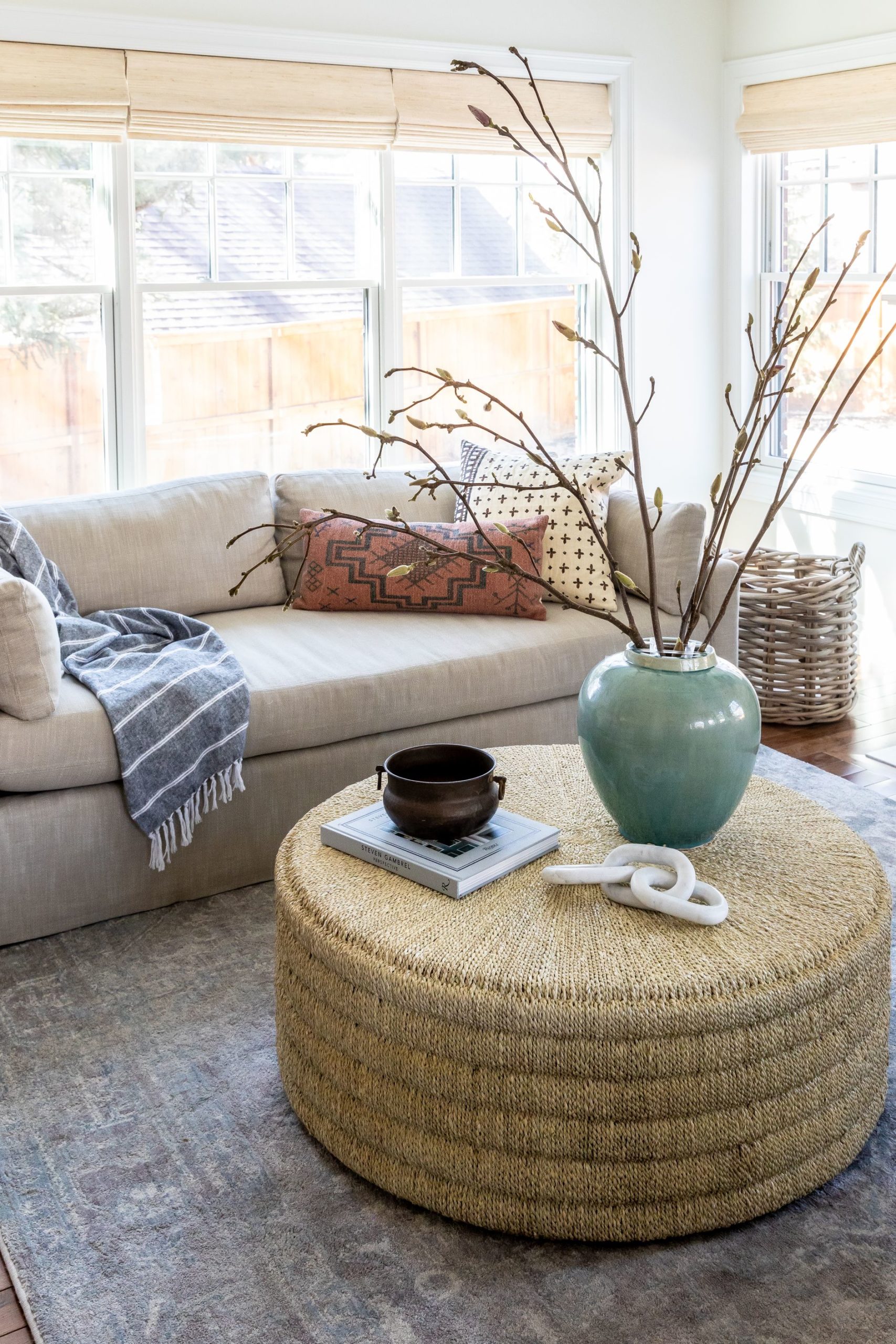
In the living room off the kitchen we sourced the Bree Coffee Table. The wicker texture adds a lot to the room without being overwhelming. We kept the accessories minimal but purposeful.
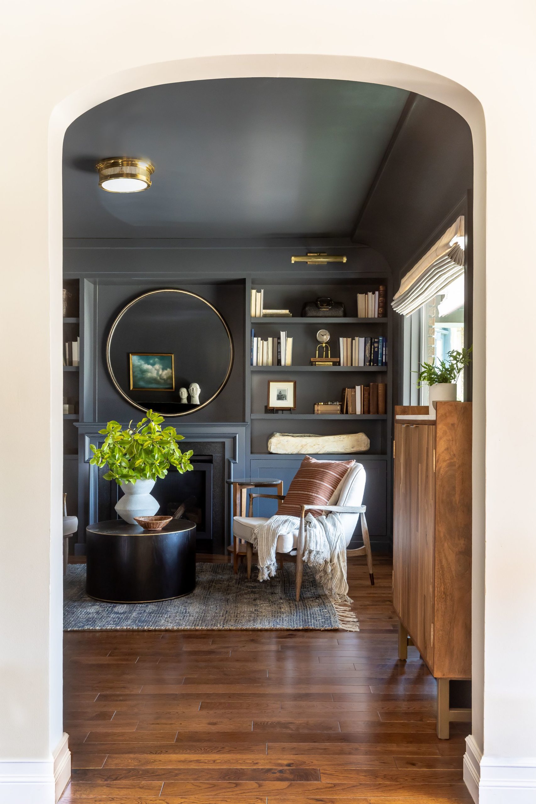
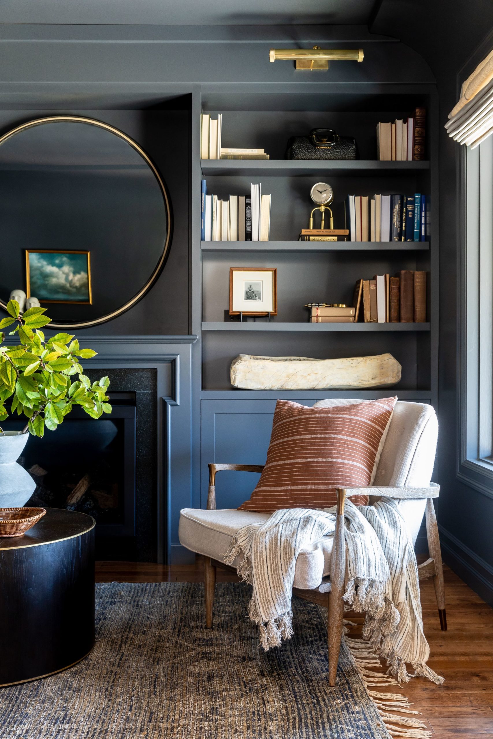
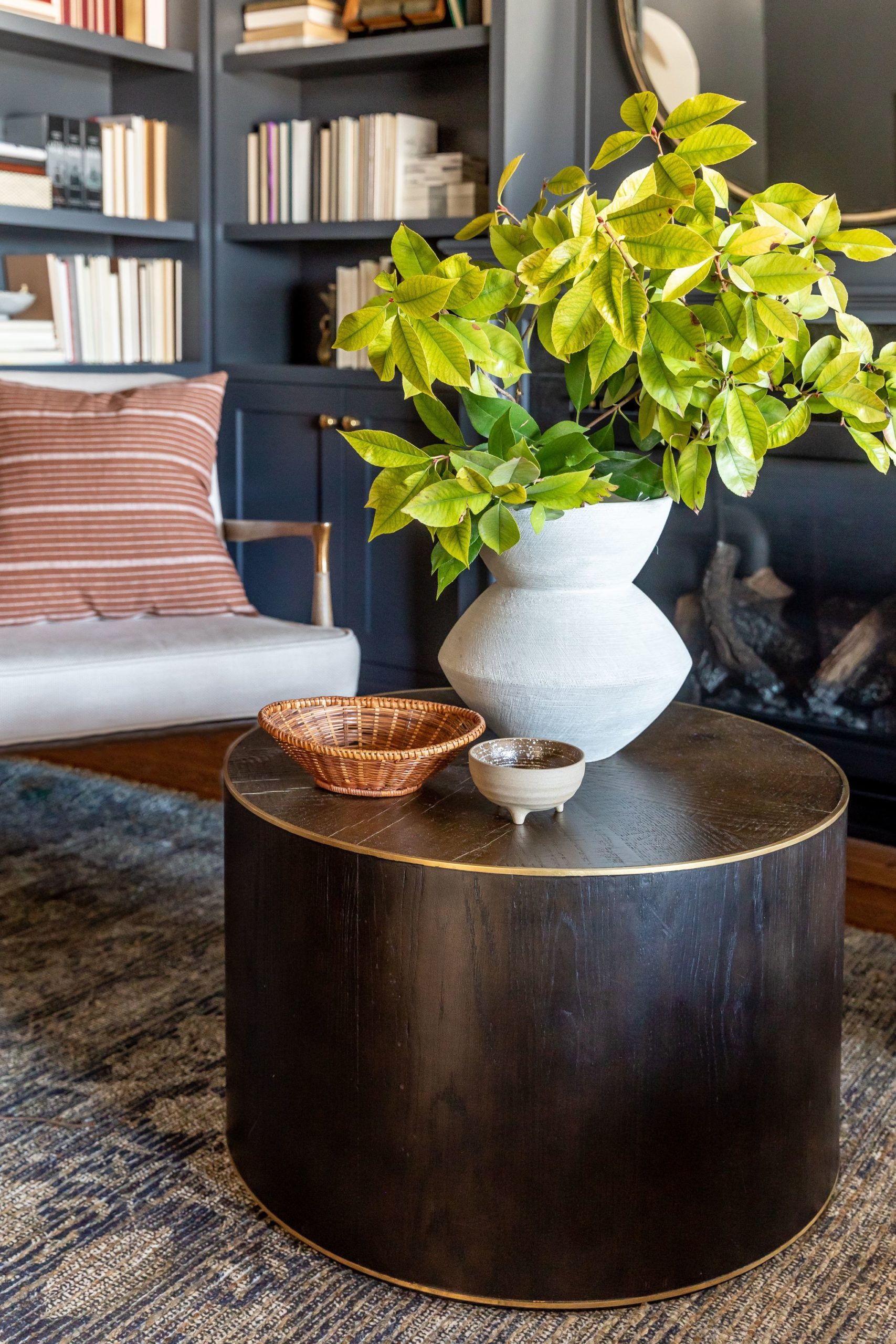
The den went through the biggest transformation in the home. What started out as a blank white box transformed into a moody den for our client to grab a book and drink at the end of a long day. We took the paint color from floor to ceiling. Painting the ceiling was a last minute decision and we are so glad we made that choice! We really wanted a coffee table in here but it needed a smaller footprint because we still need a lot of flow space in this room. This room connects to the entry to the back of the home. So we enlisted the help of the Penelope Coffee Table. This table is stylish but just the perfect size to into a smaller seating area.
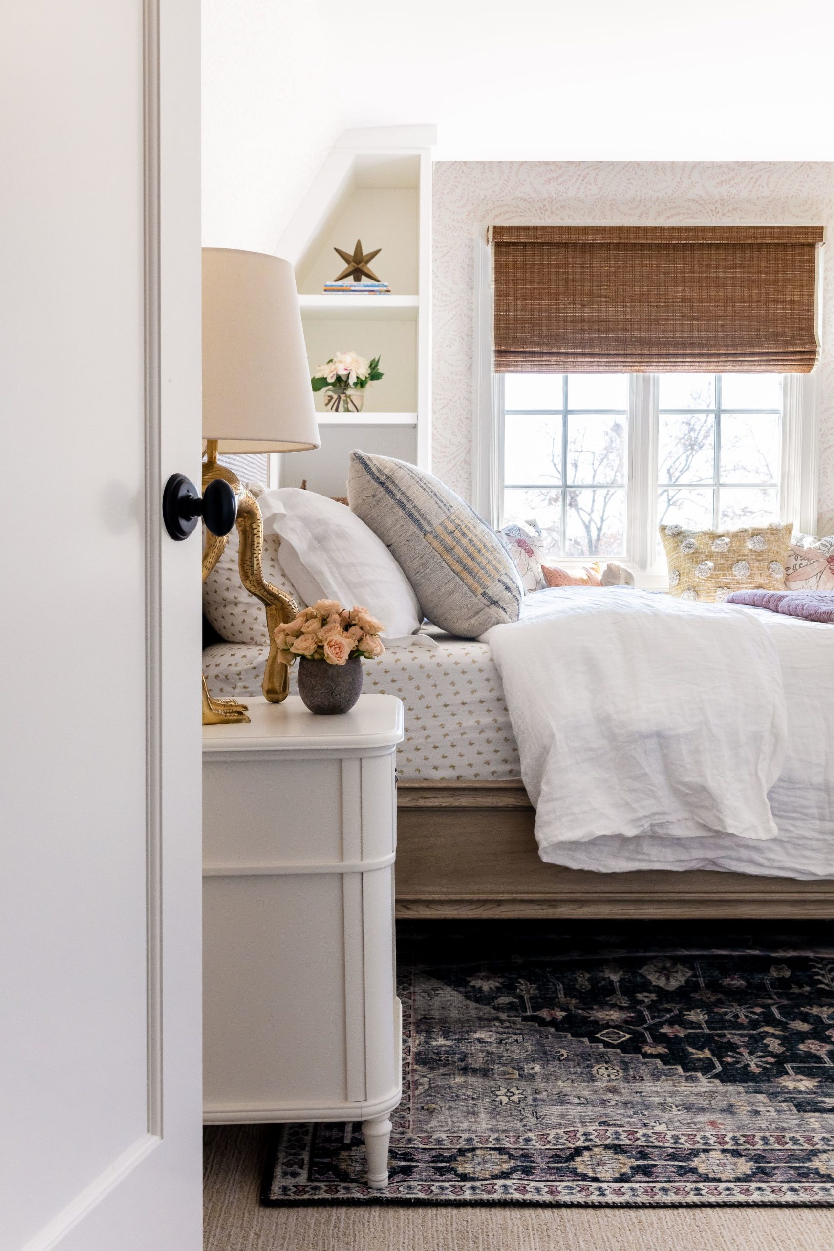
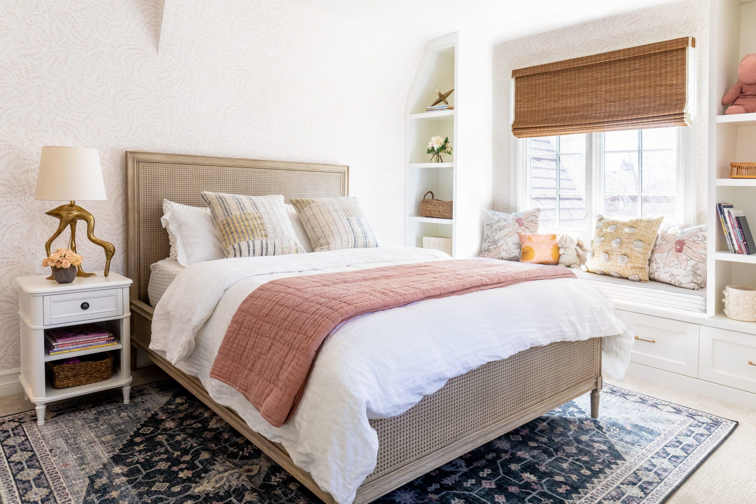
One of our favorite transformations was this little girl’s room. We wallpapered the whole room and added custom built-ins to flank the window. The real star of this space is the Winslow rug with it’s bold colors and pattern. It grounds the space perfectly.
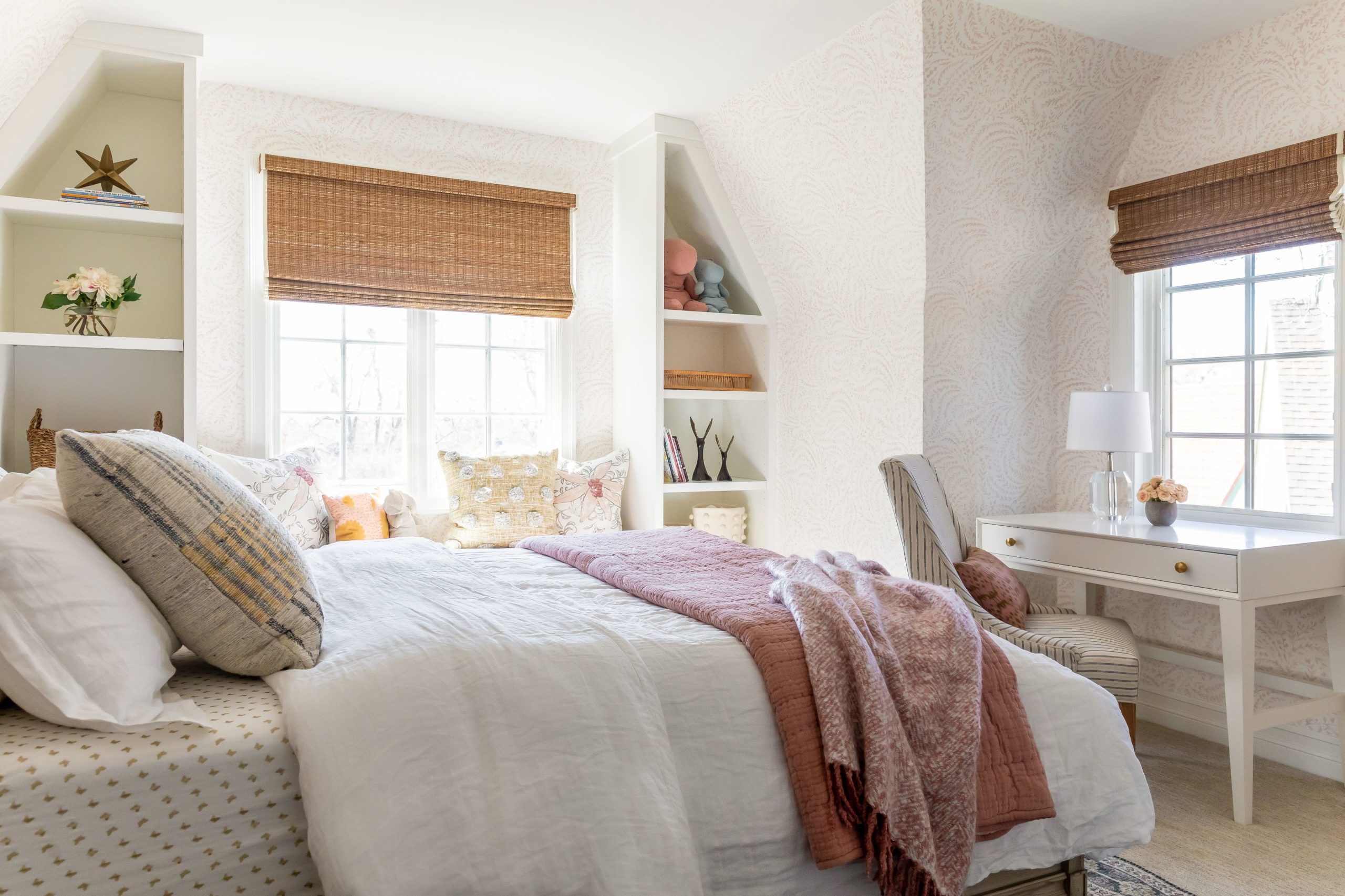
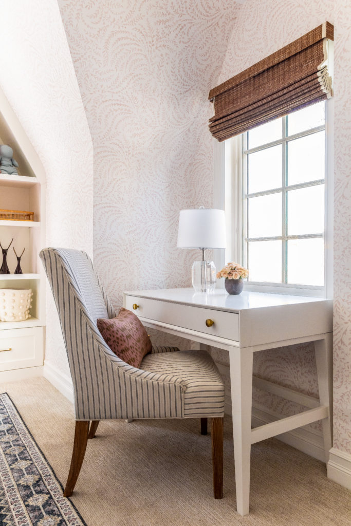
Since we added all the storage on the window seat wall we were able to squeeze a petite desk under the window.
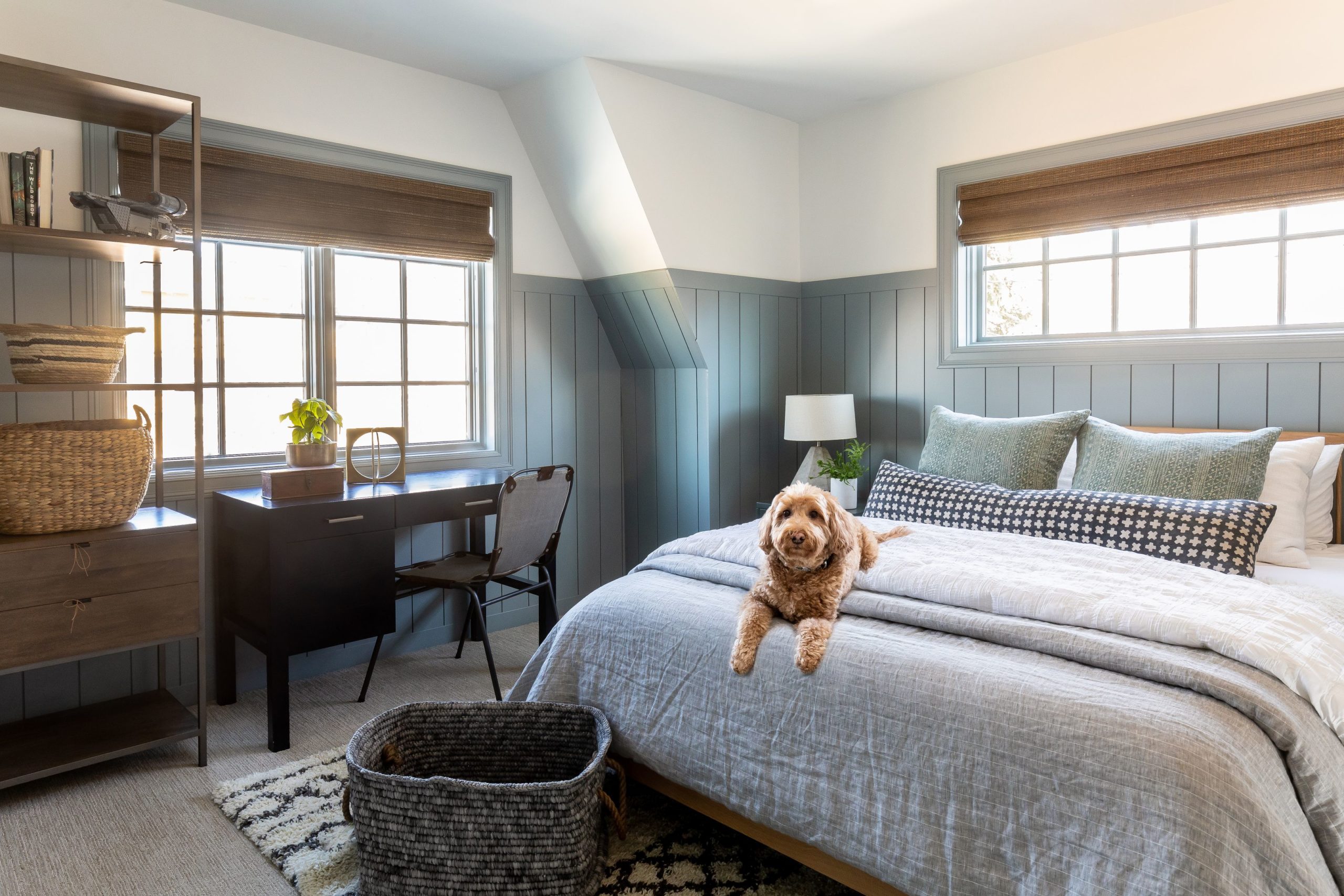
The boy’s room transformed with the use of vertical ship-lap and new furniture. We love Benjamin Moore’s Cloudy Skies. It’s just the perfect shade of blue.
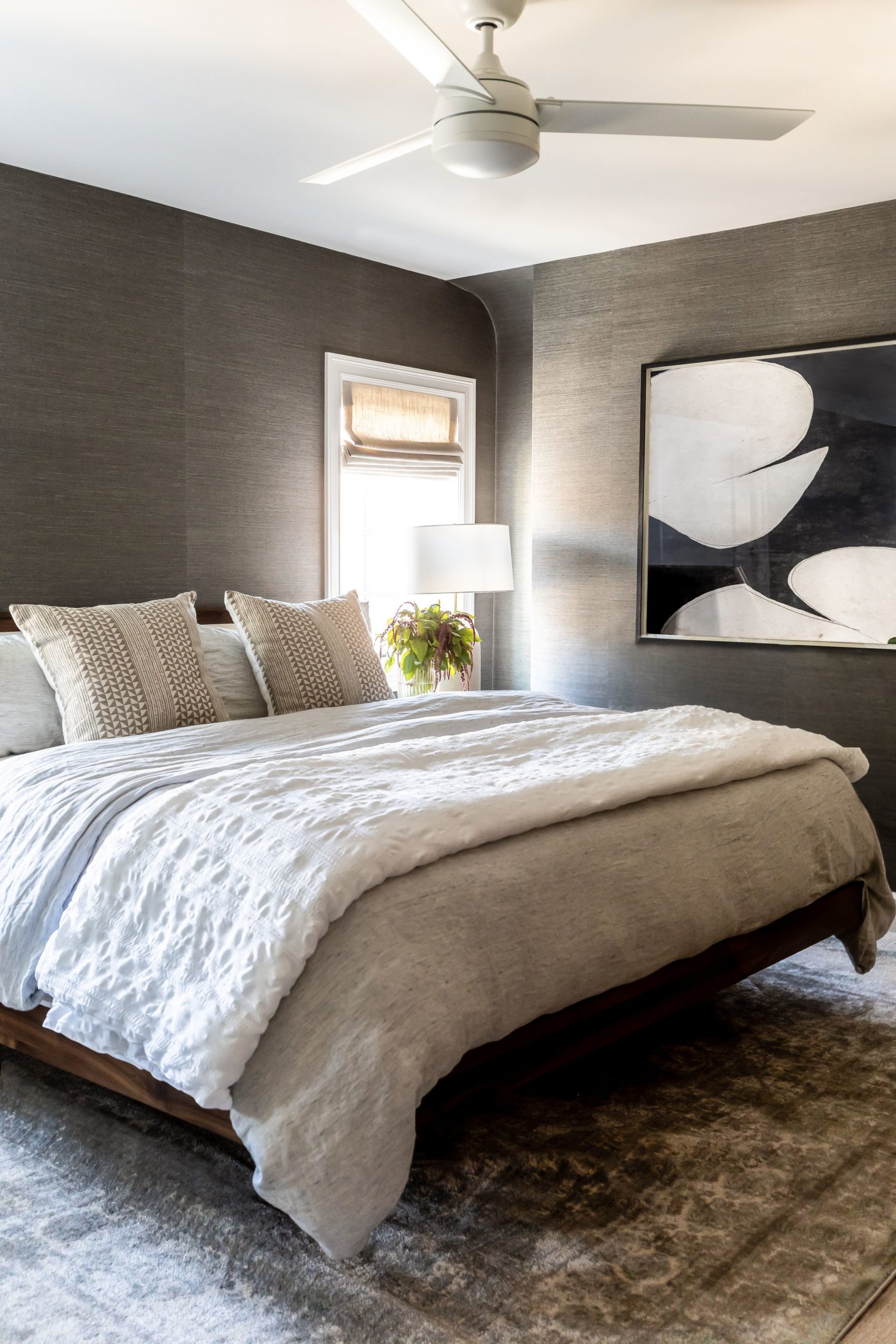
The primary bedroom is moody and sophisticated. We did a lux grass-cloth on all the walls. We always recommend committing to a paint color or wallpaper by using it on all four walls instead of just one accent wall.
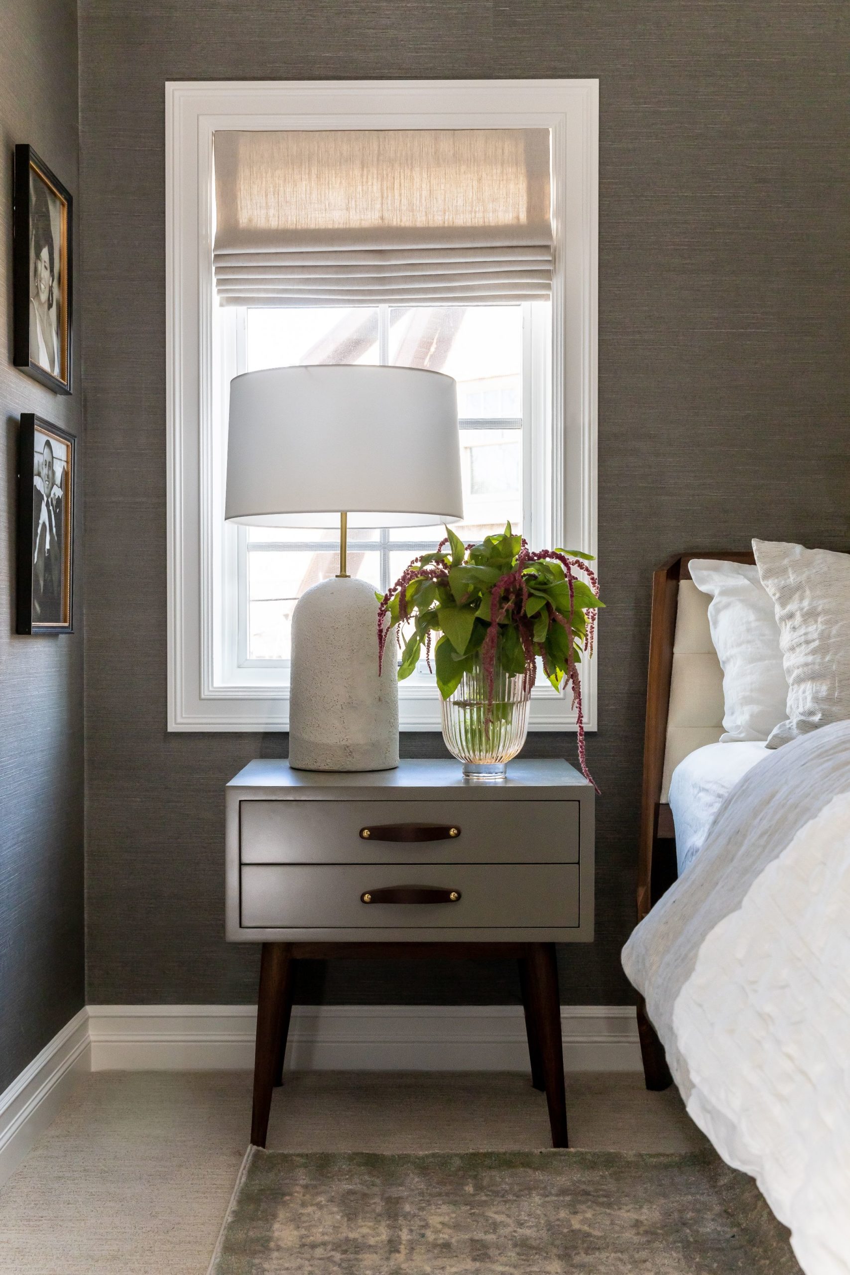
We hope you enjoyed this little tour of this beautiful home. We are so grateful for our clients who trust us with the spaces that they spend so much time in. To inquire about our design services check out our website!
