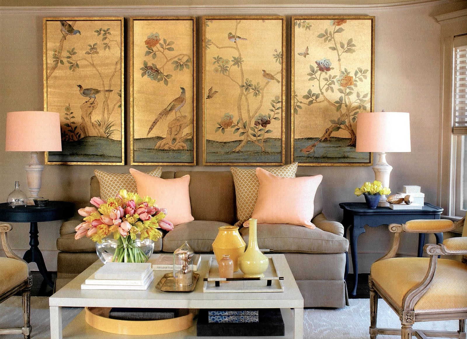
It’s no secret that I love color but that doesn’t mean I can’t appreciate a beautiful neutral color palette. In the latest issue of Martha Stewart Living she proves that neutrals and color can combine to create superneutrals!
These are subdued colors that create contrast and excitement while staying pretty and not too over-the-top.
Check out more of the article here.
I love this article…definitely a keeper! Leave it to MS – awesome!
The colors in that bathroom are so unexpected yet so beautiful!
Mmmmmm those grey dining chairs are divine!
I am still gazing at those images in Martha. Love the bathroom with the coral mirror.
love it all
X
V
I am officially in love with the room in that first photograh!
i wish i could get that mirror! i love the first room as well, fabulous paintings and very lovely colors.
have a lovely day!
Tiina
http://elcestockholm.blogspot.com
I love the mirror as well! I have been searching for one just like it for a guest bathroom. If anyone has an idea of the source, please share!
Very Fine House
Love the post about the superneutrals – these are all amazing images!
I love everything! I really want to do a window treatment like that!
LOVE. I like color for other people, but just can't use them for myself. LOVE neutrals.
Umkay, so that bathroom is so great! I LOVE this article!!! Thank you for sharing!
Love it all! Love Martha and all her new Home Depot colors! That bathroom couldn't be any cuter!
i'm in love with that coffee table (and everything on top of and/or in it!)