Today we are revealing a project we have been working on for awhile. Our amazing clients were their own contractors on this project which is super impressive considering the massive undertaking that it was and that it all took place during Covid! When we first met with our clients we chatted about the many different ways we could space plan the project. There were tricky walls and angles to work with and we were trying to fit a lot of different functional spaces into the existing footprint.
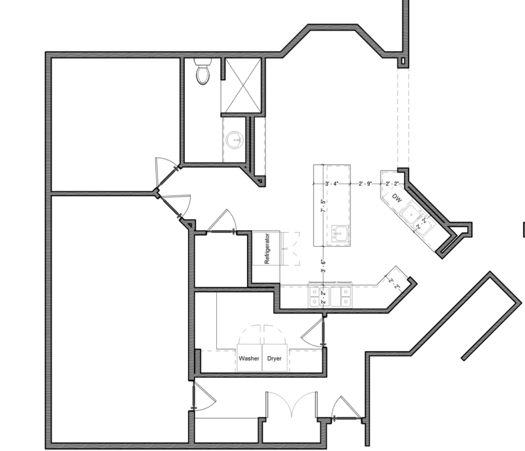
The existing floor plan had an awkward kitchen that made it so the main living room felt very separate. Our client also wanted more storage and a bigger pantry. The mudroom was tight and consisted of a small coat closet but nothing more.
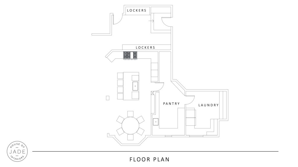
We came in with a new floorplan that took out walls to open up the mudroom and kitchen as much as possible. We also gave our client a huge pantry with ample storage and an extra sink and dishwasher. The after is a much fresher version of the home that fits the clients style and needs.
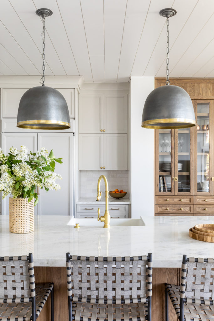
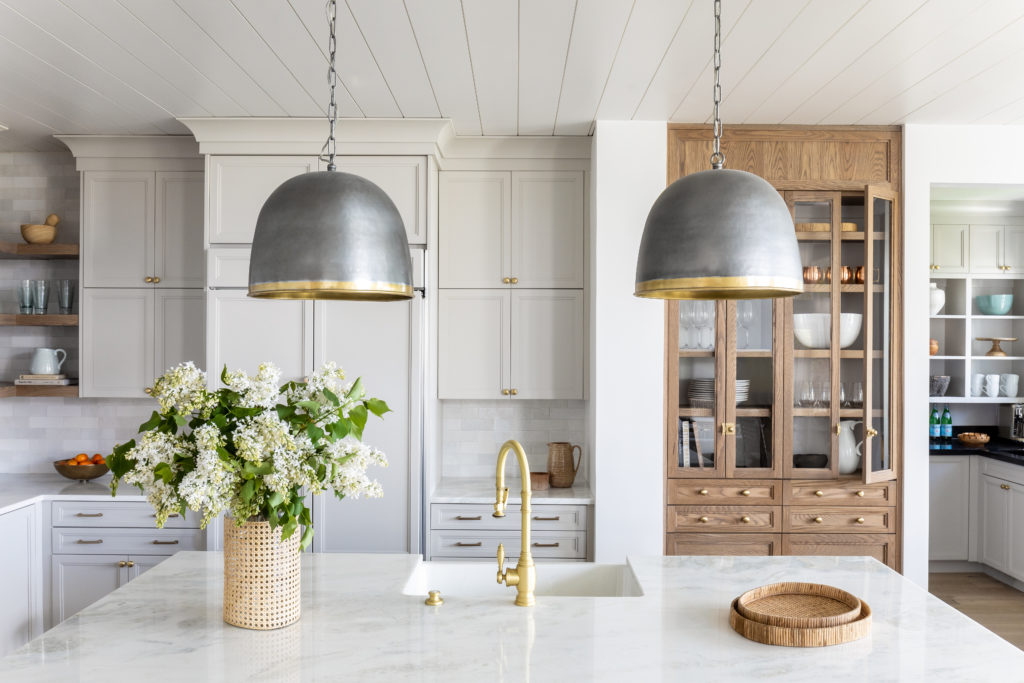
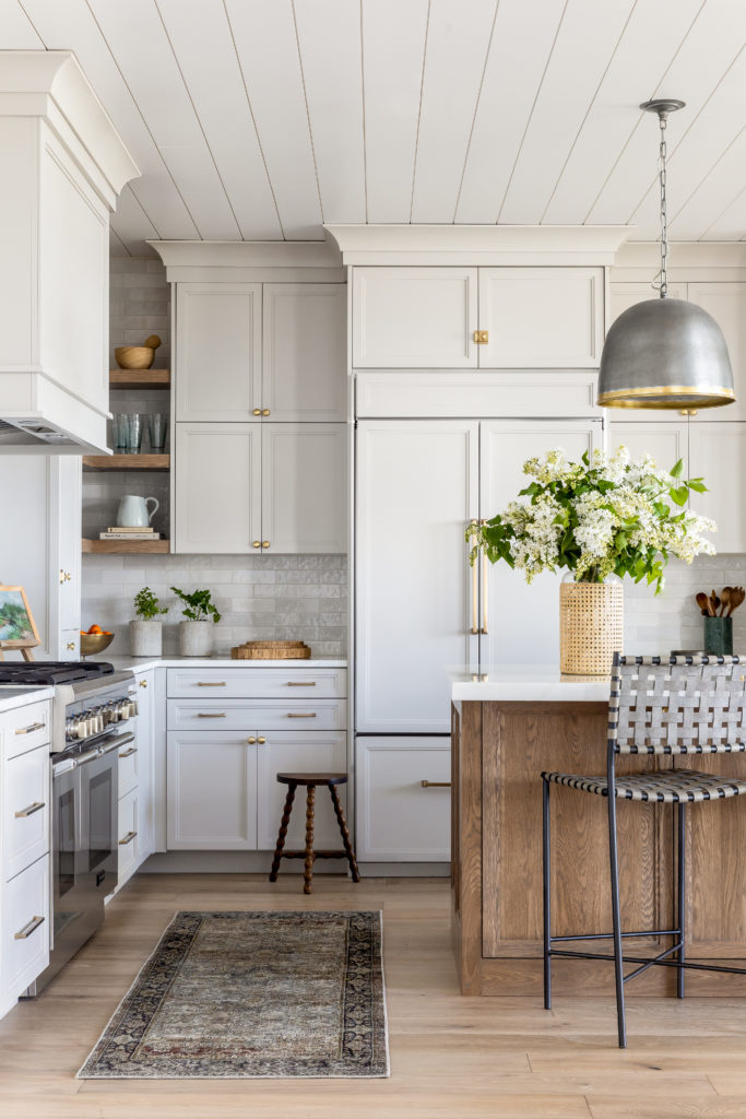
We kept the majority of the kitchen footprint the same but transformed the feel with custom cabinetry, new lighting, countertops, plumbing and hardware. There was a load bearing pillar that we couldn’t take out so we decided to use it as a natural dividing point between the gray kitchen cabinets and the wood glass front cabinet. With remodels you often have quirky elements that you just can’t change but sometime they can work to your benefit if you are up for the challenge!
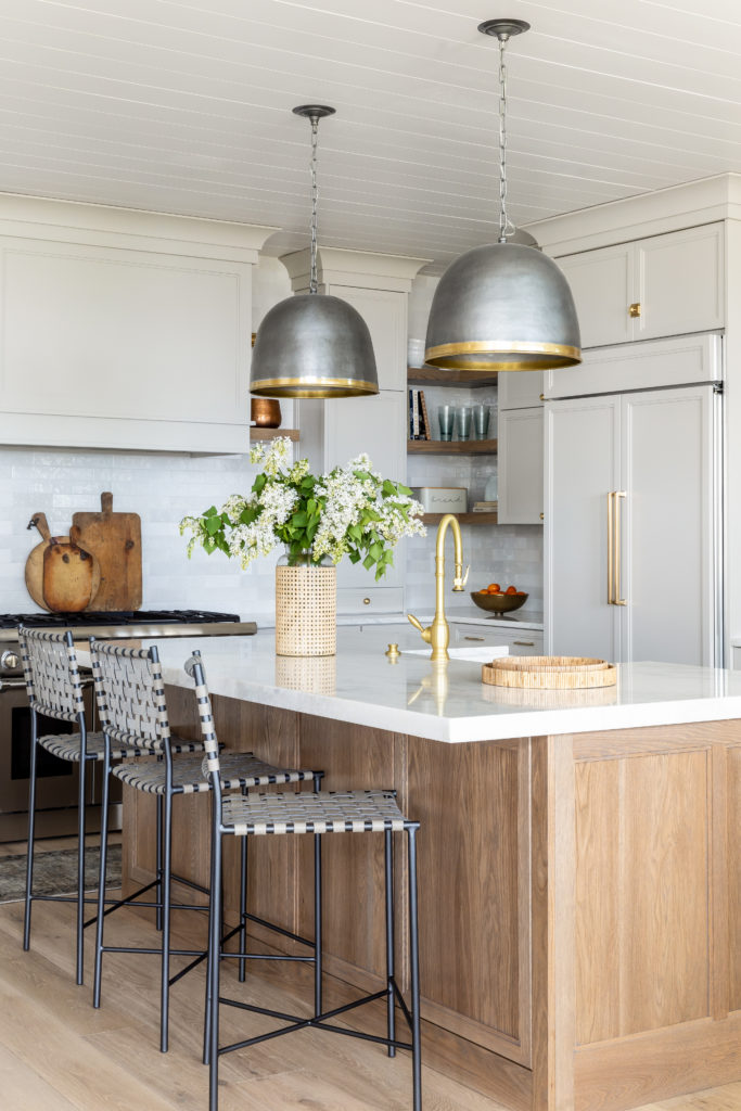
Our Logan Pendants are the perfect touch with their pewter dome shape and brass rim. The metallic element is especially stunning paired with the stained white oak island. Our Elliot counter stools in smoke gray mimic the gray perimeter cabinets painted in Benjamin Moore Nimbus.
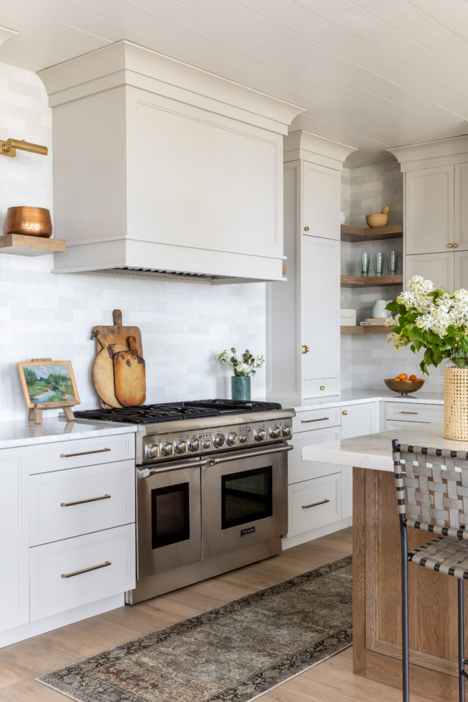
We kept the kitchen very neutral so we could add in colorful and visually impactful accessories. We brought in color with our Kendall Rug, vintage art and our hobnail tall glasses.
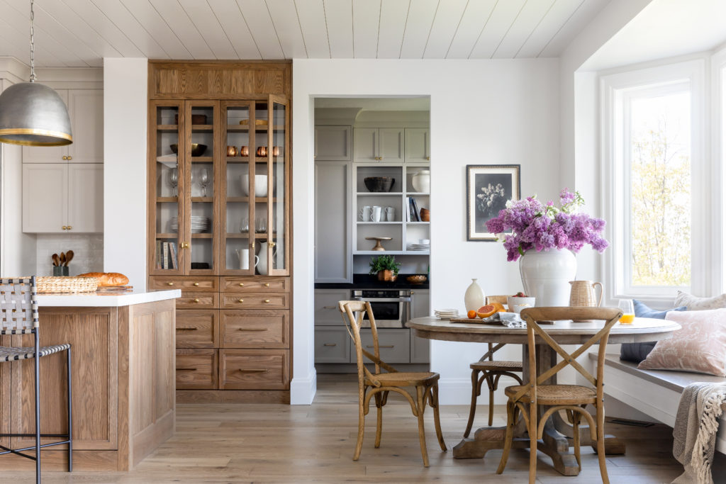
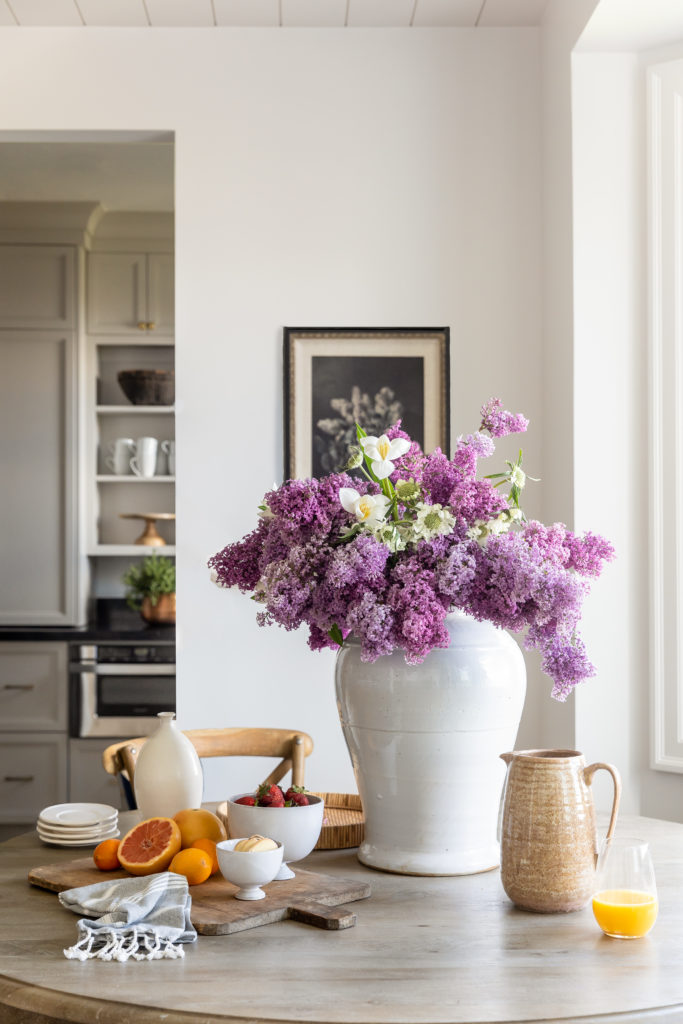
Adjacent to the kitchen is a small eat-in dining nook. We brought our Rishi Jar in front and center on the table to showcase foraged floral arrangements. Past the dining nook you get a peek at our client’s new pantry!
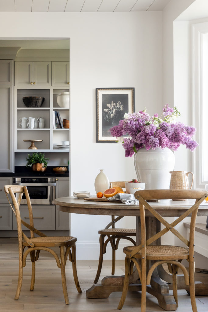
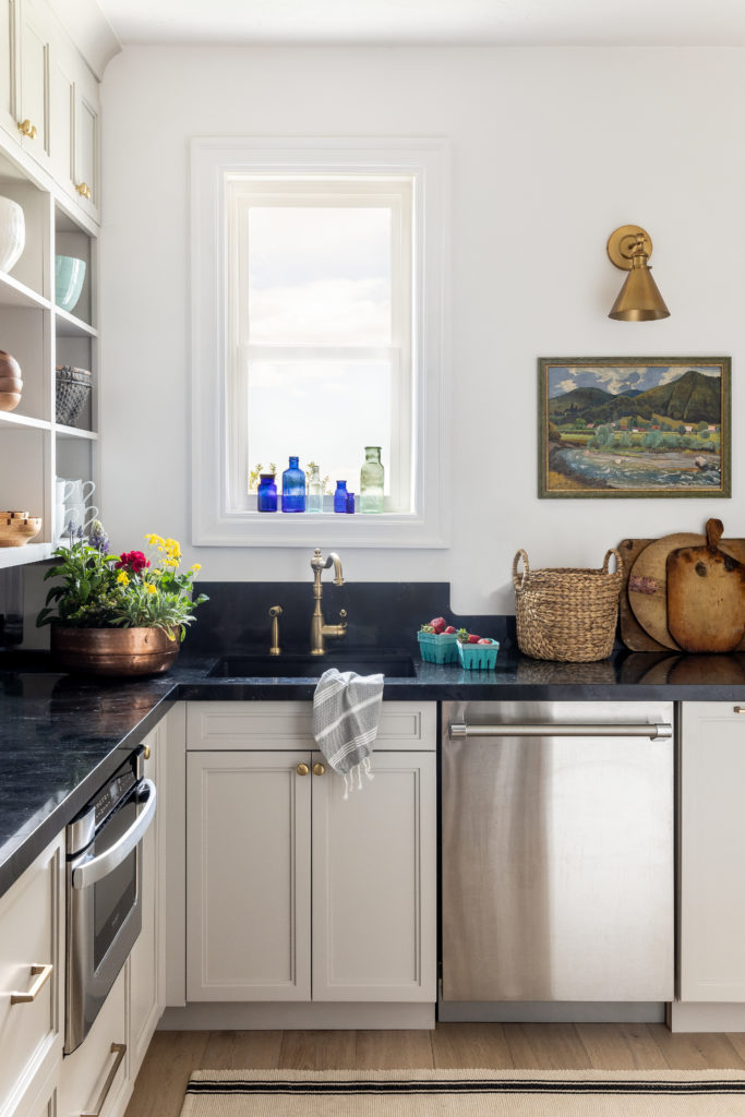
We brought the wood flooring from the kitchen and the Benjamin Moore Nimbus cabinetry in here so it felt like a continuation of the kitchen.
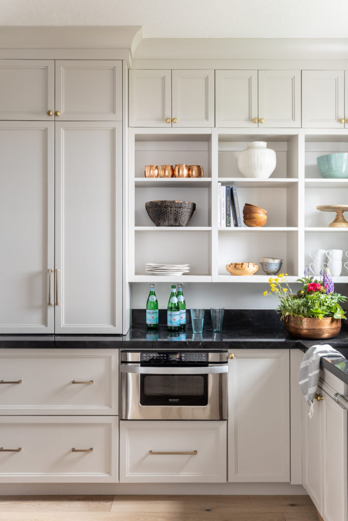
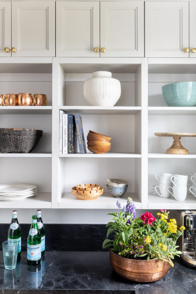
We did a combination of closed and open shelving in the pantry so our client could display pretty serving pieces like our Emory Pedestal and Emma Berry Bowls.
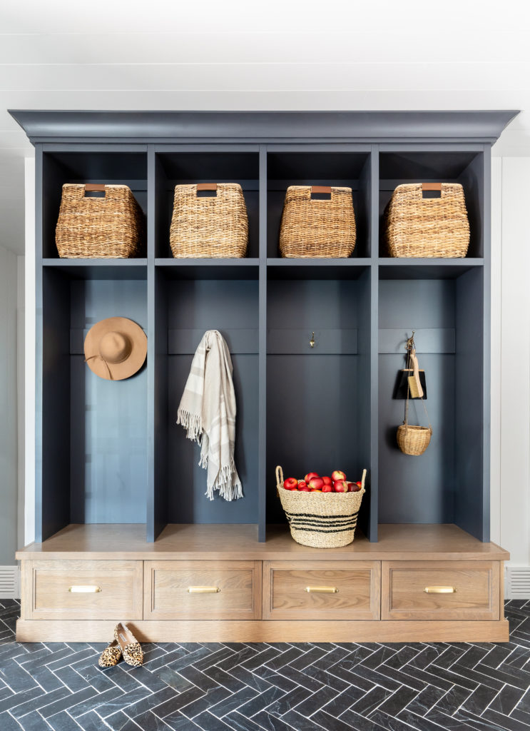
Our client’s mudroom got a huge makeover that involved us taking out walls and combining the previous laundry and mudroom into one bigger and better mudroom space. We did a custom locker wall with two tone wood and Benjamin Moore Racoon Fur.
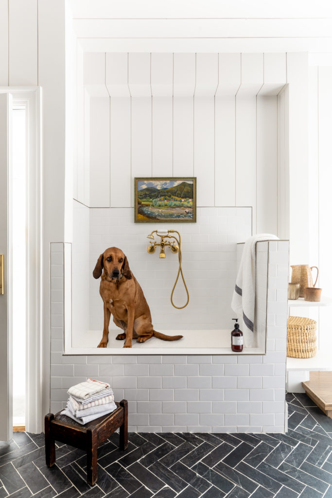
Across from the mudroom lockers we added a dogwash station for client’s ADORABLE pooch. We kept it simple with white subway and white shiplap to contrast with the slate herringbone floor.
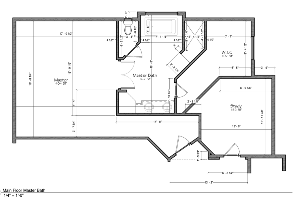
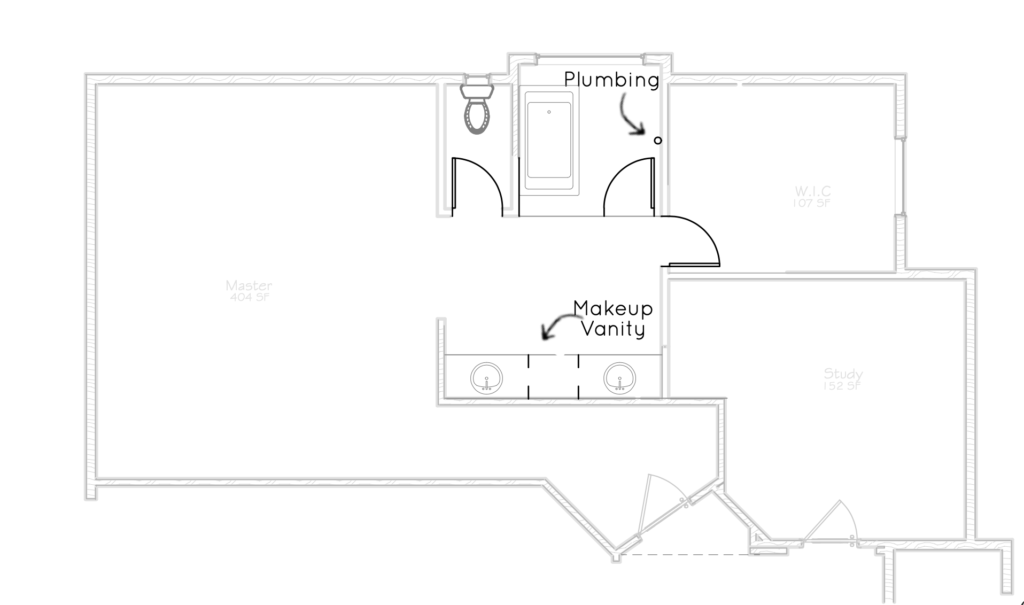
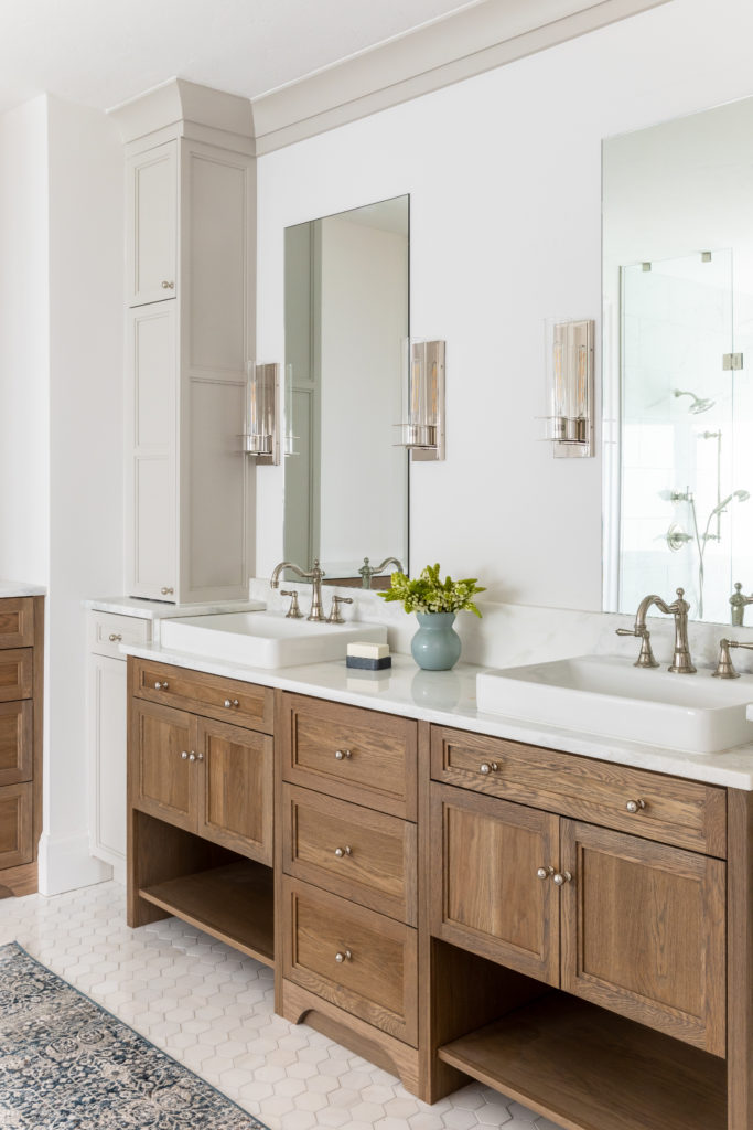
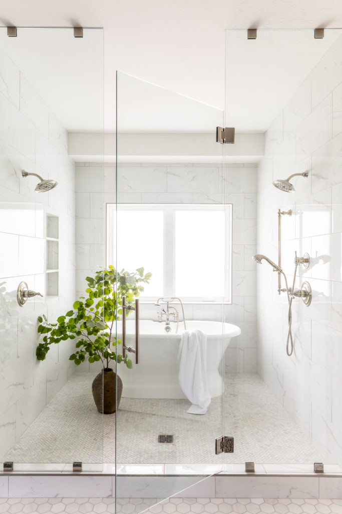
Moving into the primary bath we rearranged the space plan but kept the existing plumbing in place by combining the shower and tub into one large shower/tub combo. This opened up the bathroom considerably and made it feel much bigger!
photography by Lindsay Salazar Photography Styling by Noelle Wright
Bravo to our clients for their hardwork on this amazing remodel!