A midcentury modern home gets an update with a gorgeous kitchen, more storage space, and improved living and dining areas.
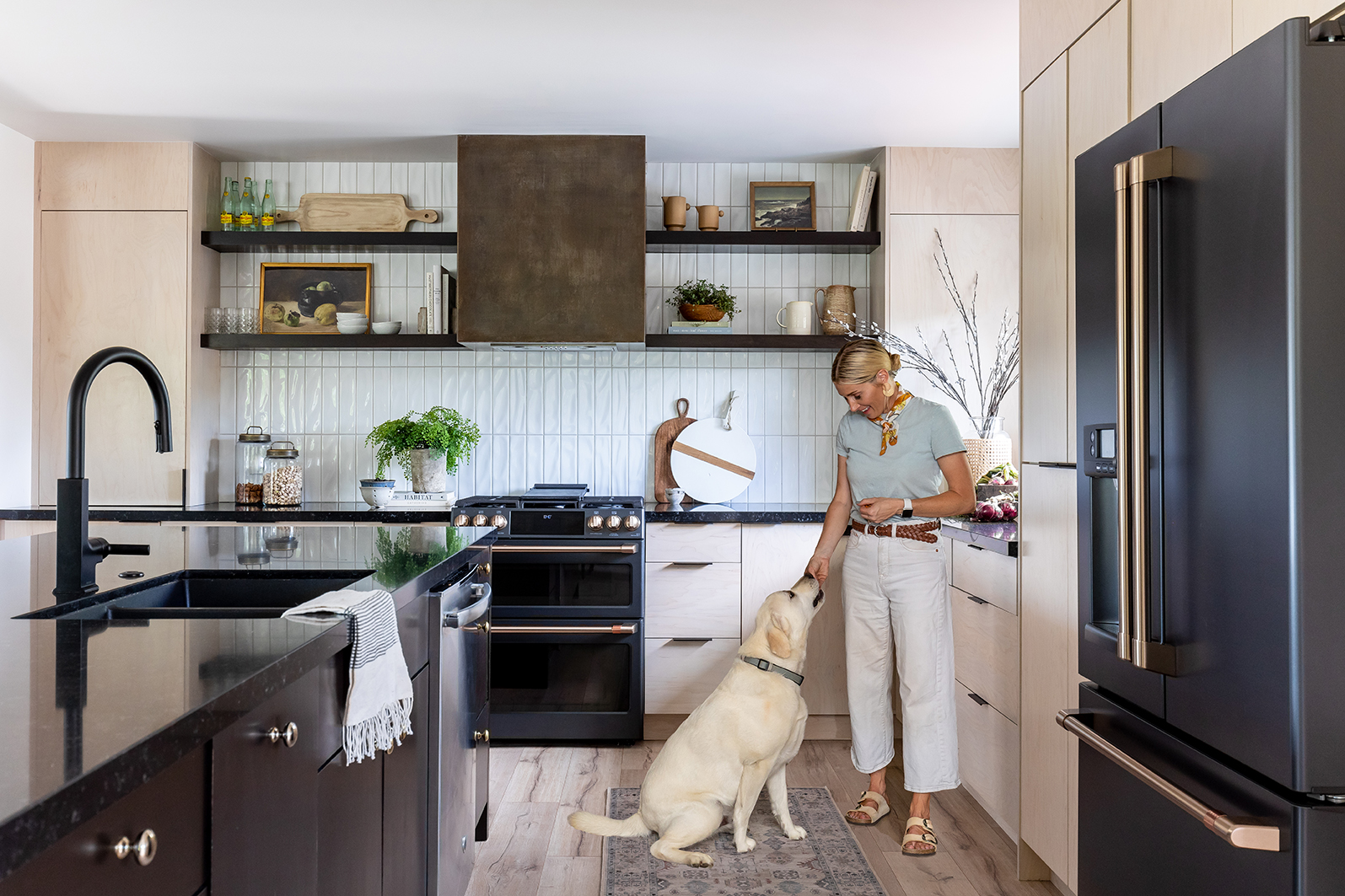
Today we are so excited to share this beautiful kitchen, dining, and living space remodel. We’ve been eagerly awaiting this reveal for awhile! After Covid delays and slow shipping times for some *stunning* appliances, we are finally ready to show you how we helped create a timeless, warm, and welcoming home that felt personal and unique to our clients.
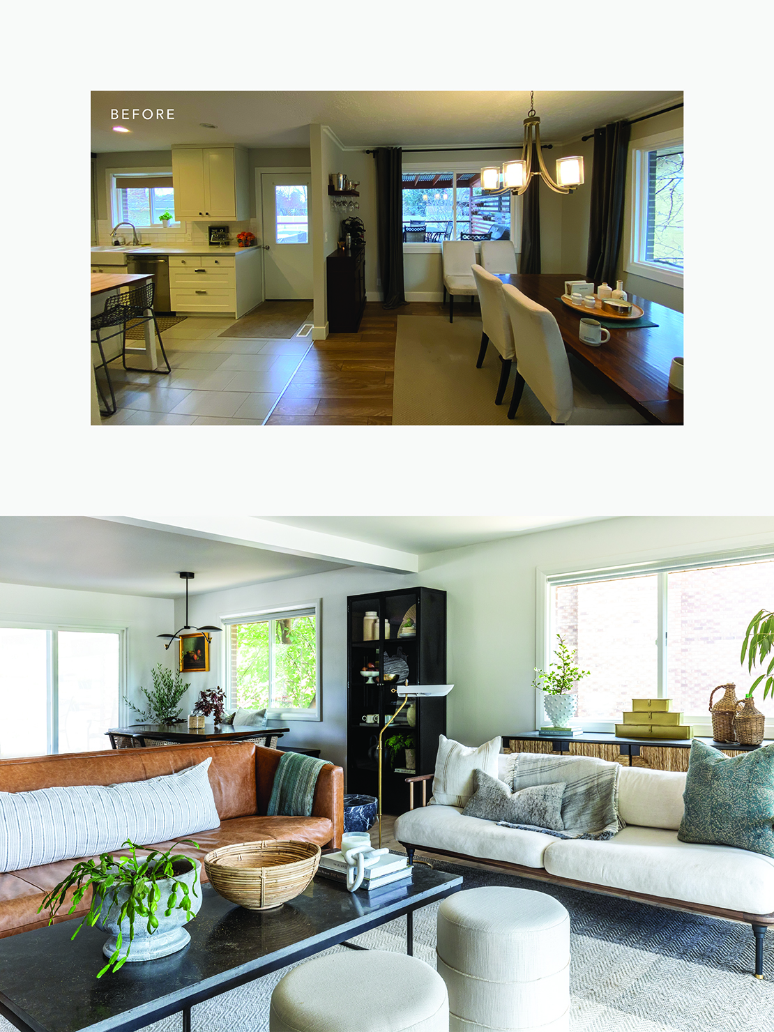
This mid-century home was built in the late 70’s and although it had some upgrades, there was still very limited storage space and many barriers impeding the natural flow. After walking into the home, we knew right away that we wanted to adjust the crowded floor plan and open up the space.
At House of Jade, we are big advocates of distinctive kitchen, dining, and living room spaces. However in this particular home, it impeded functionality. We worked on the floor plan to find ways to make the flow more open and natural, while still creating intentional spaces for each room and also increasing storage.
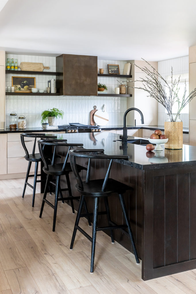
We decided to knock out the wall separating the living room from the kitchen. This allowed us to open up the kitchen and make the space feel more roomy.
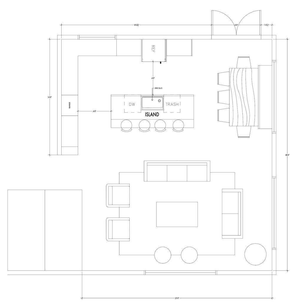
While designing the new floor plan, we started coming up with ideas for maximizing the kitchen space. The current kitchen had a small island and limited counter space. The client wanted to replace their old Ikea cabinetry with more functional storage and a more intentional, mature feel.
During the design process, we found that we could expand the current counter and storage space by relocating the exterior door closer to the dining area. We even had enough room to add a new and improved kitchen island!
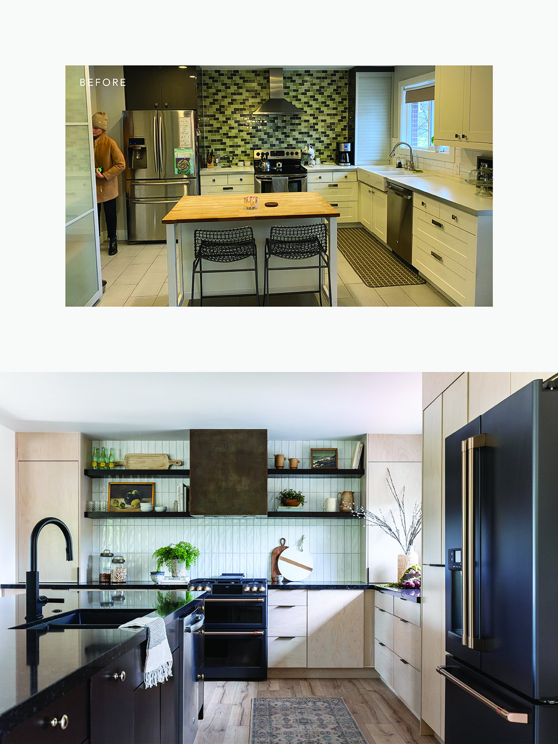
We always want to make our clients happy, but we love when we can suggest unique approaches that they may not have thought of themselves. For this remodel, we designed an all-wood kitchen with a darker color palette to pull in the architecture of the home and the dark brick exterior. In this era where design blogs are awash with white kitchens, it was freeing to get creative and bring in darker elements.
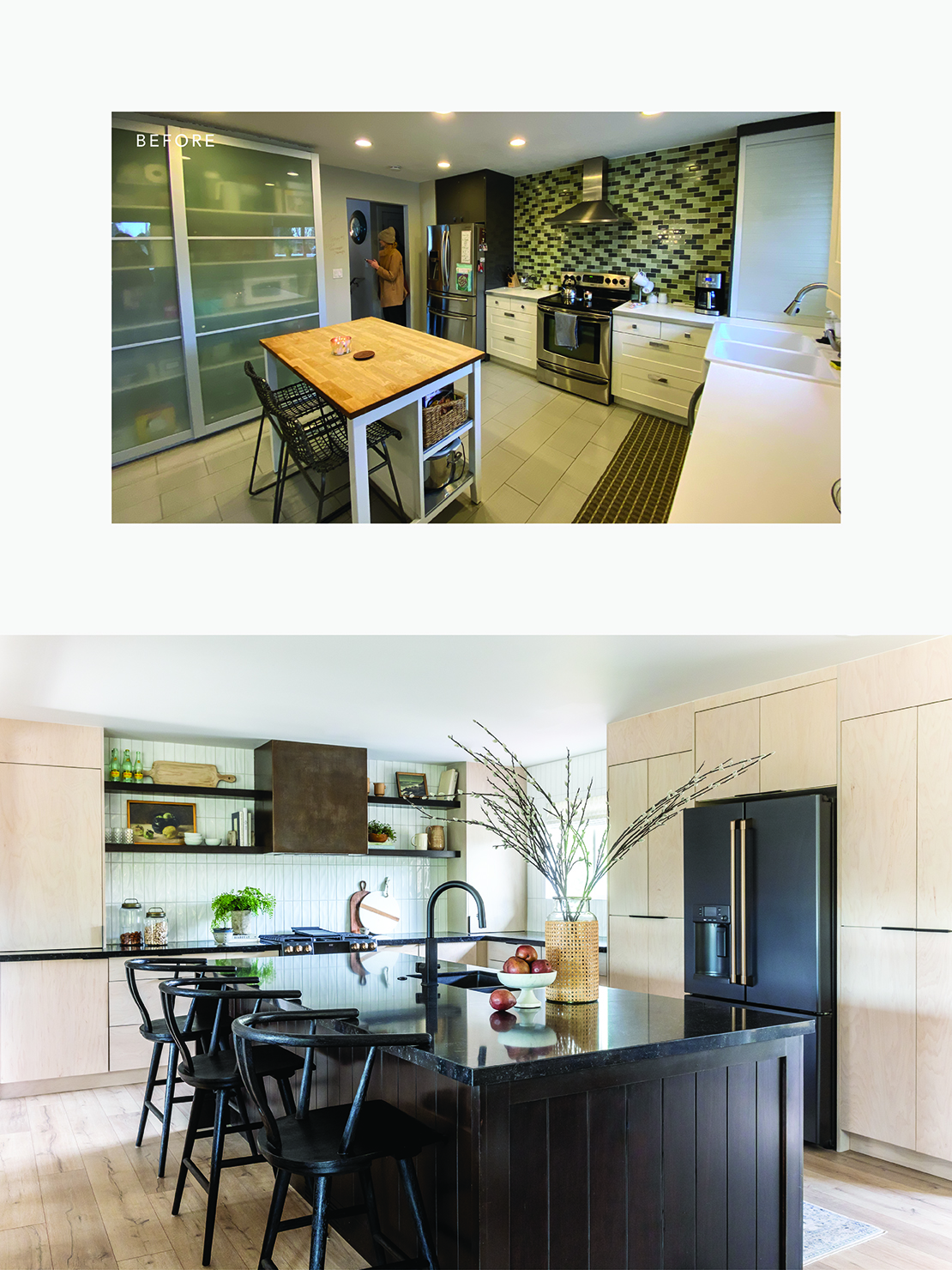
We are so in love the results! The effect was a grounding, mature feel. And because we had knocked out the half wall and moved the door, the light was streaming in and the space felt so much more bright, open, and beautiful.
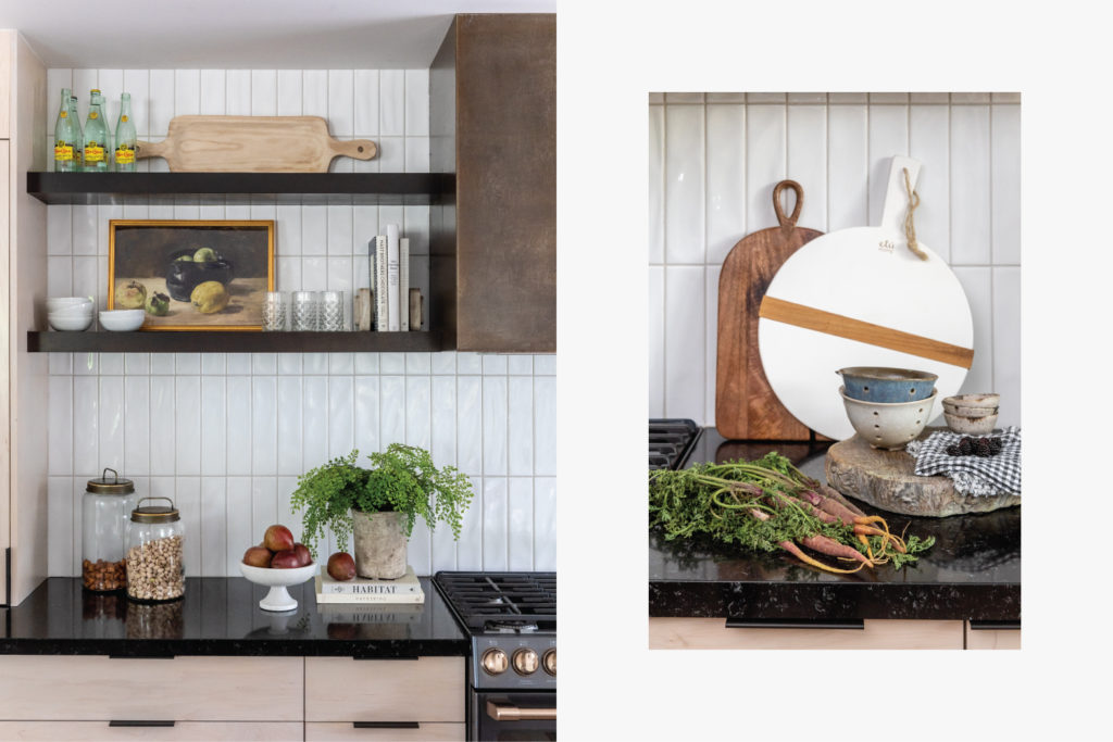
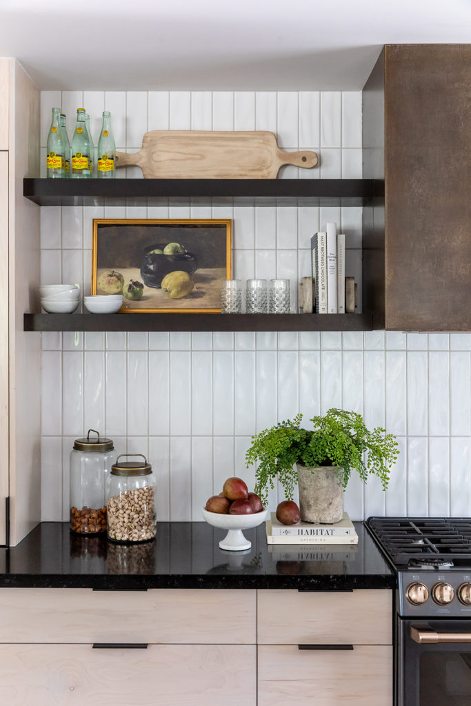
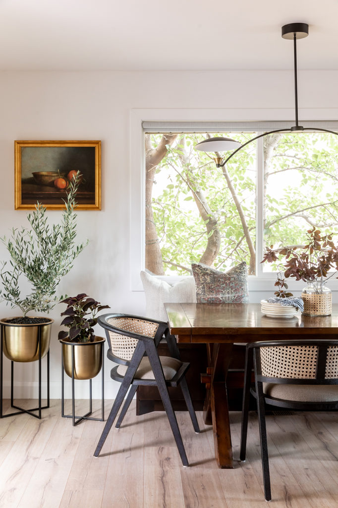
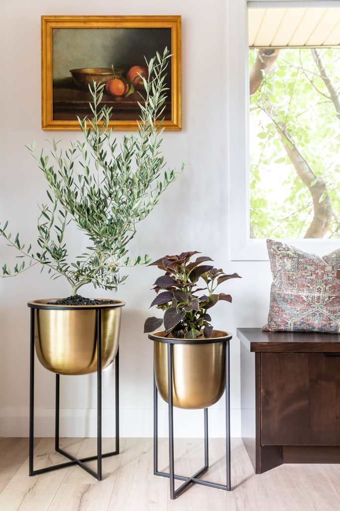
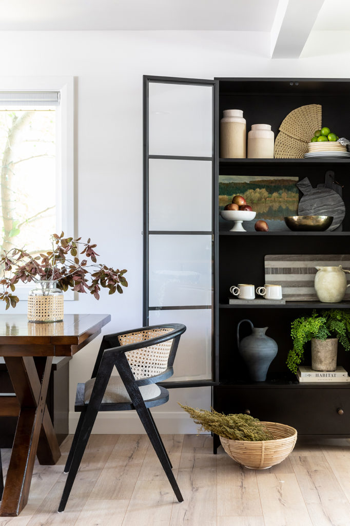
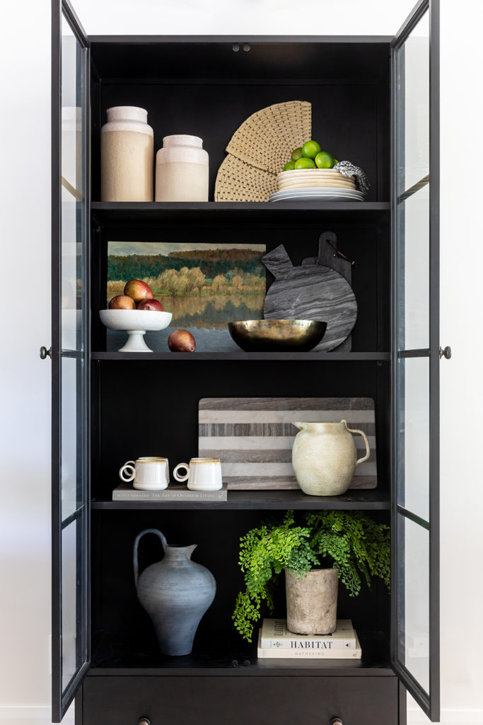
We wanted the styling in here to feel warm, welcoming, and curated. This fruit still-life had all the right colors for a compelling, warm focal point. The tones are earthy, organic, and neutral to go along with the vibe of the kitchen styling.
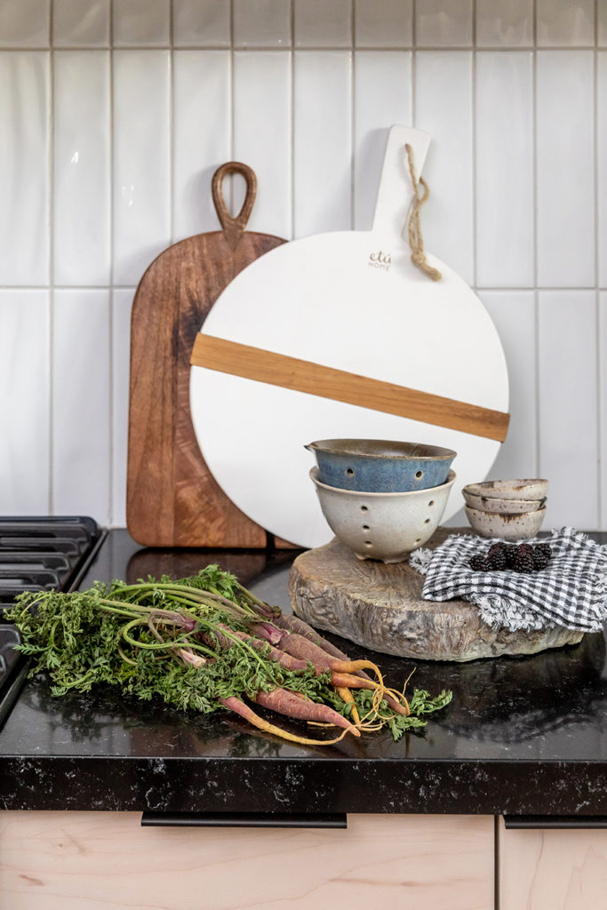
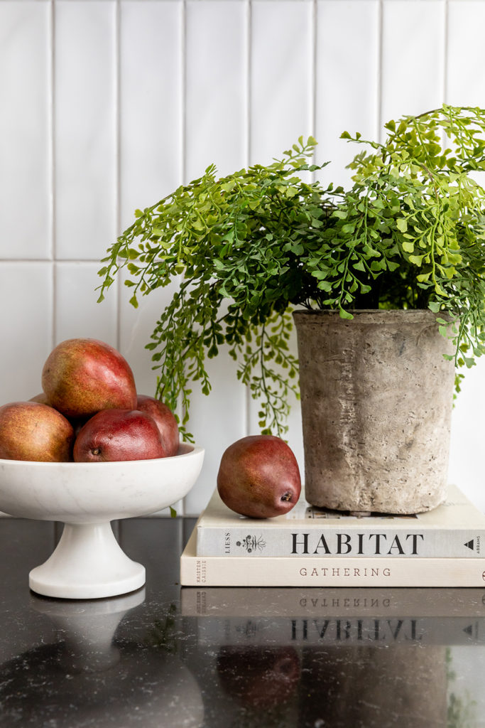
We accessorized with functional items our clients may reach for like grains, fruit bowls, cutting boards, grey-ribbed tea towels, and cookbooks. We added bottles and these perfect hobnob glasses for vintage flair.
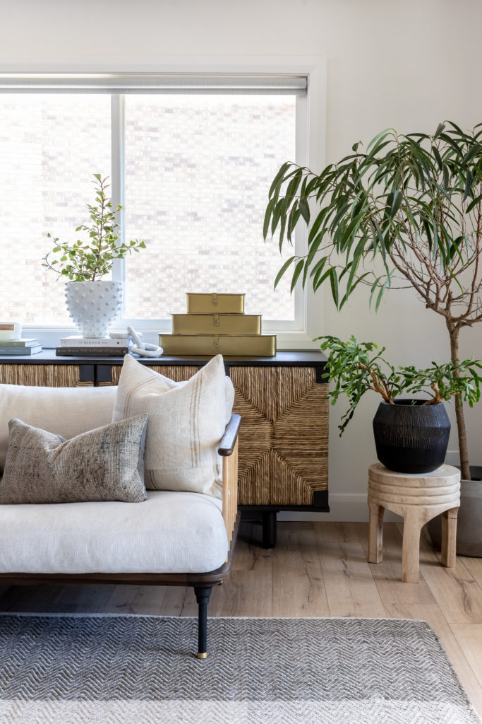
Isn’t that low-profile wood-look pedestal adorable? We love bringing in touches of nature in with charming accent pieces like this.

When we designed the island, we decided on a gorgeous dark-stained wood as a nod to the dark exterior colors. We love the durability of a wood stain. It ages so nicely and won’t need touchups or be prone to peeling or chipping like paint.
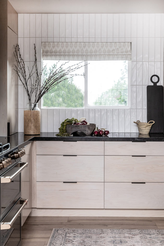
We paired the island wood panels with black countertops and black plumbing fixtures. Black fixtures were a unique choice, but here it blends in with the countertops so beautifully. It looked mature, dynamic, and intentional. What a transformation!
We replaced our client’s old counter stools with these clean, matte black barstools and styled the counters very minimally. This cane-wrapped vase brought in more natural elements traditional to the mid-century aesthetic. The light color is a stunning contrast to the darker features in the space.
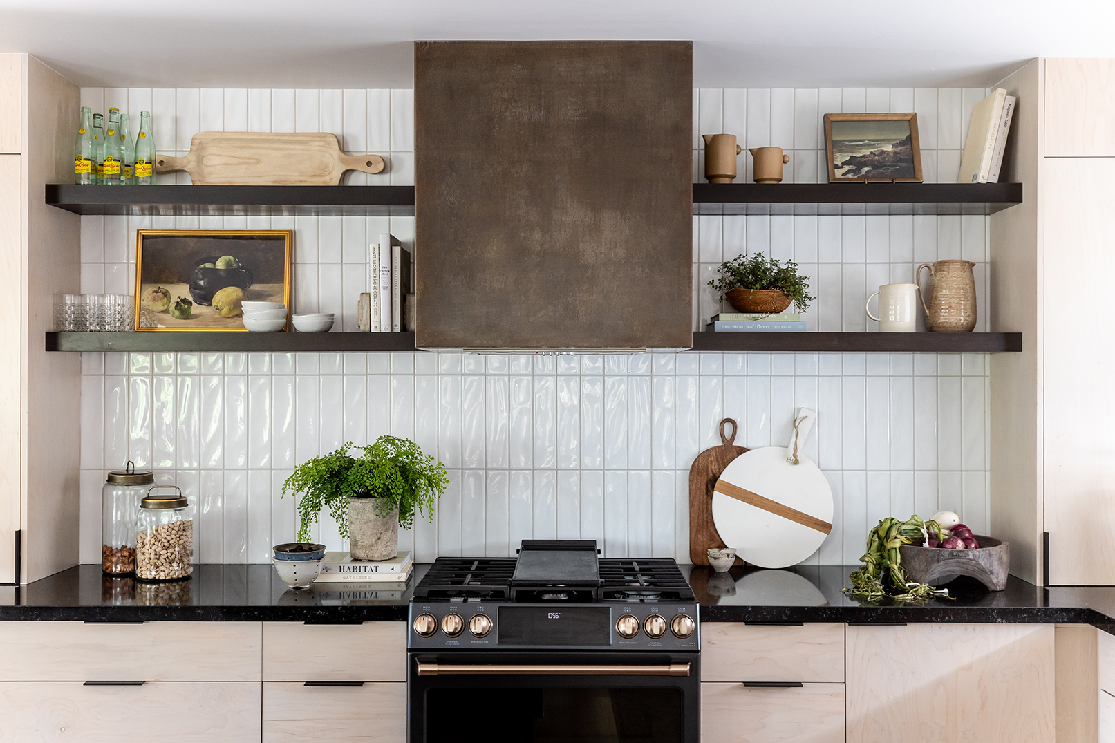
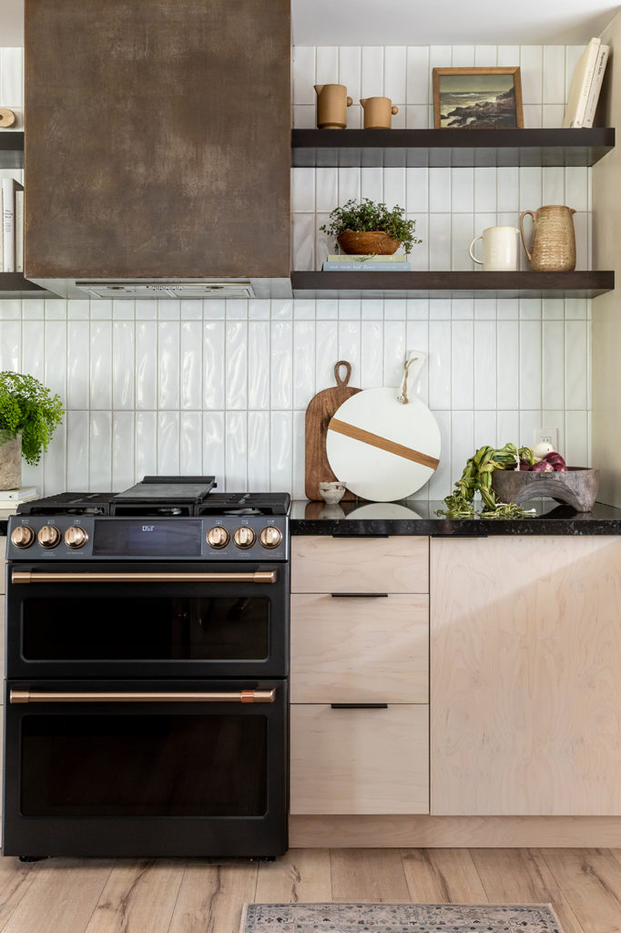
Usually, we would add feature lighting over the top of the kitchen island, but here we decided to draw attention this gorgeously-crafted, custom aged-metal range hood. We worked with Snell Welding on this project and they knocked it out of the park. It looks amazing with the GE Café stove, which is one of our favorite parts of this remodel.
The colors of the Café line by GE have dark shades to tie in the depth of the island, and they come with customizable handle options! We wanted to bring in more metallic elements, and the handles were the perfect small-scale way to do this.
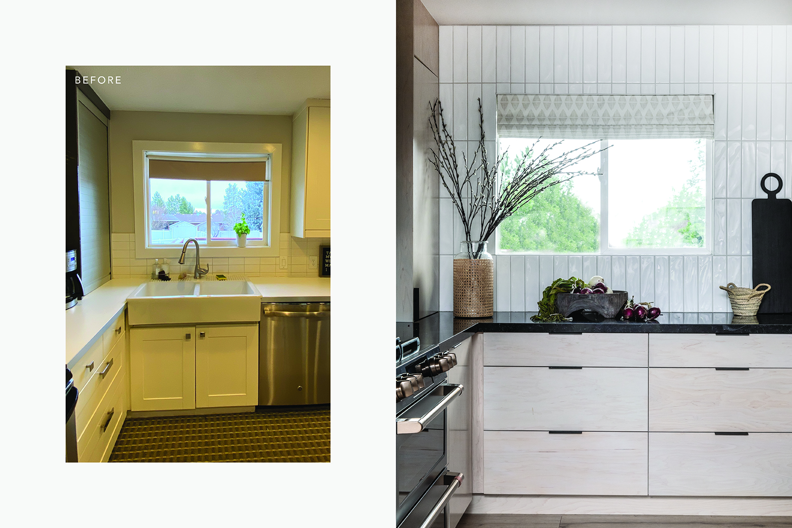
We thought this cool, modern wave tile on the backsplash would bring in a modern feel. The backsplash wraps around the wall and continues up to frame out the kitchen window, adding extra light and subtle texture to the space. We replaced the blinds with a lightly textured Roman shade from Uptown Drapes. When our clients walk up their stairs in the morning, they’ll be greeted with light streaming in from this cute window framed with pretty tile.
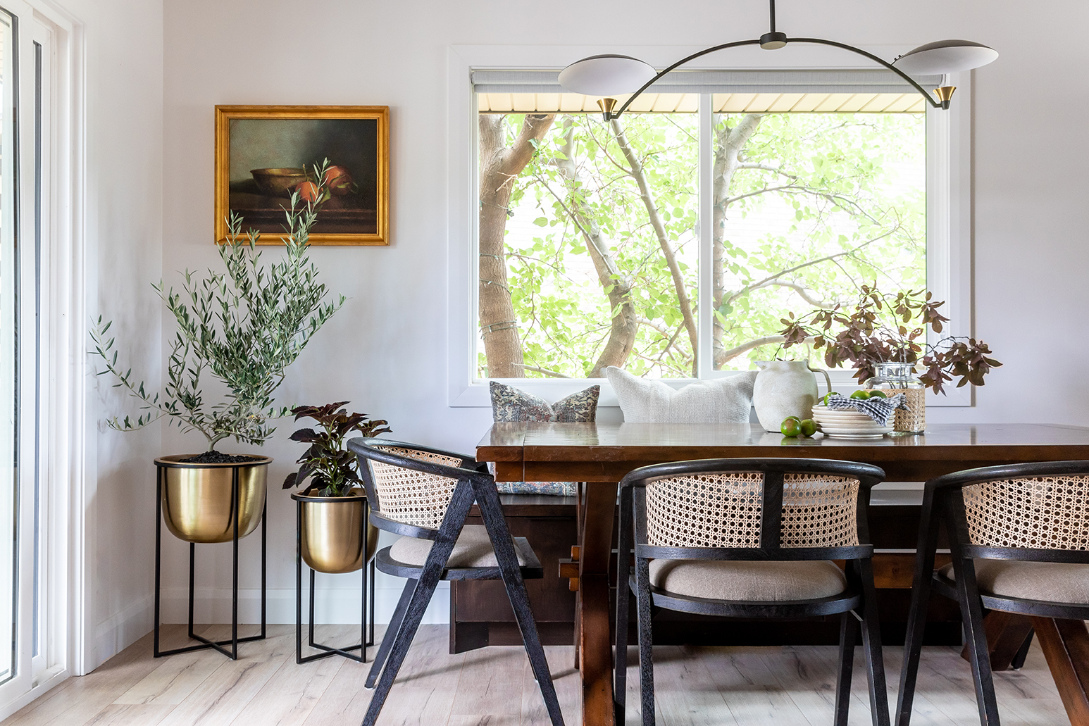
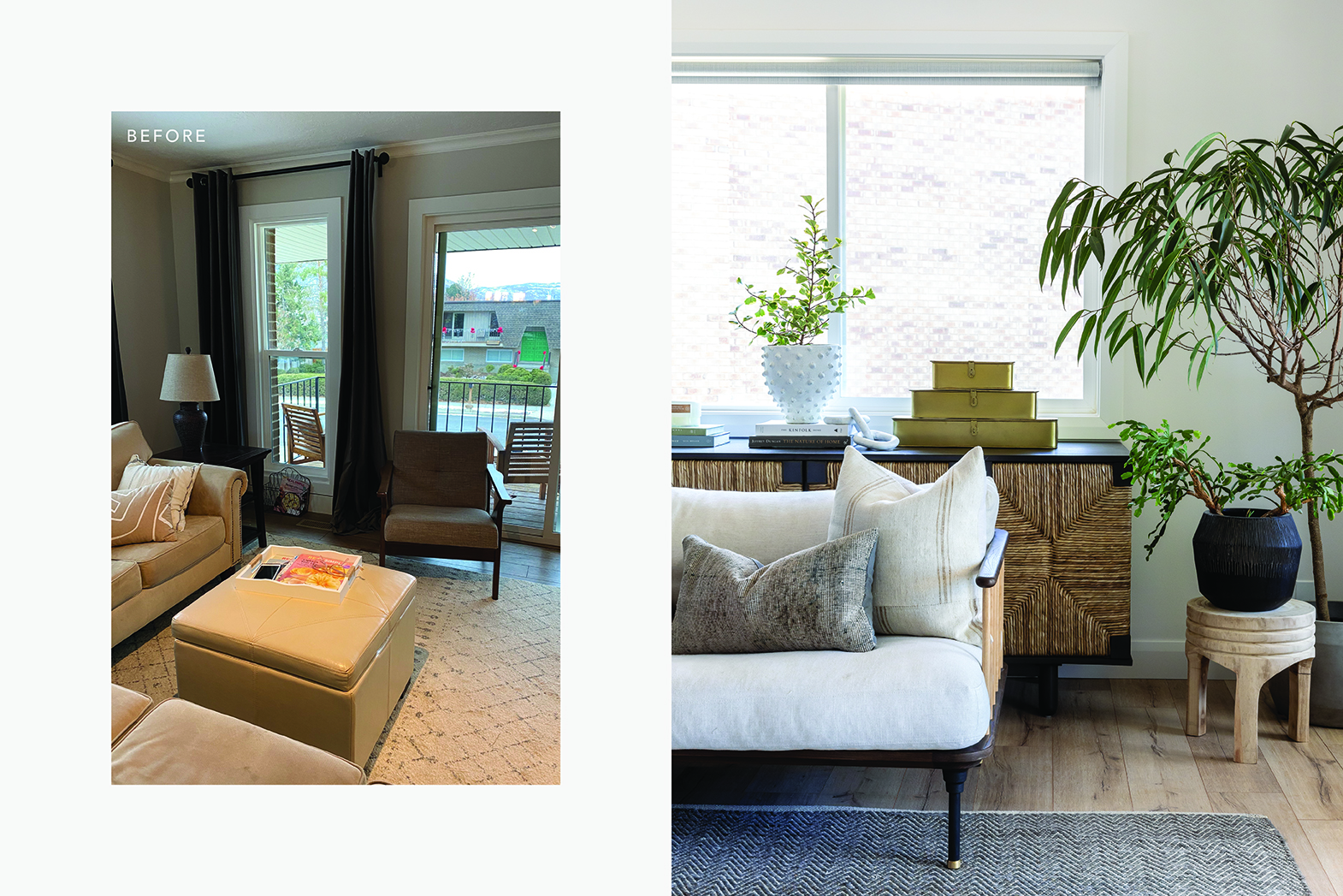
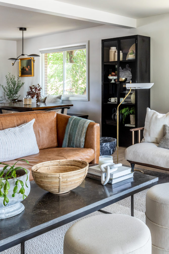
We’re really thrilled with how beautiful this whole project turned out. The kitchen now flows seamlessly into the upscale dining and living room areas, and our clients enjoy more storage and space to spend time with loved ones. While this remodel was a big undertaking with Covid delays and custom elements, the result was worth the wait. View the full photoshoot below!
