A small space gets some big and impactful updates.
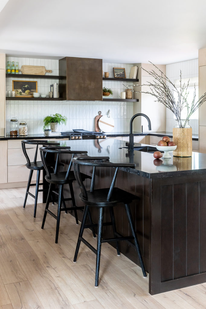
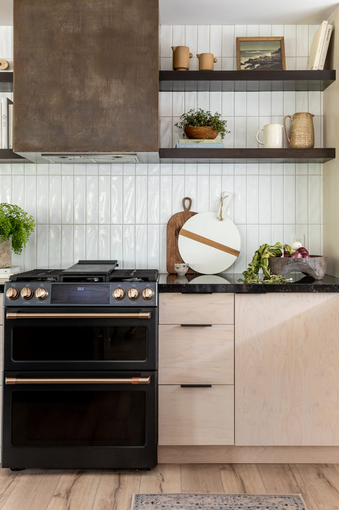
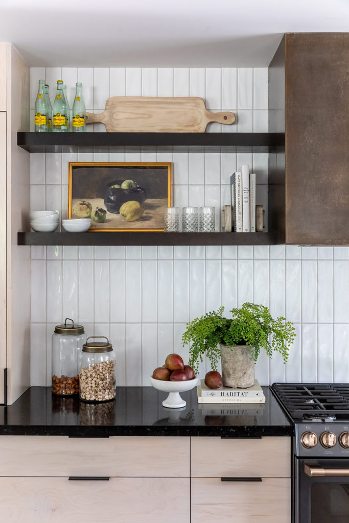
We’re back for Part 2 of the Midcentury Remodel project! In case you missed it, check out their stunning kitchen reveal and see where we started with this design.
Our clients wanted their home to be a better fit for their current lifestyle. Their kids have all moved out and it was finally time for them to have a well-designed space that felt mature, warm, and welcoming.
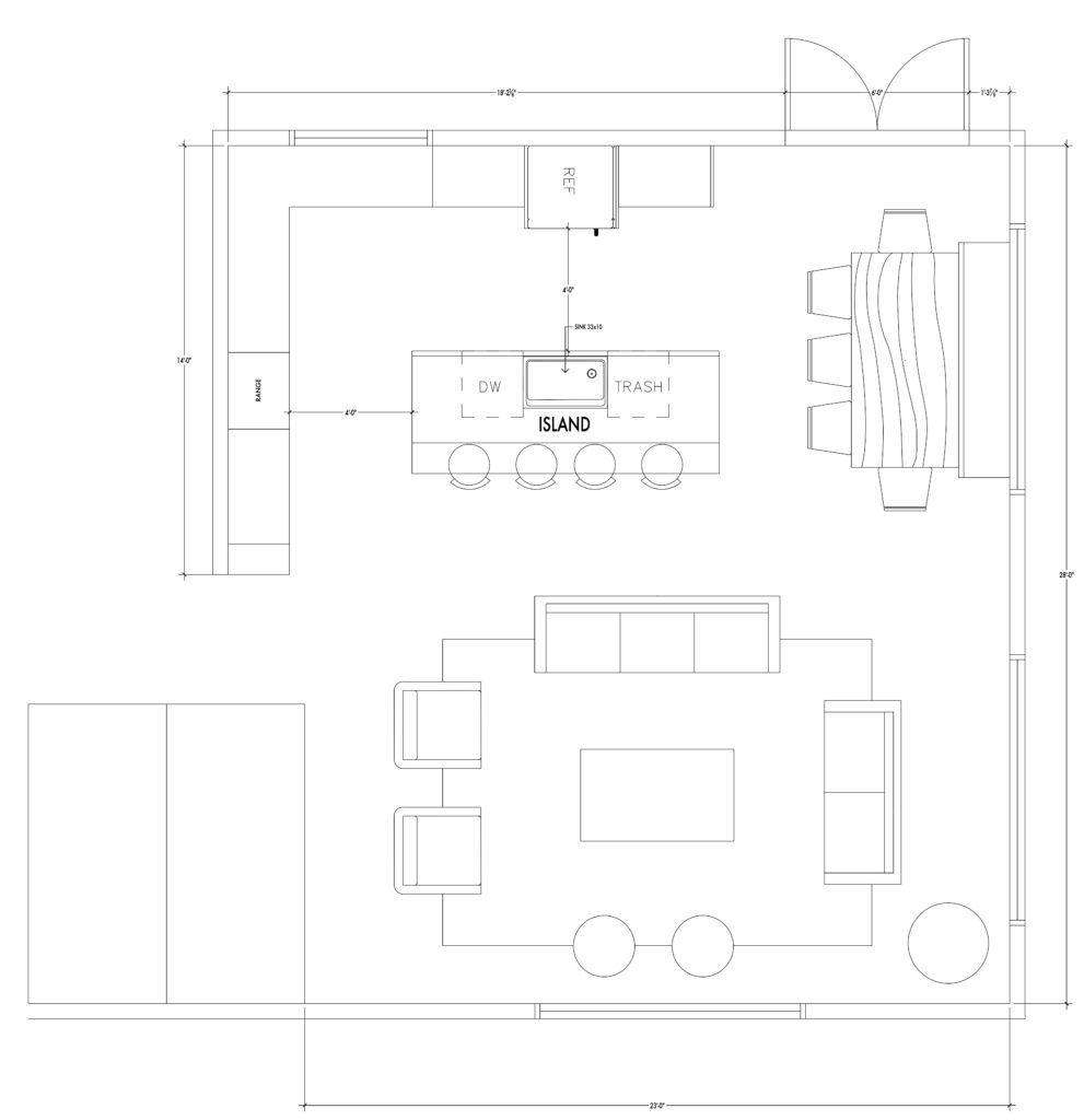
Overall it was a nice space, it just wasn’t functioning well and there wasn’t a good flow. It felt crowded and spaces were blocked off with too many barriers. We took down a wall near the entryway and another half wall to move the exterior door. This allowed us to create one large room with spaces that still function well separately.
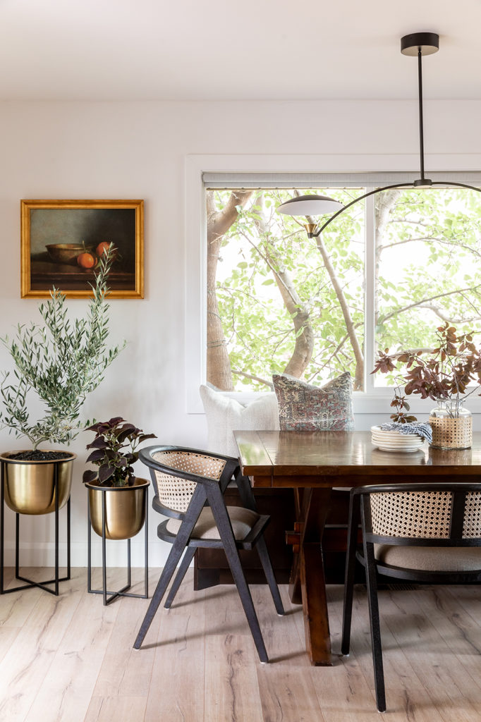
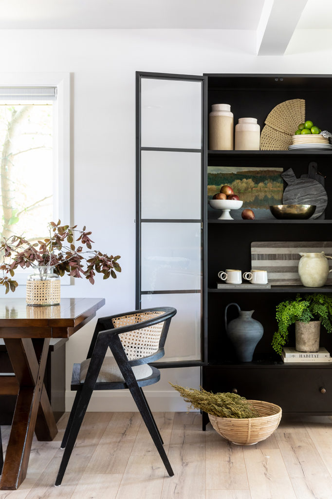
Adjacent to the kitchen we designed a sophisticated but inviting dining room. The clients wanted to keep their existing dining table and it worked perfectly in this space.
Heather Ford, the head designer on this project, selected these dining chairs to complement the table. We love the organic shape and how they bring in another element of wood with the cane webbing. This makes the space feel cohesive and ties into the warmth of the kitchen. The chairs are upholstered for comfort and the caned back is a nod to midcentury design.
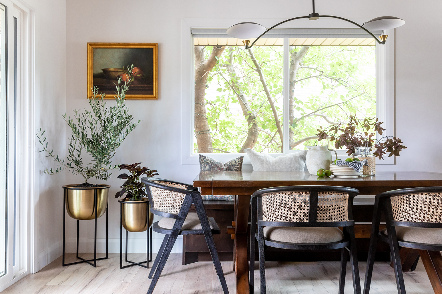
This custom bench seat for the dining table fits perfectly under the window and allowed for a little extra storage without compromising on seating space. By matching the bench color to the island, we were able to bring a hint of the kitchen back into the connect dining area.
The light fixture above the dining table was selected by the client and is the perfect focal point. She asked the House of Jade team if it would work well in the design and we loved it!
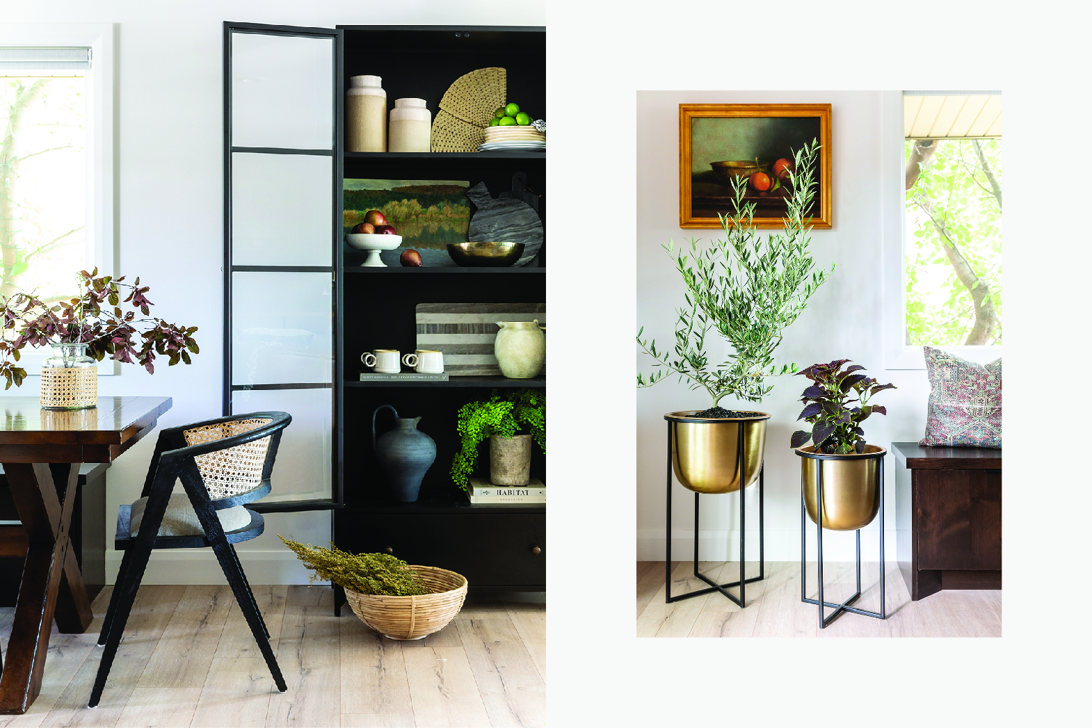
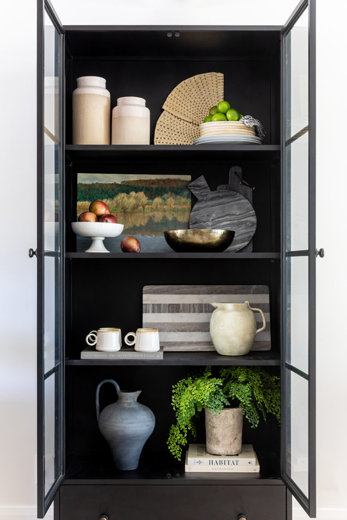
To give the client some functionality, we added a cabinet between the dining and living room. It works well to separate the spaces without crowding them and is a perfect spot to display some of their personal pieces.
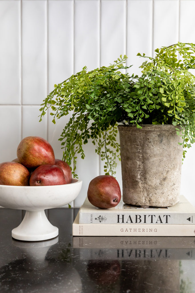
We added some organic shapes and natural finishes with the cream-colored jug, matte black vase, and a set of midcentury mugs. Styling with items like this curved marble cheeseboard elevates the space while mixing textures with cane bowls adds cozy warmth.
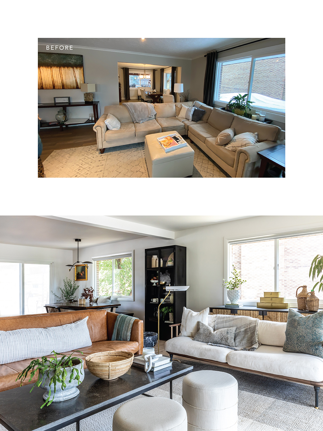
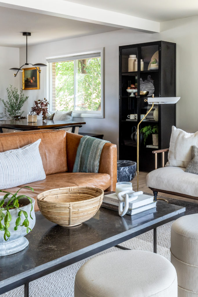
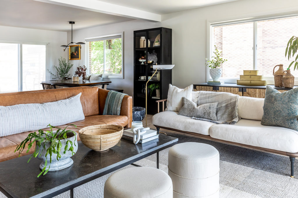
The final section of the space was the living room, which is the first thing you see when you walk through the front entry. We wanted a separate living area that still felt cohesive with the kitchen and dining room, so we continued the LVP floor throughout the entire space. It’s amazing how spacious this home feels with the wall between the kitchen and living room removed!
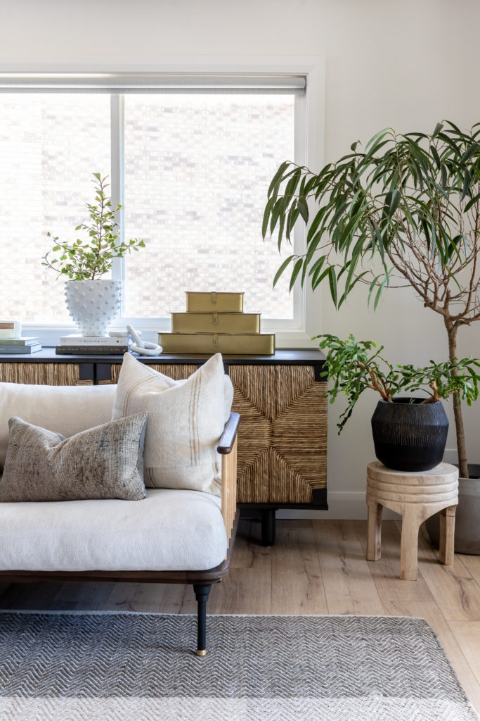
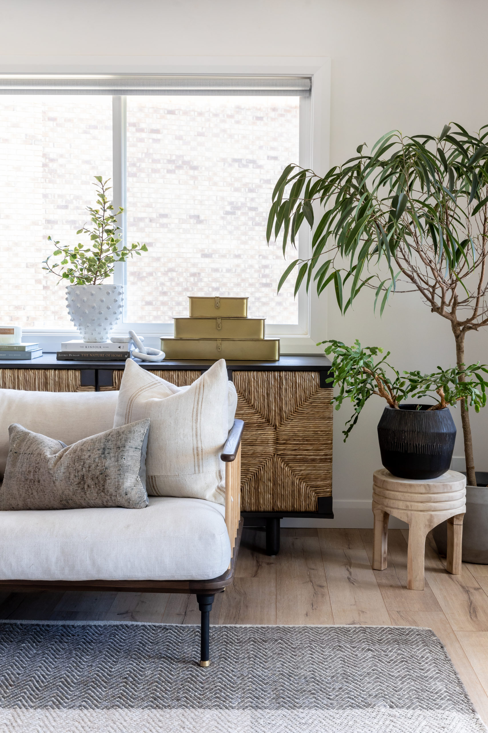
We swapped out the original heavy drapes and blinds for some simple, clean roller shades that don’t detract from the lighting and landscape. The client has several mature trees in their yard, so even though their home is in the suburbs it still feels very private.

We used a lot of layering on the sofa and in our display spaces for both coziness and warmth. Adding organic shapes and textures made the room feel natural and sophisticated, which is what the client really wanted for the space.
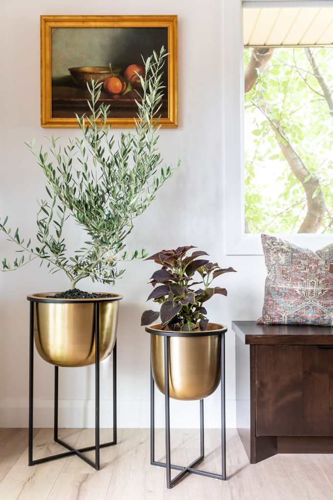
At House of Jade, we love using plants as a way to bring life into any room we design. Our client happens to be a gardener and had a few plants of his grandmother’s that he wanted to feature throughout the space. We’re thrilled that the heirloom plants complement the living room so beautifully!
This remodel was so fun for the House of Jade team. Our clients had lived in a space that didn’t feel like them for so long, so we were excited to bring them the changes they craved. View the full gallery of the finished renovation below!
