We’re so excited about the first reveal of the Devine Build! You might be familiar with the homeowners.. Brad & Hailey Devine!
Today we’re taking you inside to the first two spaces to the right and left of the entrance, the dining room and office! Want more Devine Build? Check out the Introduction to the Devine Build to get to know the project a little bit better.
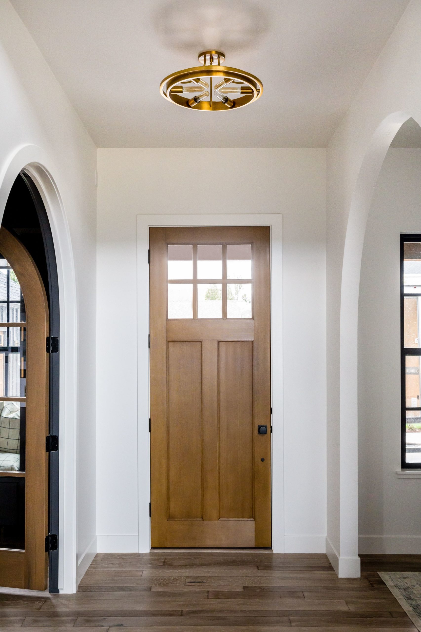
This dining room is a flex space between the mudroom hallway and the entryway. It needed to act as a flow space so we put a dining table down the middle to enable people to walk around all sides of the space. It’s a simple room but it’s made special with the details.
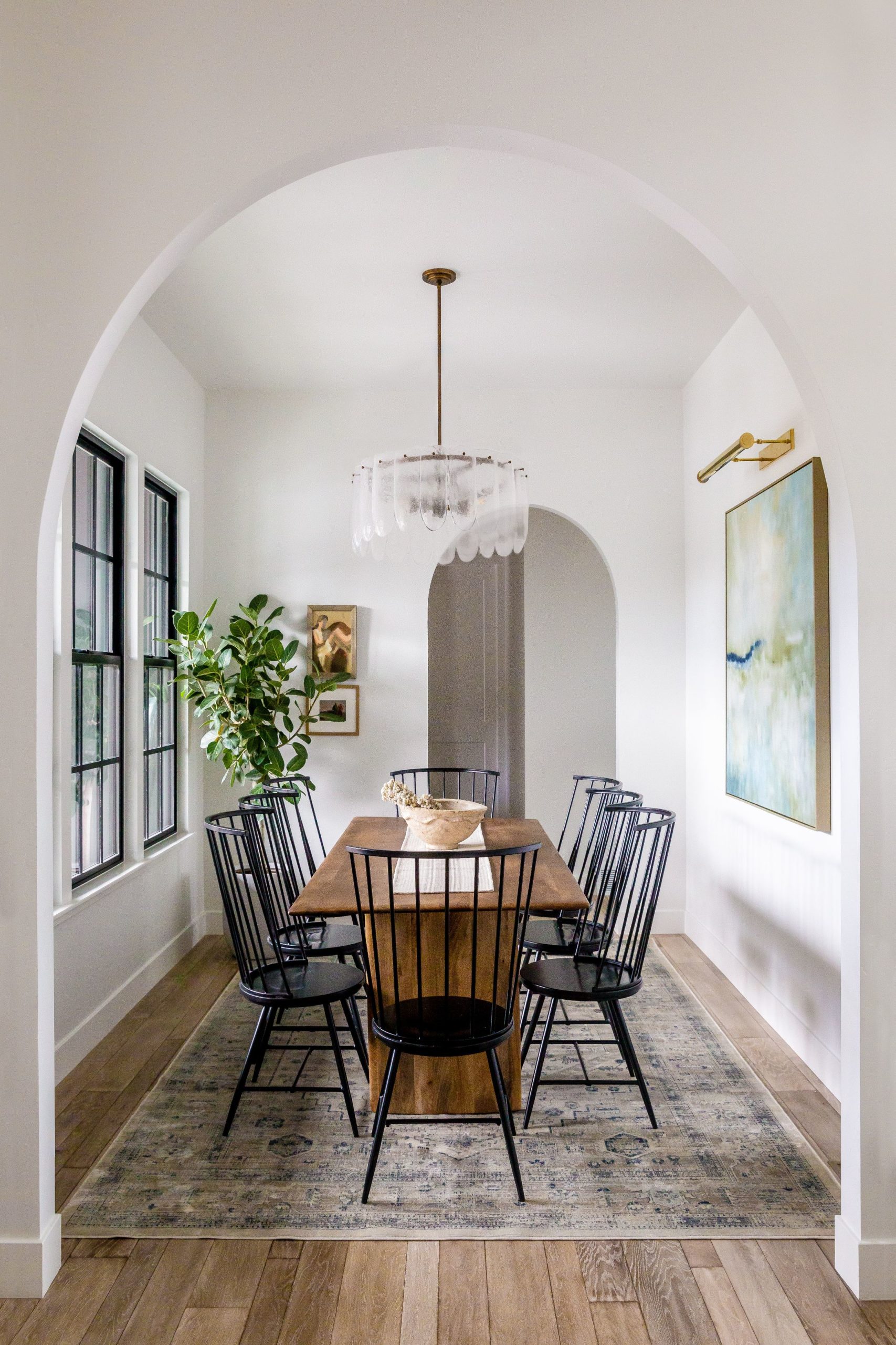
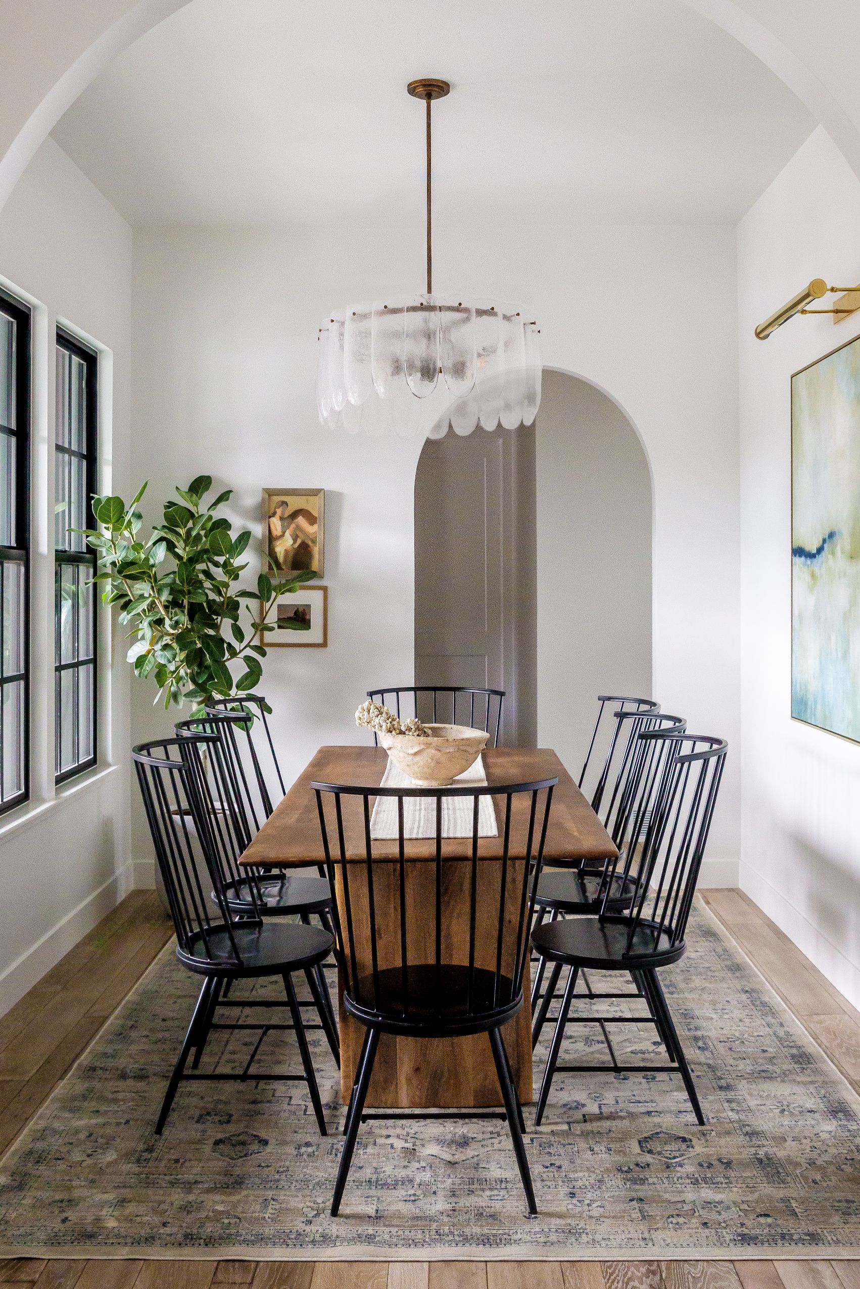
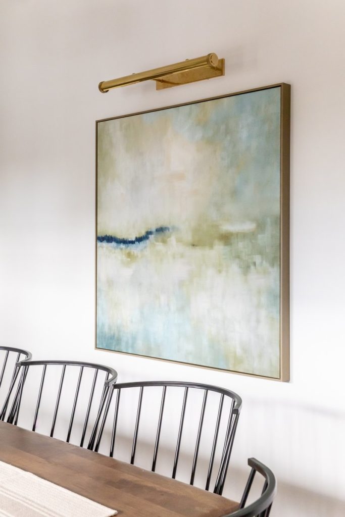
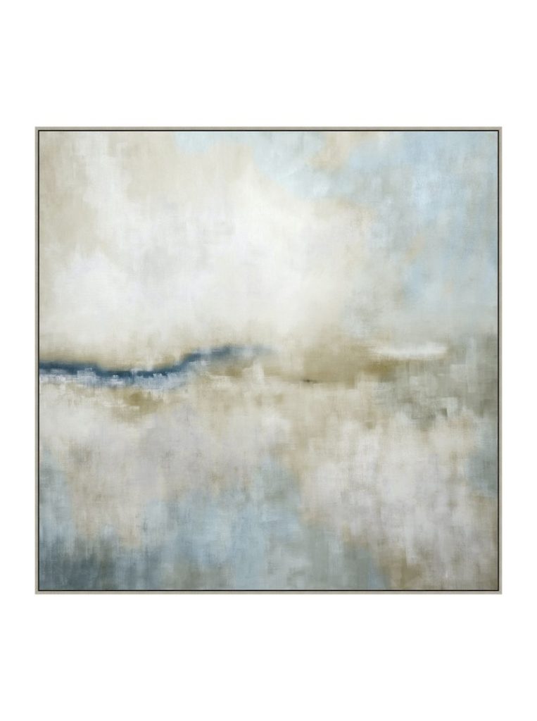
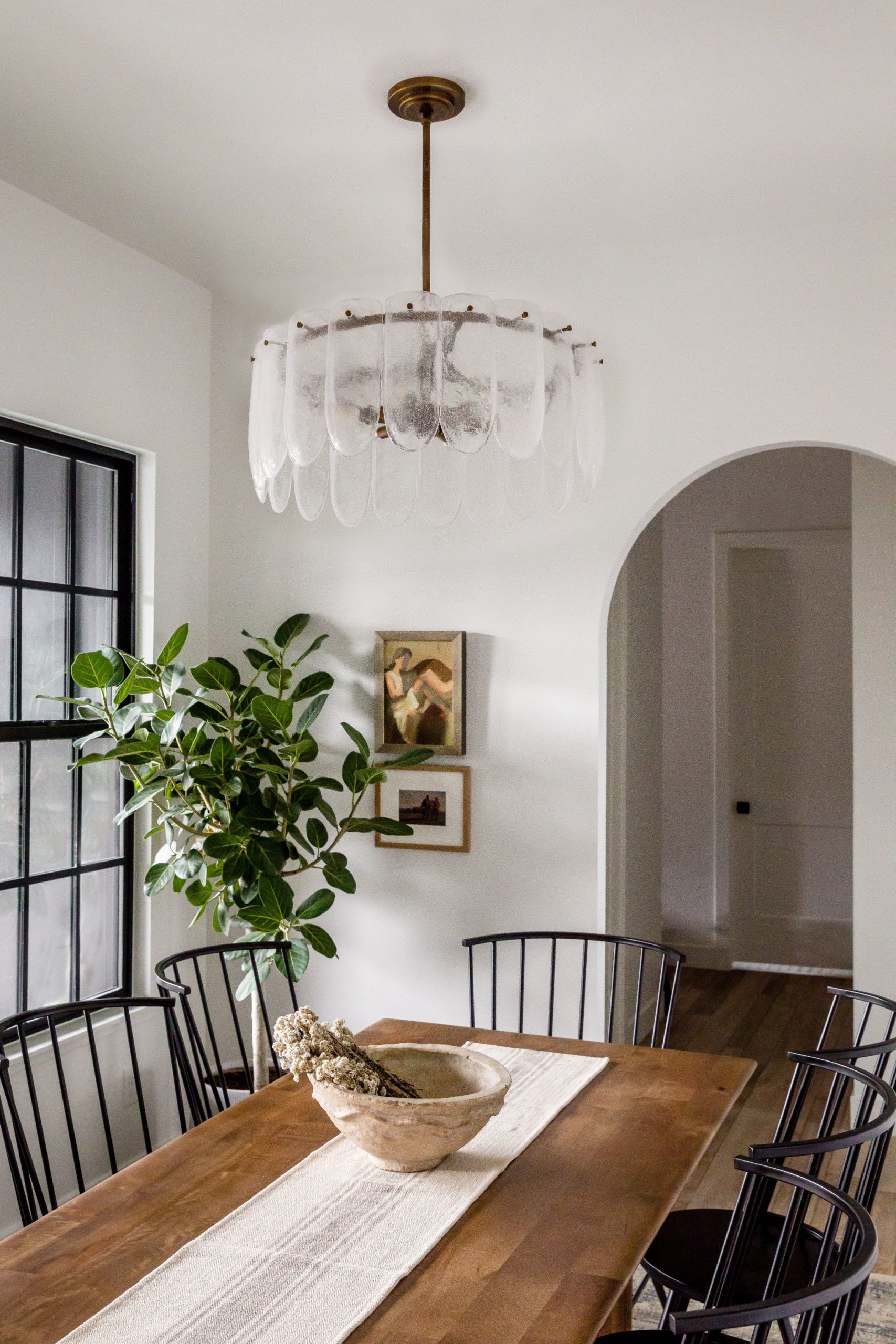
Hailey chose a beautiful and slightly feminine light fixture that contrasts perfectly with the adjacent dark office. We chose a large abstract in here to fill the blank wall and add a bolt of color.
Anytime we have an empty corner we love to add a tree! Greenery instantly inserts life into a room. Because this room has great natural light we knew the tree would be in good hands in this little corner. We don’t always do rugs under tables but this space called for a little pattern and softness underfoot. The Surrey Rug has a nice vintage tone making it feel like it’s been in their home for years.
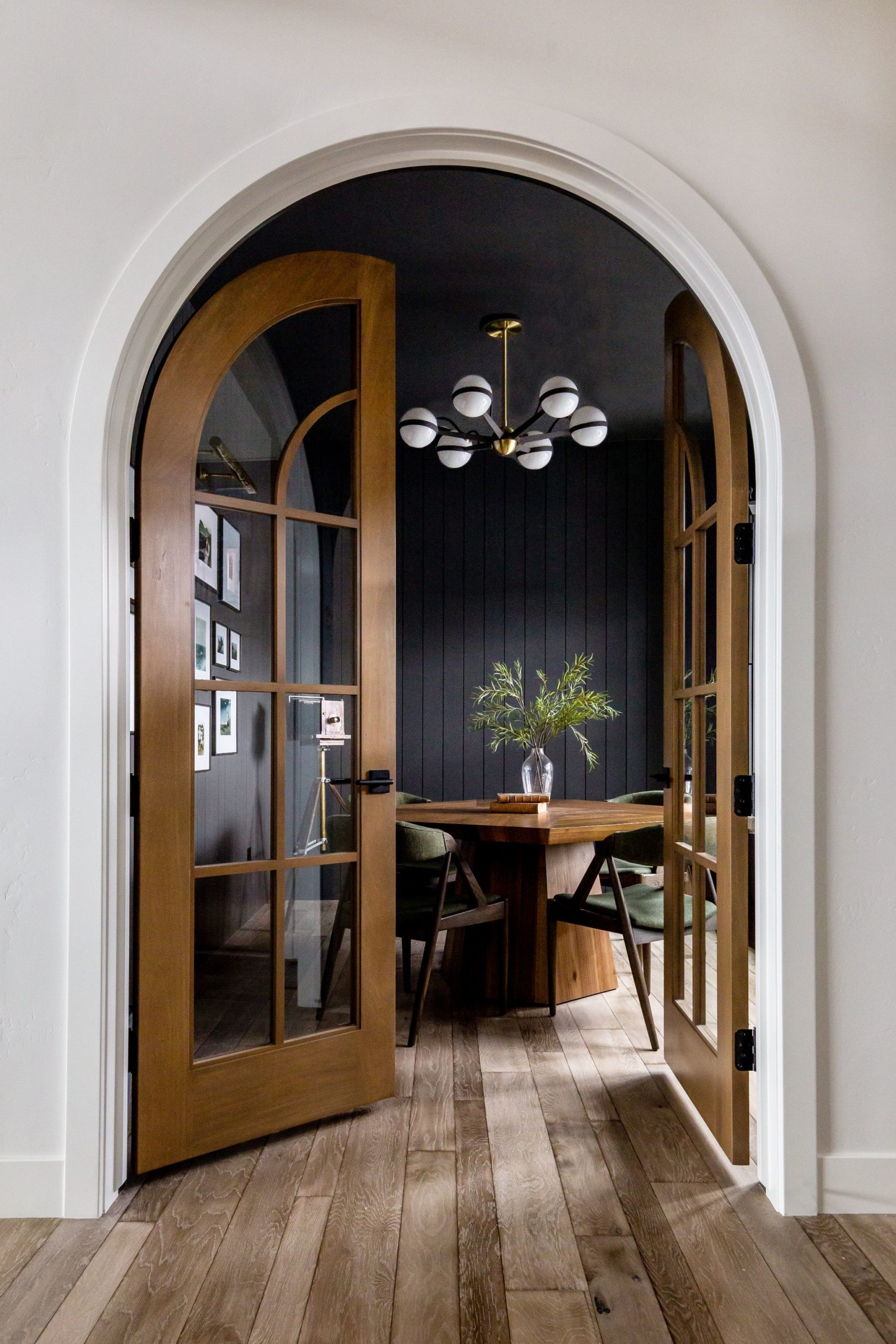
For the Devine’s office, it was all about the “vibe”. This space needed to be bold but also fit in with the cozy and calming vibe of the rest of the home. We played with dark tones and layered in wood, upholstery, greenery, and metallic finishes with the dark vertical shiplap. It’s not a huge space but it’s mega functional.
What we love VERY most about this office is the arched door opening. It’s EVERYTHING! The arches frame the entire room in a rich warmth with stained doors. Hailey went back and forth on having these doors be white or stained and we are so happy she ended up on stained because they are the most beautiful wood one against her white walls and dark office.
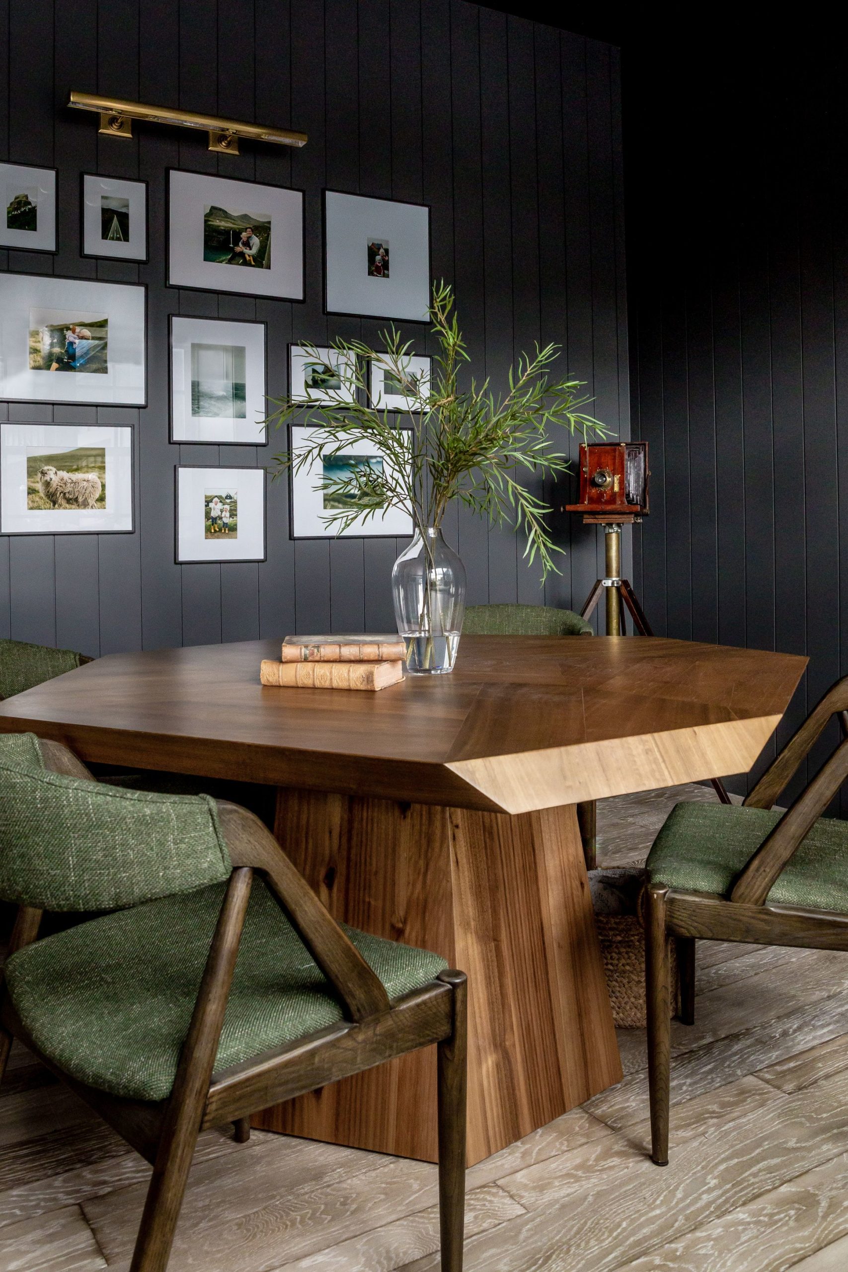
The window wall is packed with built-in storage and the round table enables anyone to pull up a seat to work. We have a large piece of art on the adjacent dining wall so we decided to mix it up with a gallery wall on the office wall. The gallery wall is full of pictures from their travels showcasing what their brand is really all about; family and adventure.
We did an upholstered seat on the chairs so that anyone could work for hours on end without being uncomfortable. The Oliver Dining Table has a funky geometric shape that makes it unlike anything else!
Stay tuned for more next week!
