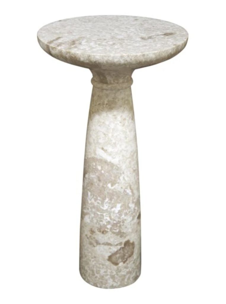
We’re back with the Devine Build! Last week we showed you the dining + office space, and this week we’re sharing the kitchen and living room.
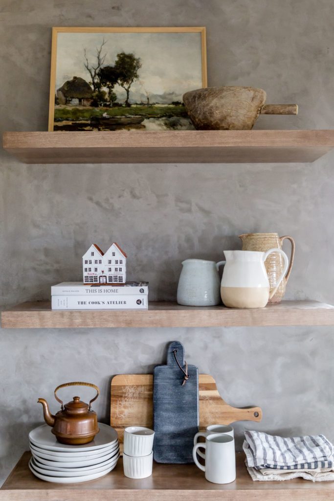
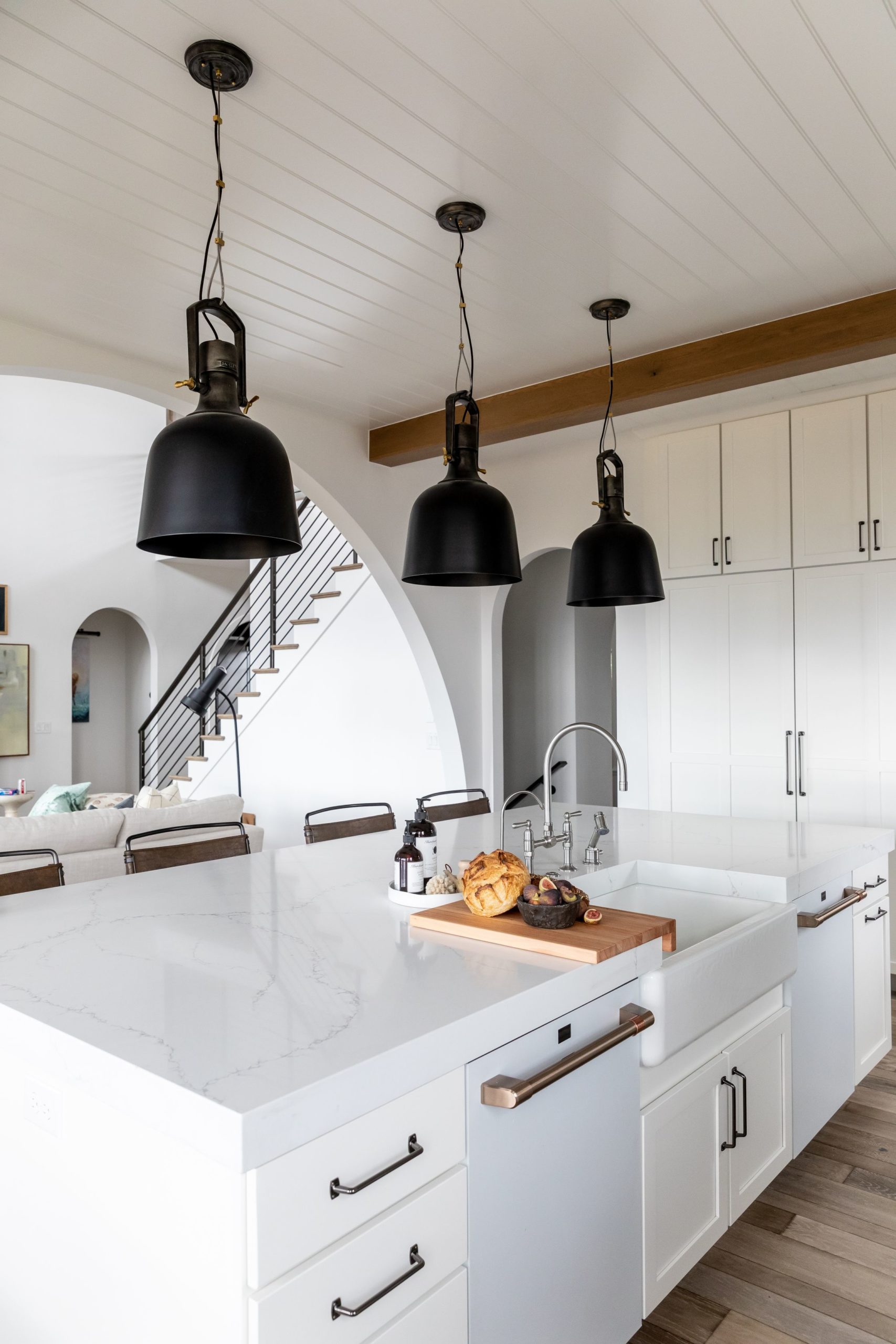
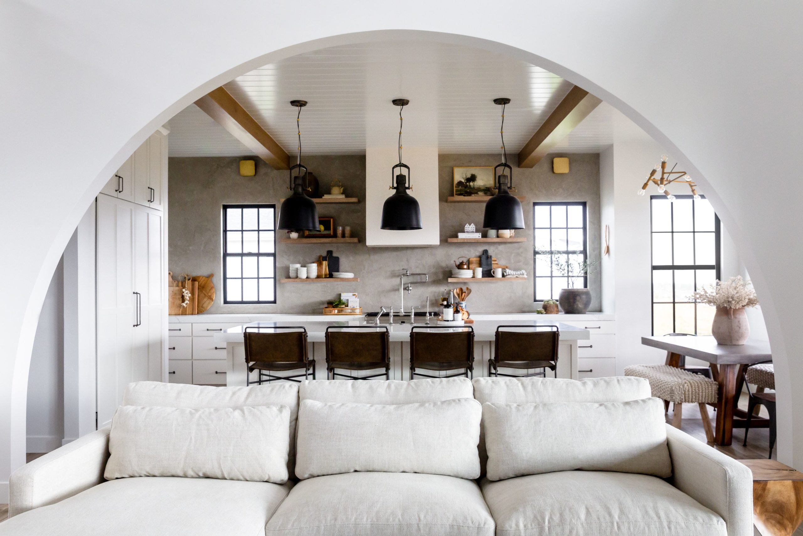
From the beginning, Hailey had a clear vision of the kitchen. She knew she wanted dark pendants, a cement backsplash, and white cabinetry to act as a neutral backdrop. We love the cement! It’s a backsplash that can do no wrong. It makes the wood shelves and collected accessories shine. We wanted the styling in here to feel very cozy, calming, and collected. The tones are earthy, organic, and neutral. We accessorized with things the devines could reach for on a daily basis like pitchers, cutting boards, plates, mugs and tea towels.
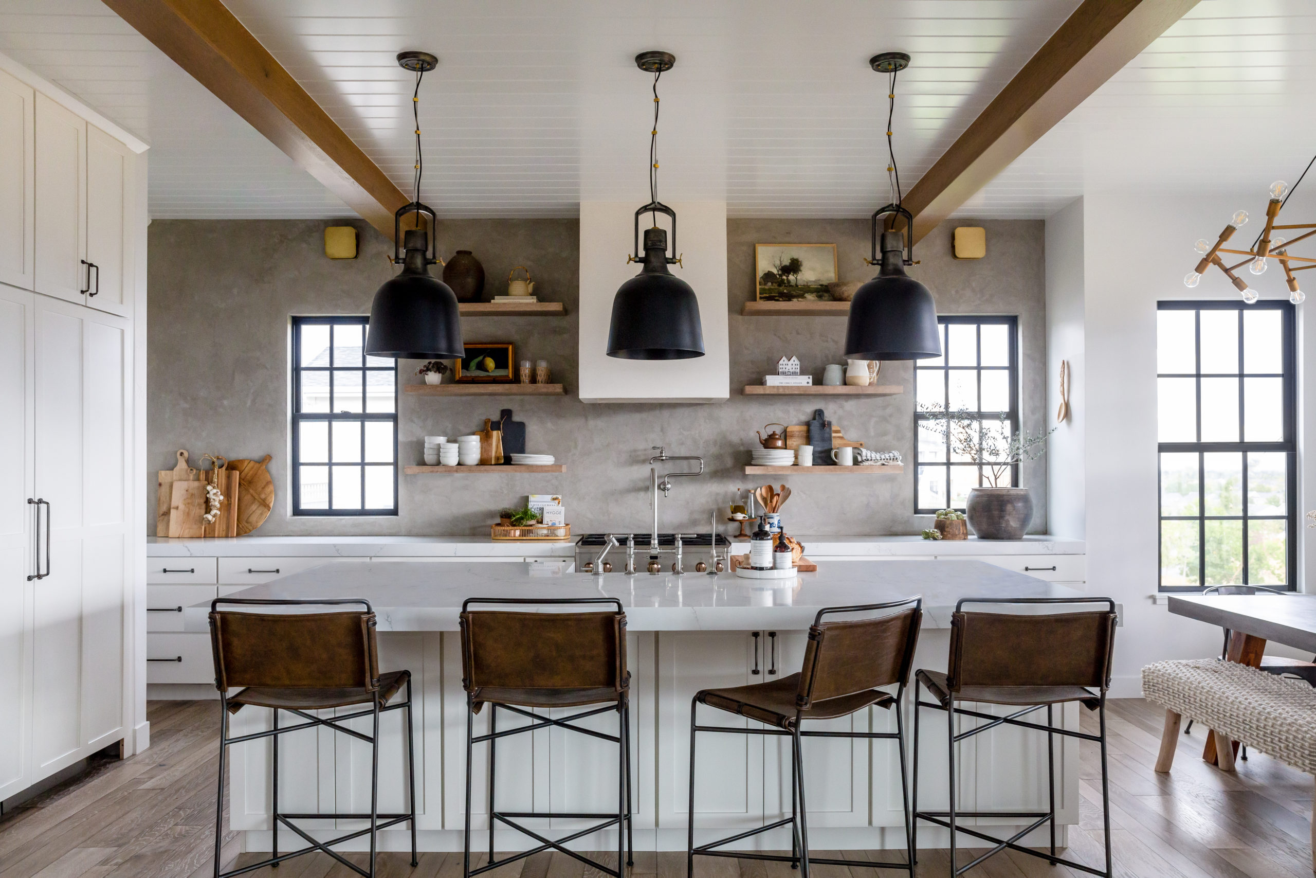
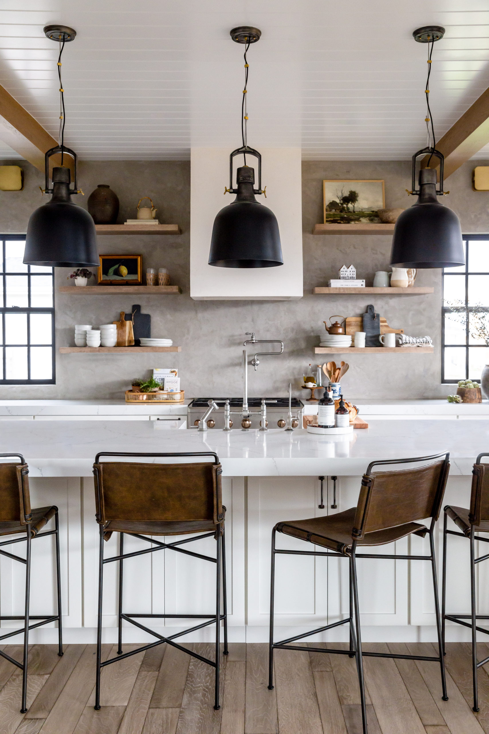
Using the Margot Counter Stool
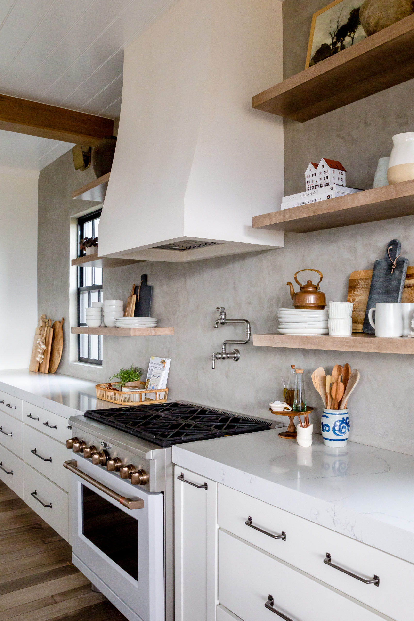
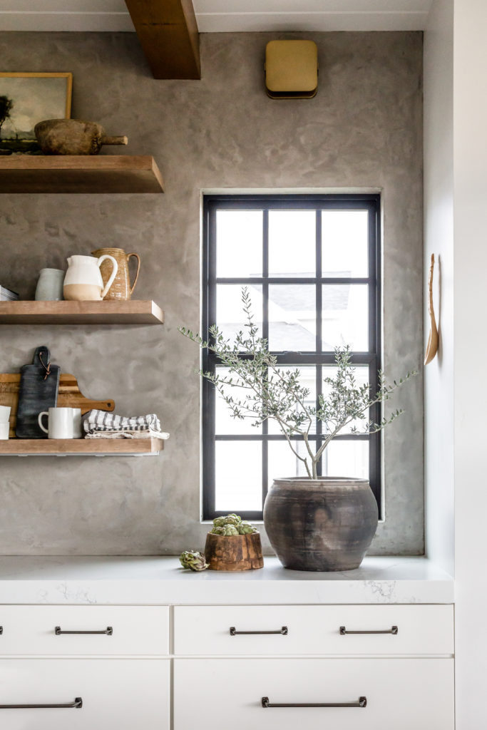
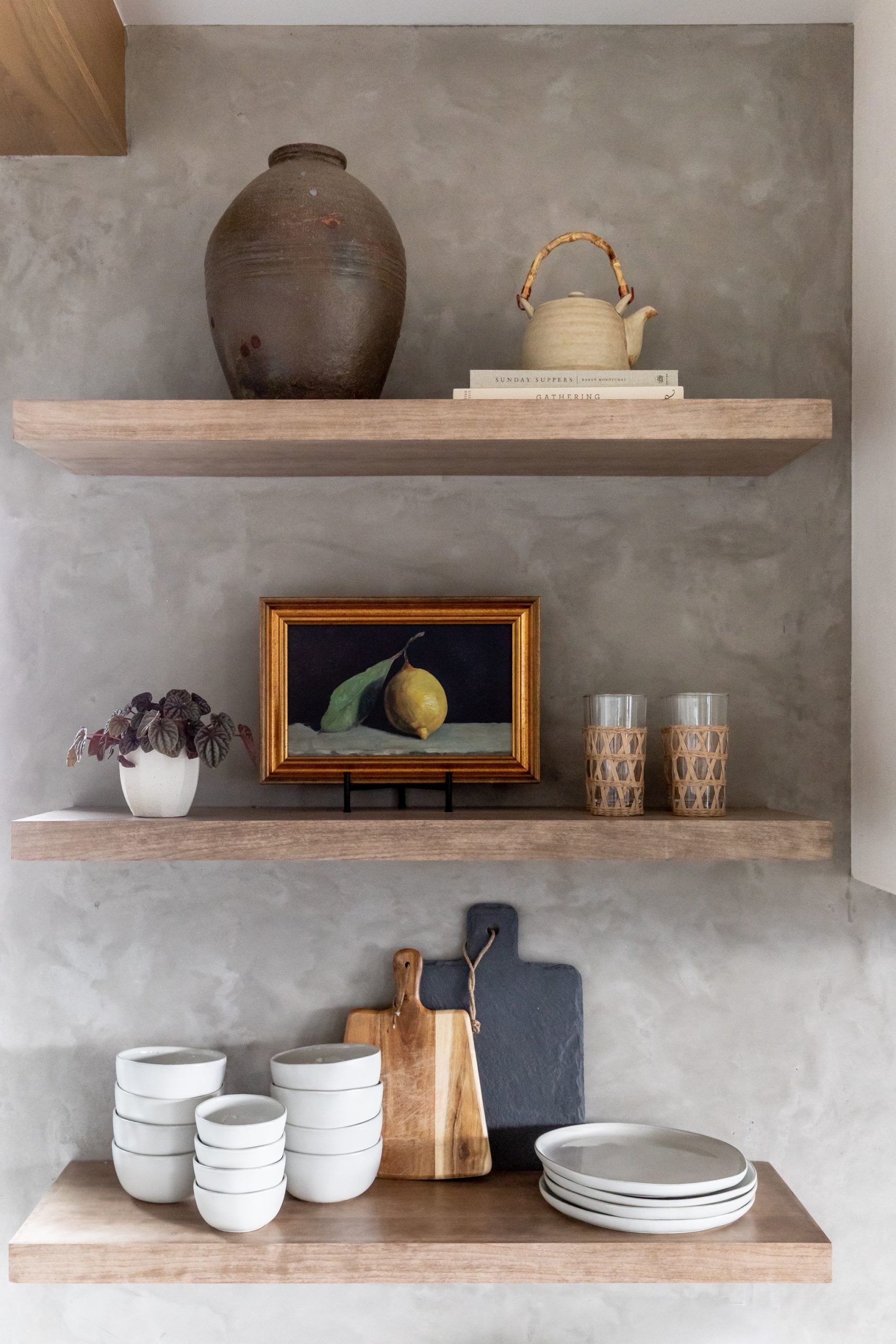
Nothing about this space feels over decorated but it does feel lived in and loved. There are even some personal mementos that the Devine’s wanted to incorporate like pottery their daughters made and some treasures from their travels. The leather barstools warm up the white and gray kitchen. We love how they mimic the leather from the family room. This home is all about TEXTURE!
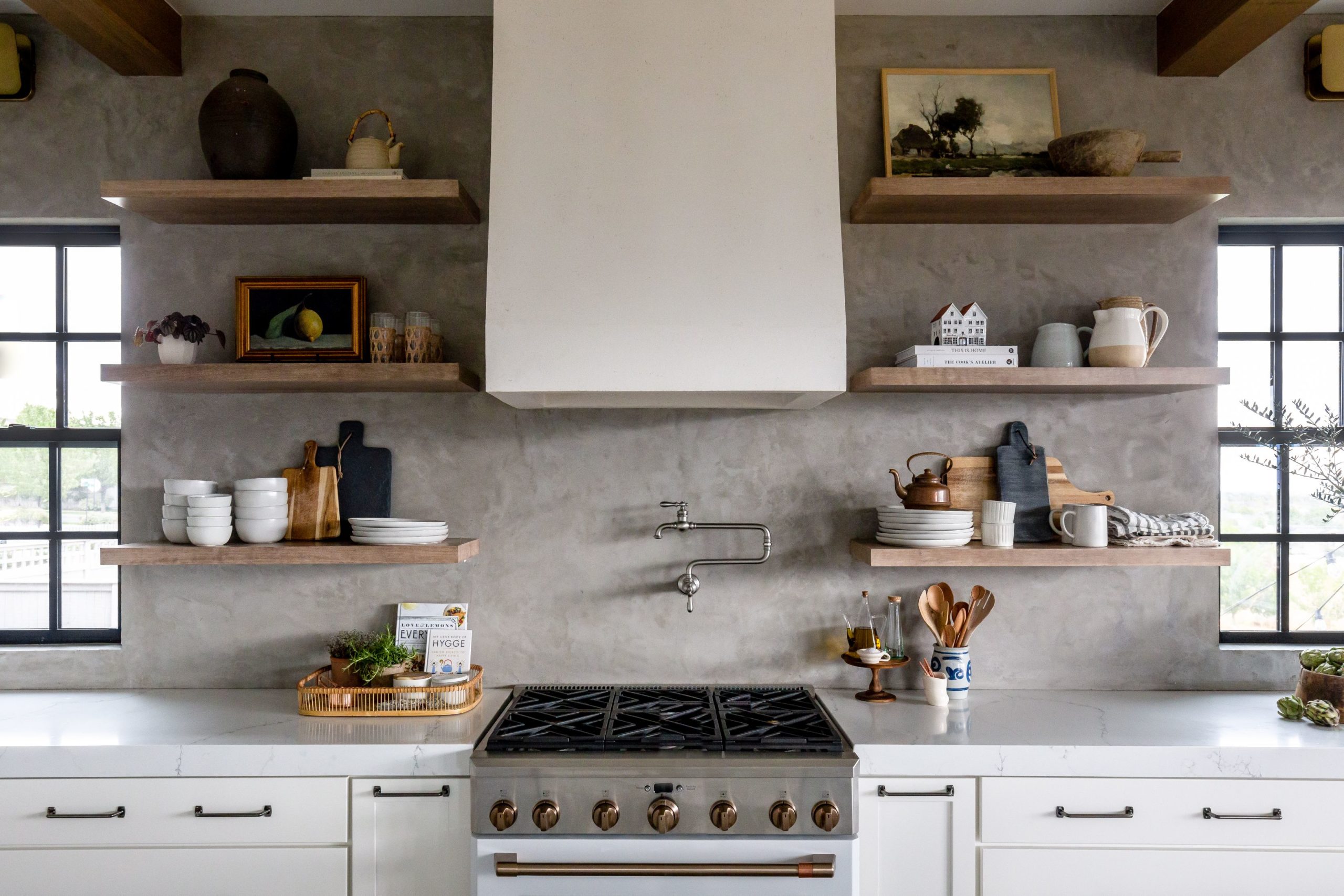
Shop the shelving: Nora Stoneware Teapot, Still Life: Lemon, Stonebridge Marble Cheese Board, Aslin Pitcher, Sophie Tray
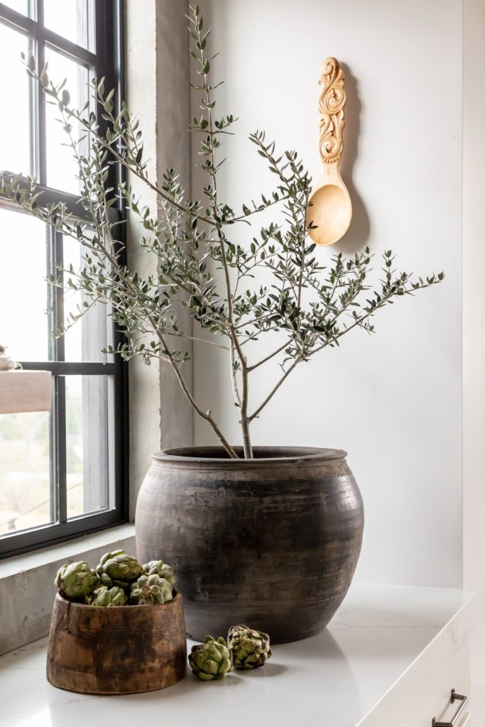
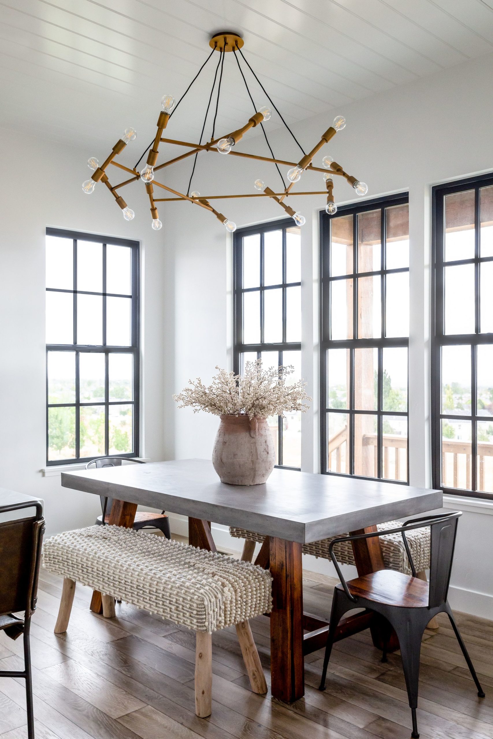
The nubby texture on the dining benches adds so much interest to the concrete tabletop and the terracotta pot is everything in this little nook.
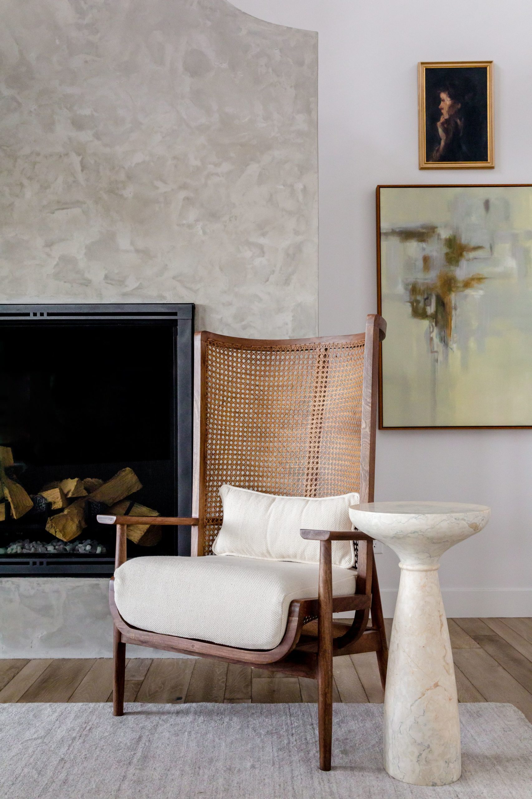
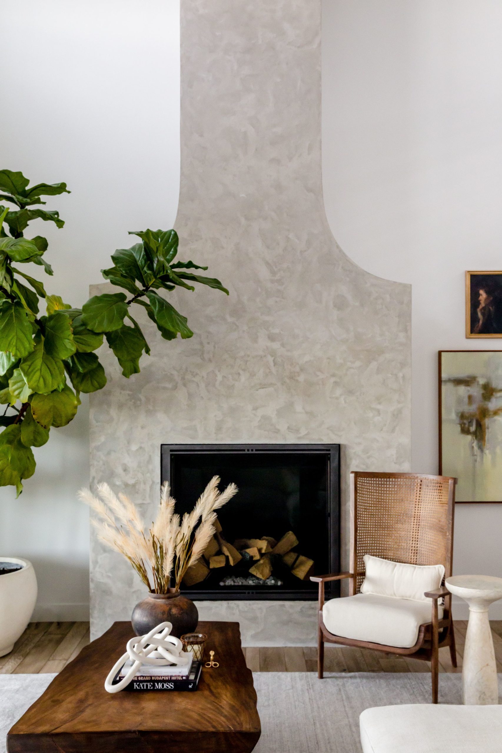
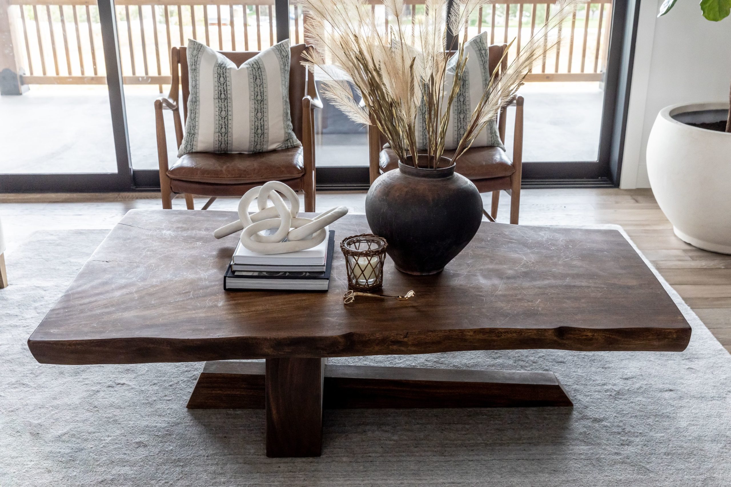
It was very important for us to get this family room right for the Devine’s. This is a space that you see right as you walk in, so it really sets the tone and vibe of the whole house. Our challenge in this room was to create a space that felt cozy and “hygge” even with the sweeping two-story ceilings. The fireplace is a concrete painted plaster so it can feel modern but also a bit cold. We counterbalanced that with lots of warm wood tones. The coffee table is a show stopper with its asymmetrical shape and live edge. The leather chairs bring in a warm texture that plays nicely with the linen sofa. The Devine’s wanted a very simple look so there are no built-ins or mantle on this large wall.
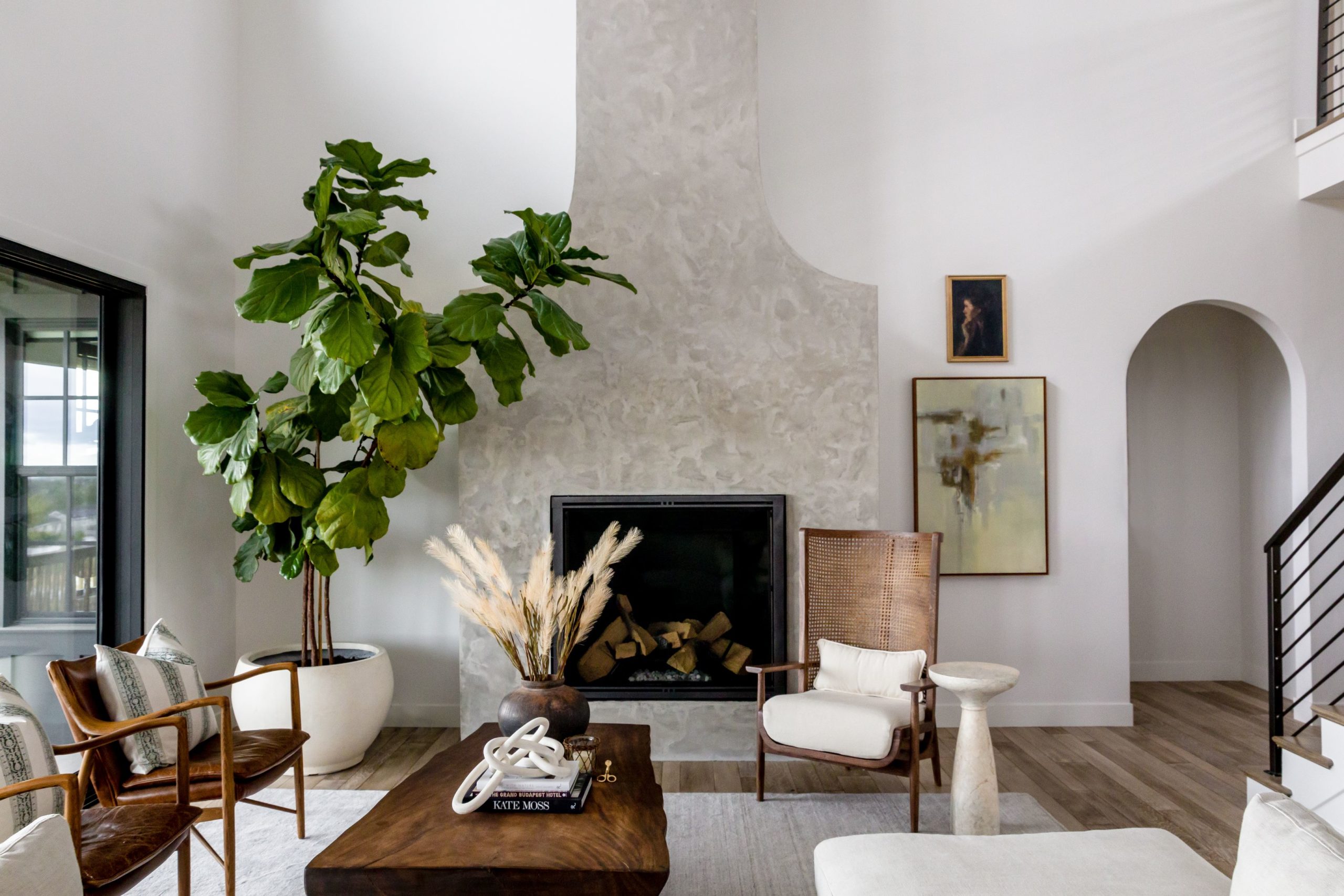
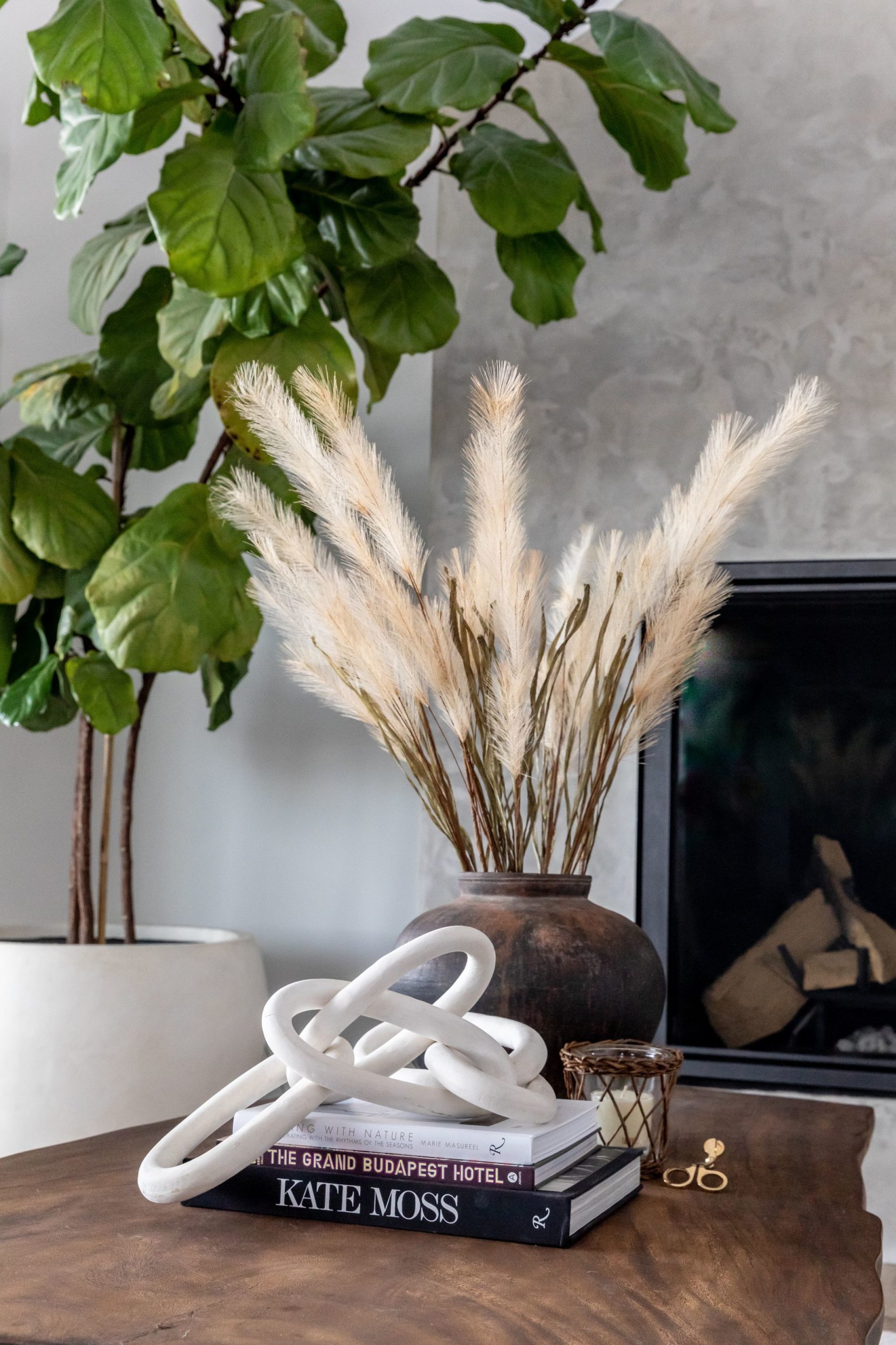
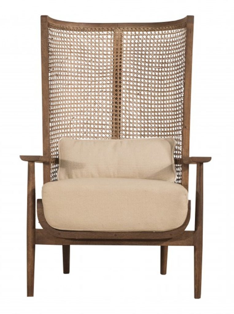
As designers, we are so used to bringing in lots and lots of accessories to flank a large fireplace so we had to think outside of the norm to make this wall feel “finished”: We chose an architecturally interesting chair that had a lot of dimension to it to sit on the right side and then we used a large, oversized fiddle fig on the other. the tree breathes life into the room making it feel less spacious and empty. The art that we layered on the right side adds so much color to the wall that you almost don’t’ miss all the little knick-knacks and accessories you would use to fill a shelf.
