We’re back with more Havencrest Remodel! Today we’re taking you through the kitchen, living room, laundry, and mudroom. Make sure you take a tour through part one to see the family room, office, and entry. This was a remodel, so we’ll be showing you the transformation photos. Stay tuned for a video with more!
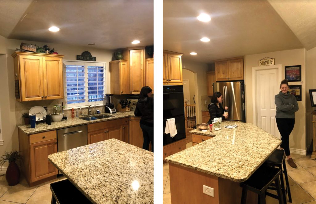
KITCHEN: BEFORE
KITCHEN: AFTER
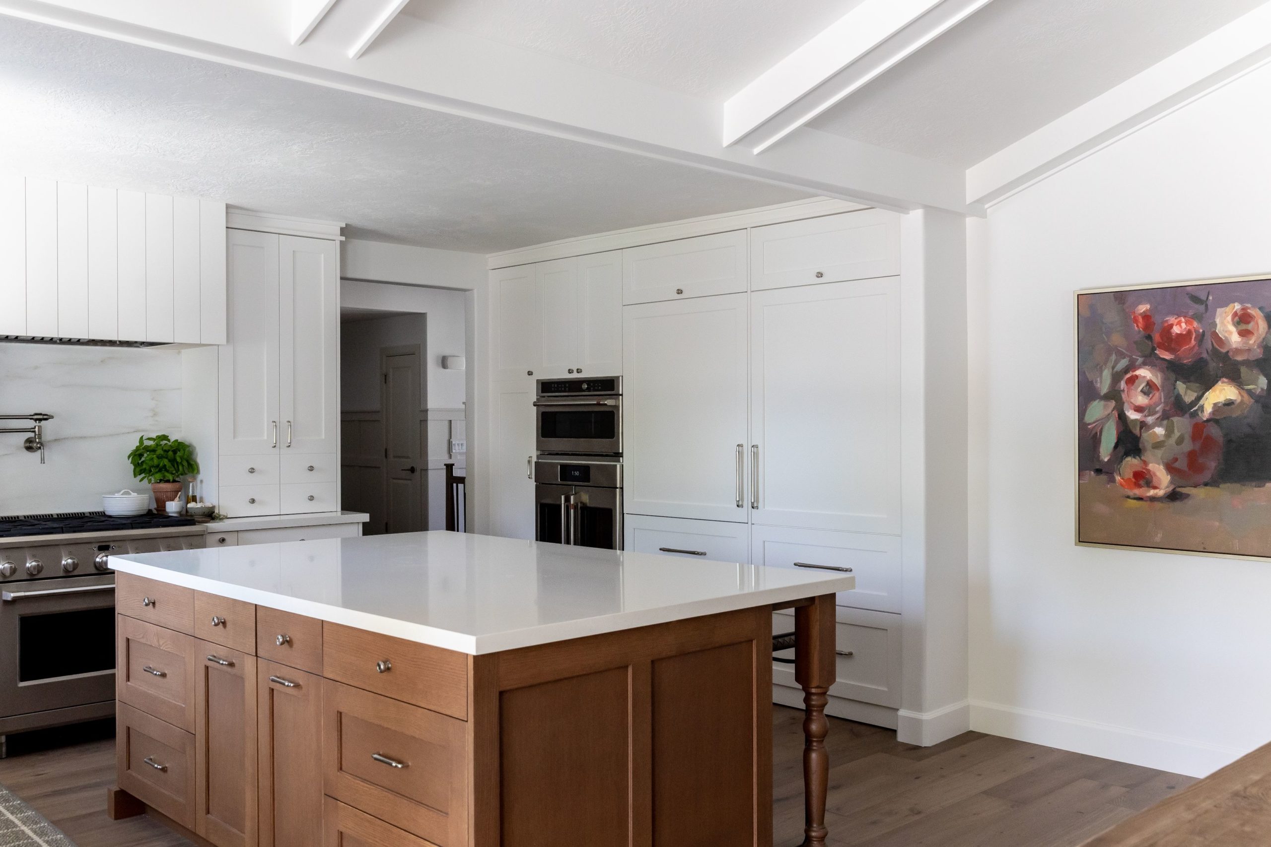
The kitchen is a big part of the home as it sits in the middle of the spaces so we wanted to pack a big punch with the design. We loved working with Marwood Design, they were super helpful with the shiplap hood. It has no trim, going straight to the ceiling to create height.
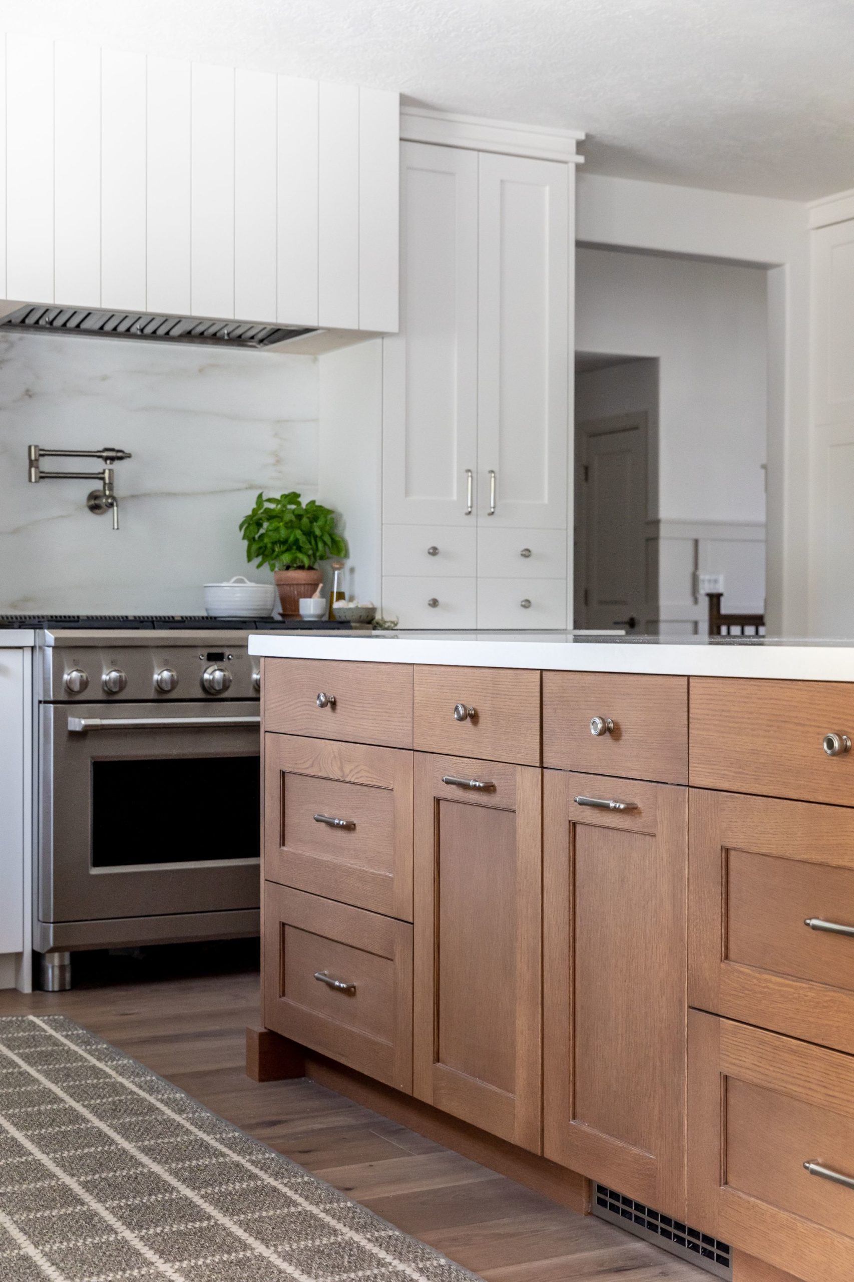
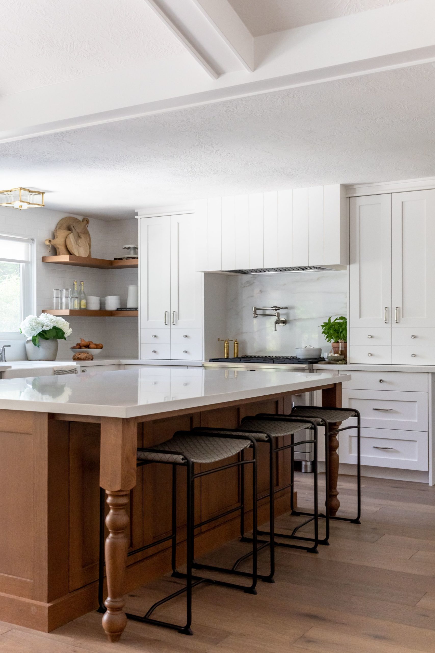
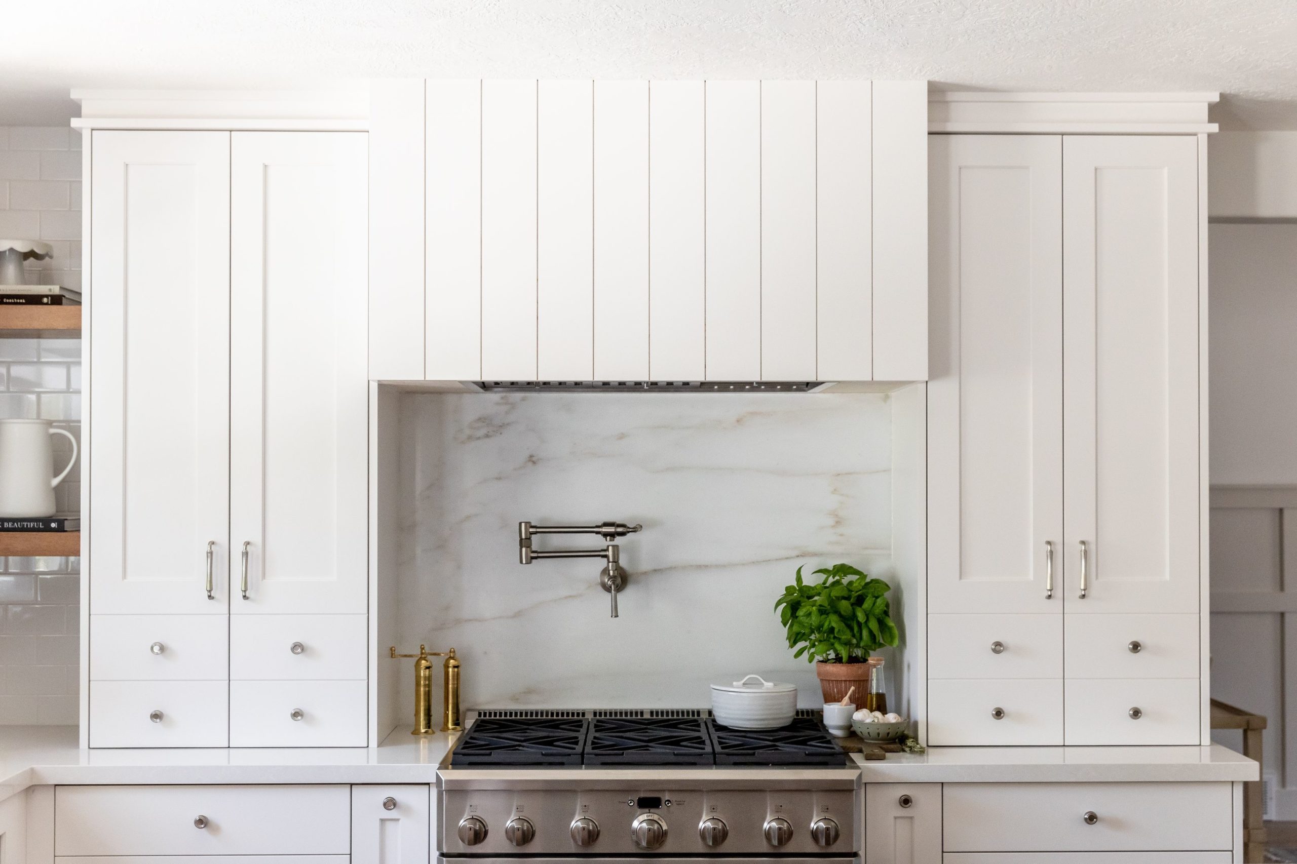
The ceilings were 8′ tall in the kitchen so we used canned lighting instead of pendants so as not to distract from the hood detail. To make up for the lack of pendants we used a fun flush mount over the sink!
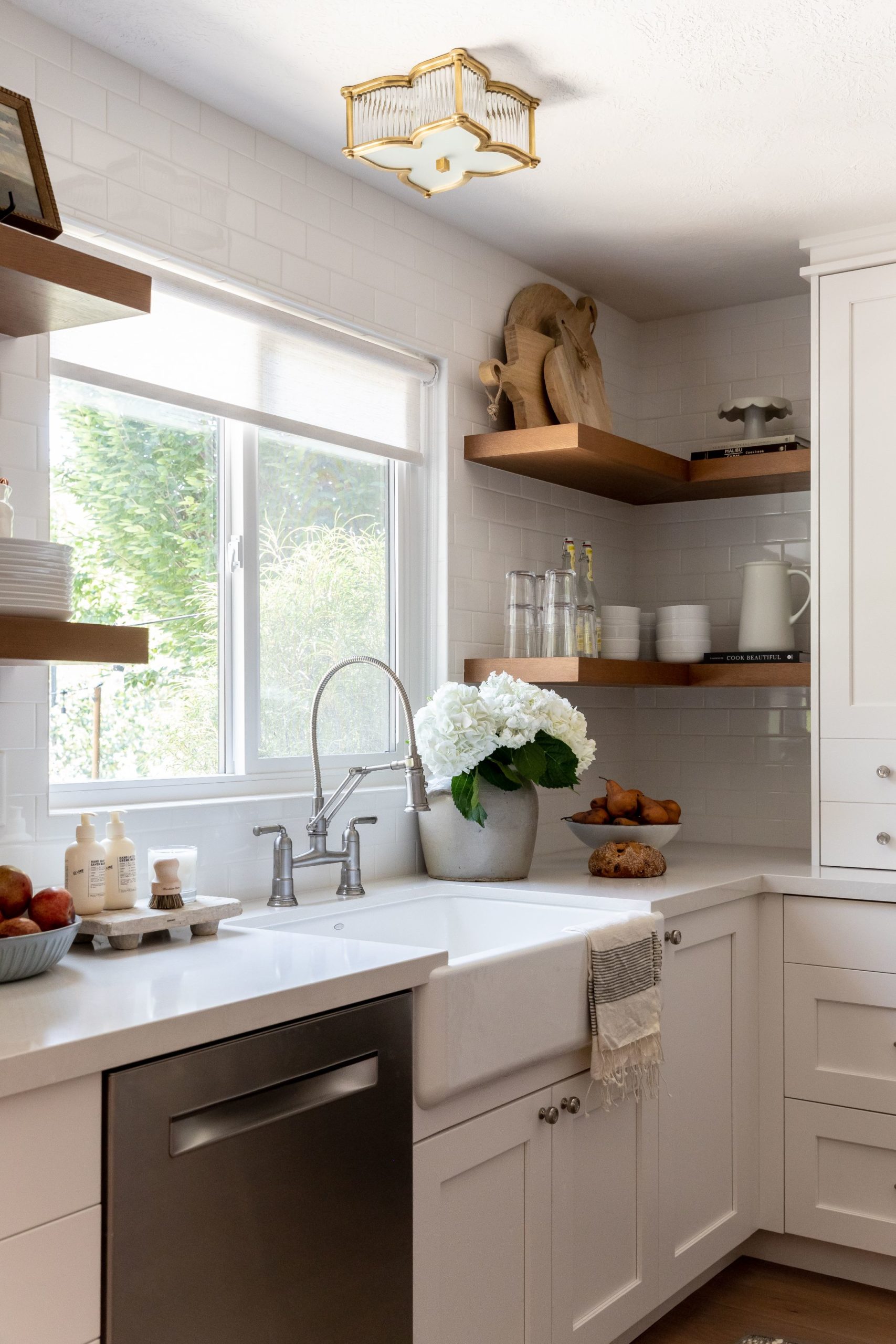
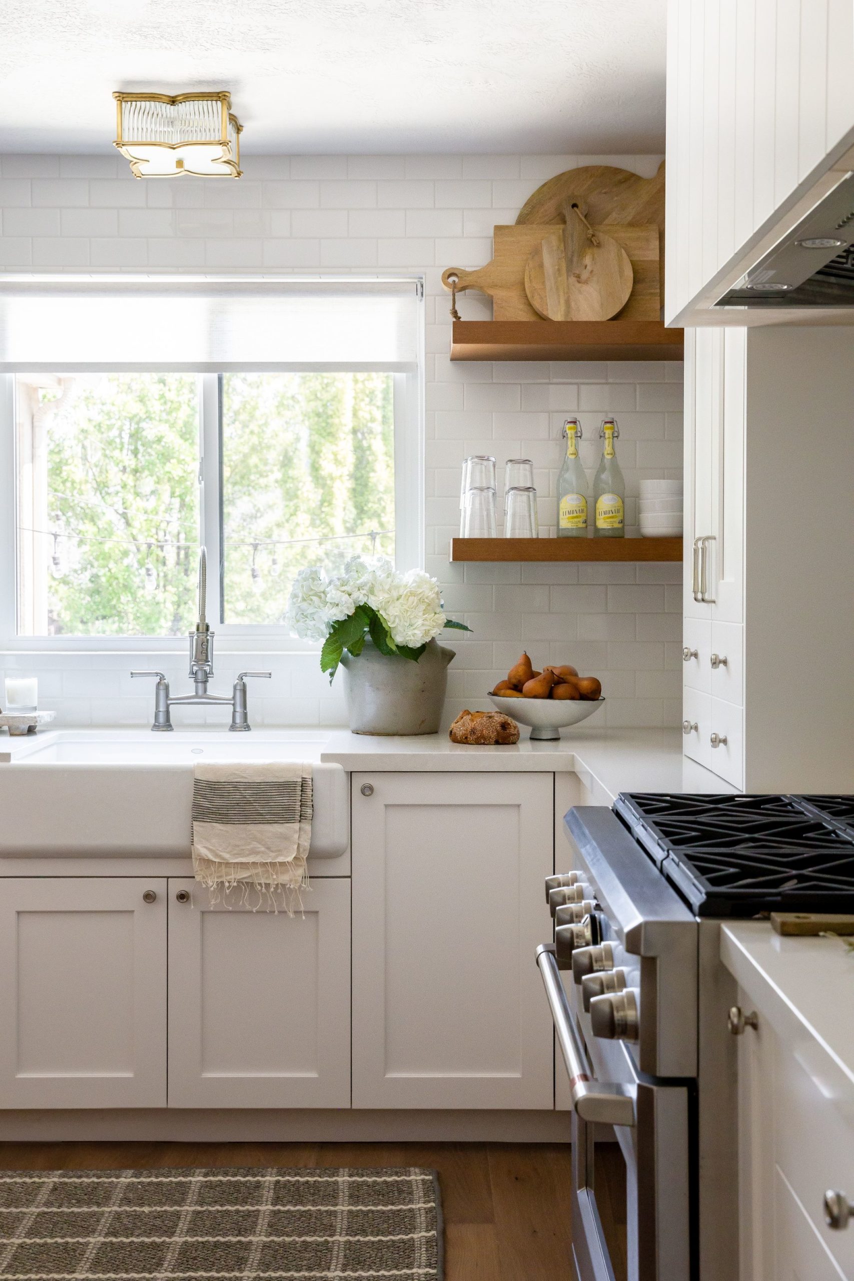
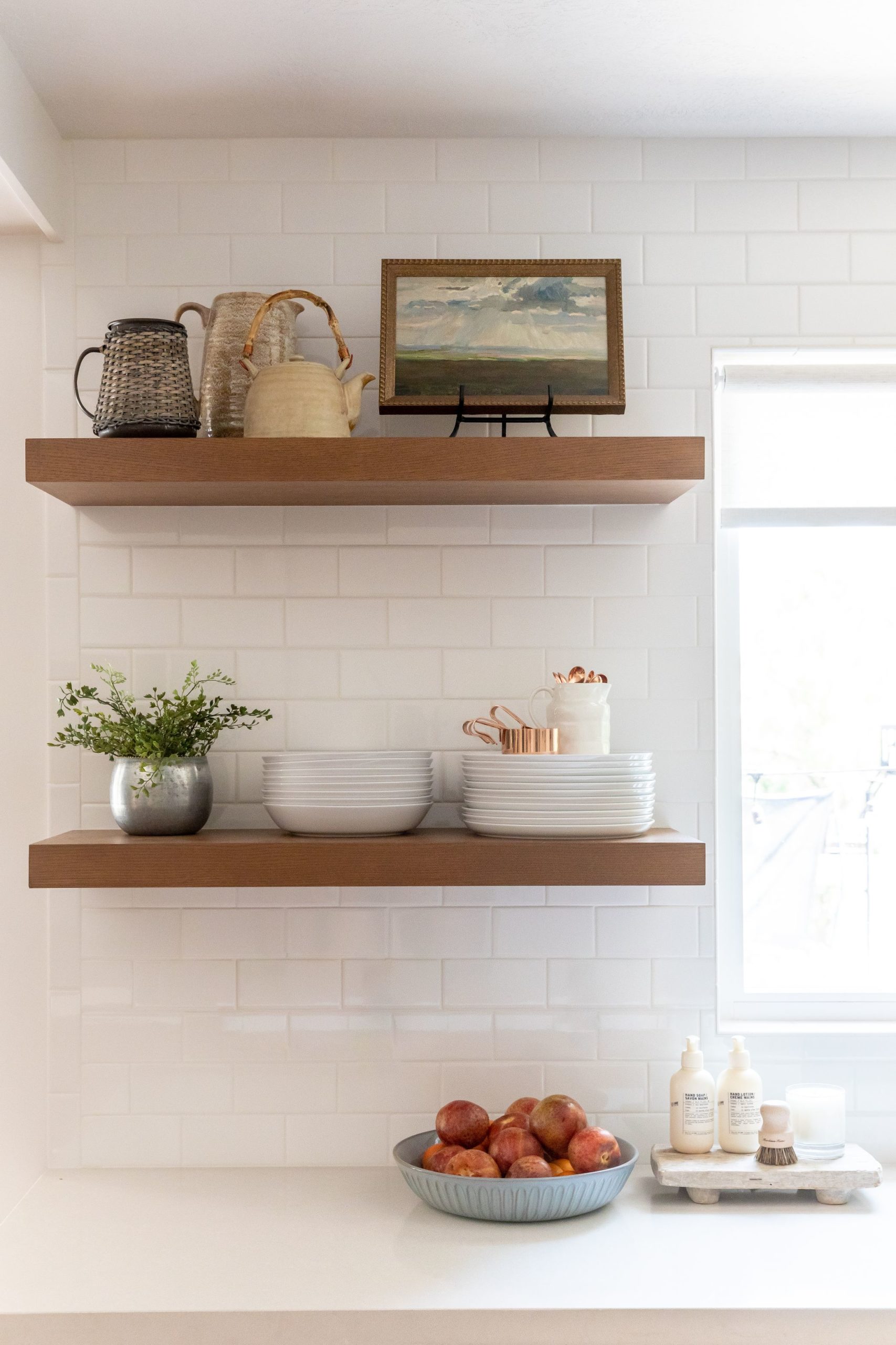
The subway tile goes from countertop to ceiling, and we made the island bigger and longer to maximize storage.
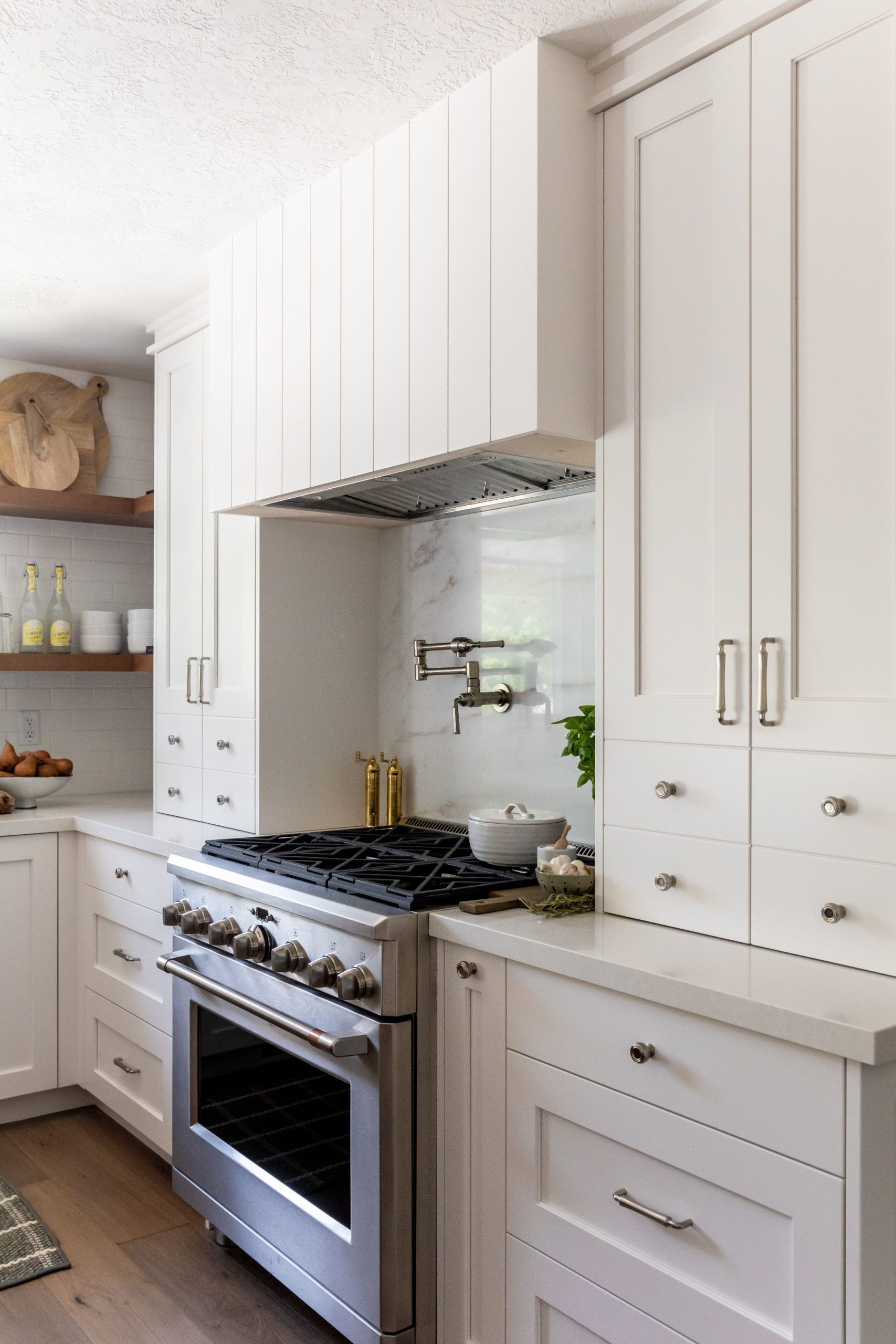
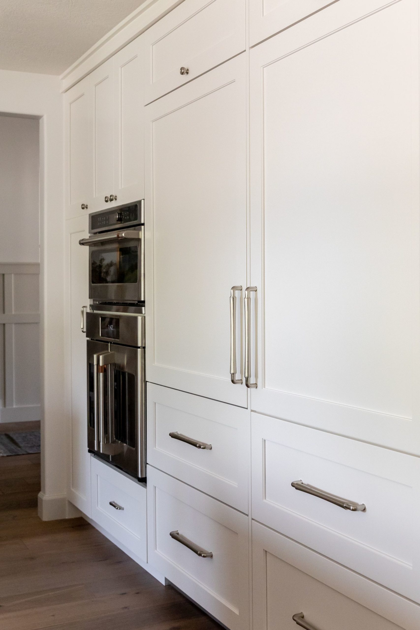
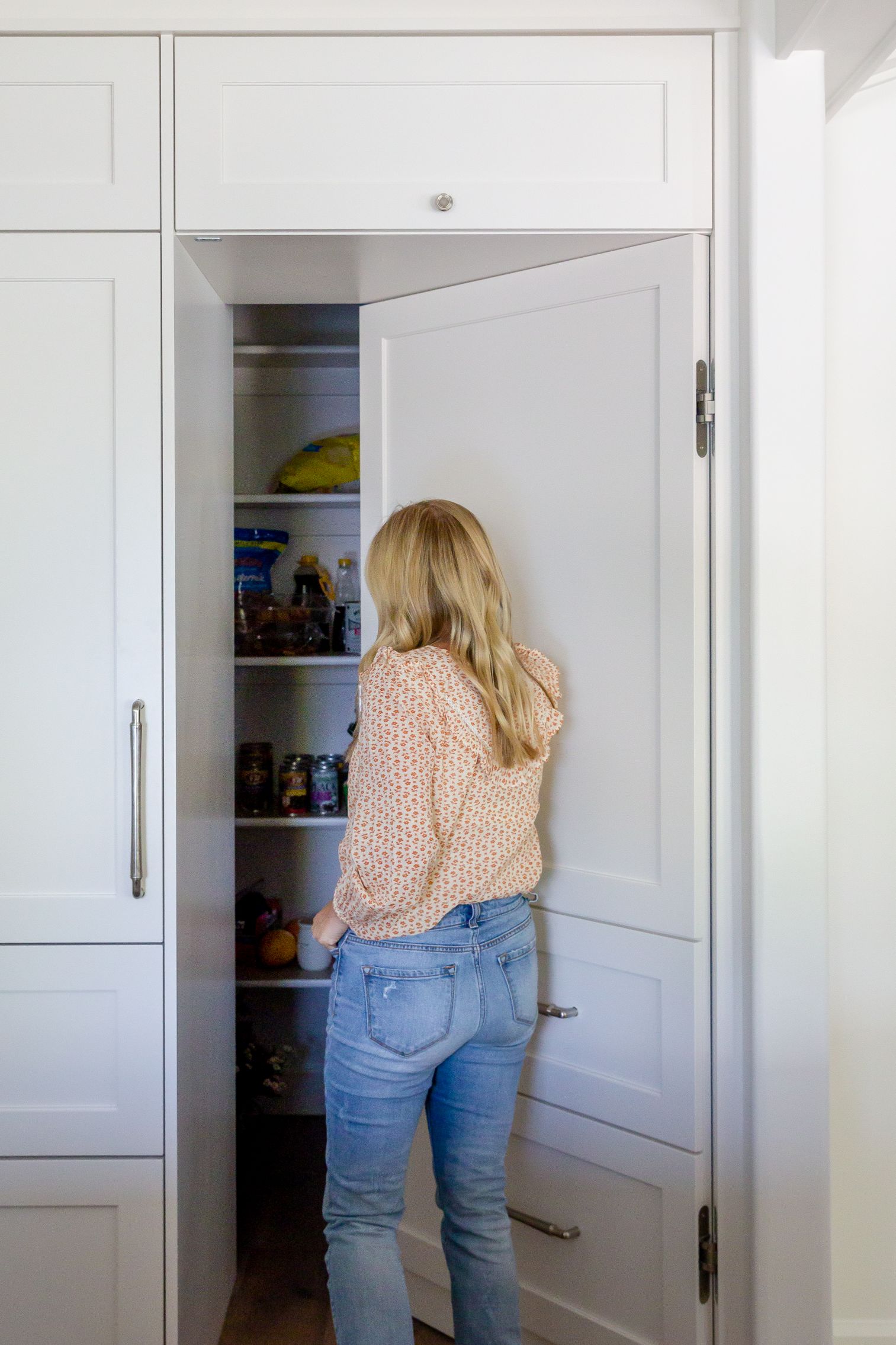
Here is a full wall of cabinetry where the ovens and microwave live makes space feel larger and maximizes storage with a hidden pantry.
We created a dining room to separate the kitchen and living. It features plenty of seating and a beautiful table topped with our Hartford Table Runner.
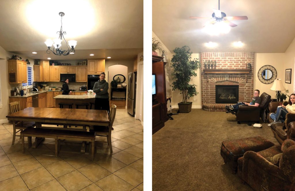
BEFORE: DINING + LIVING
AFTER: DINING + LIVING
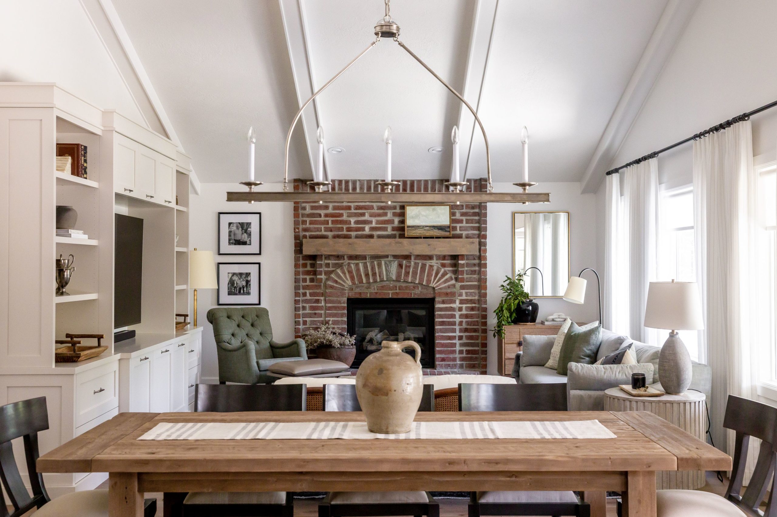
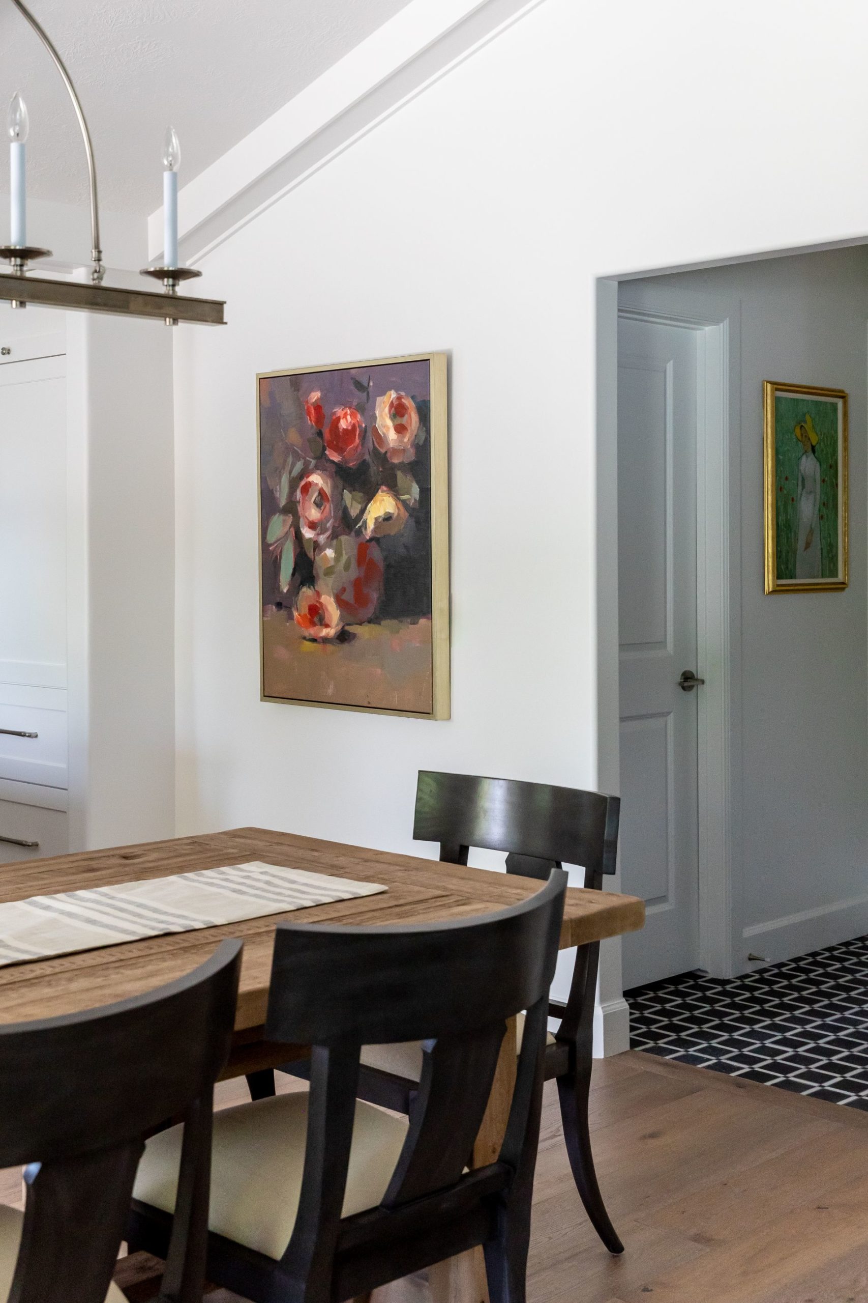
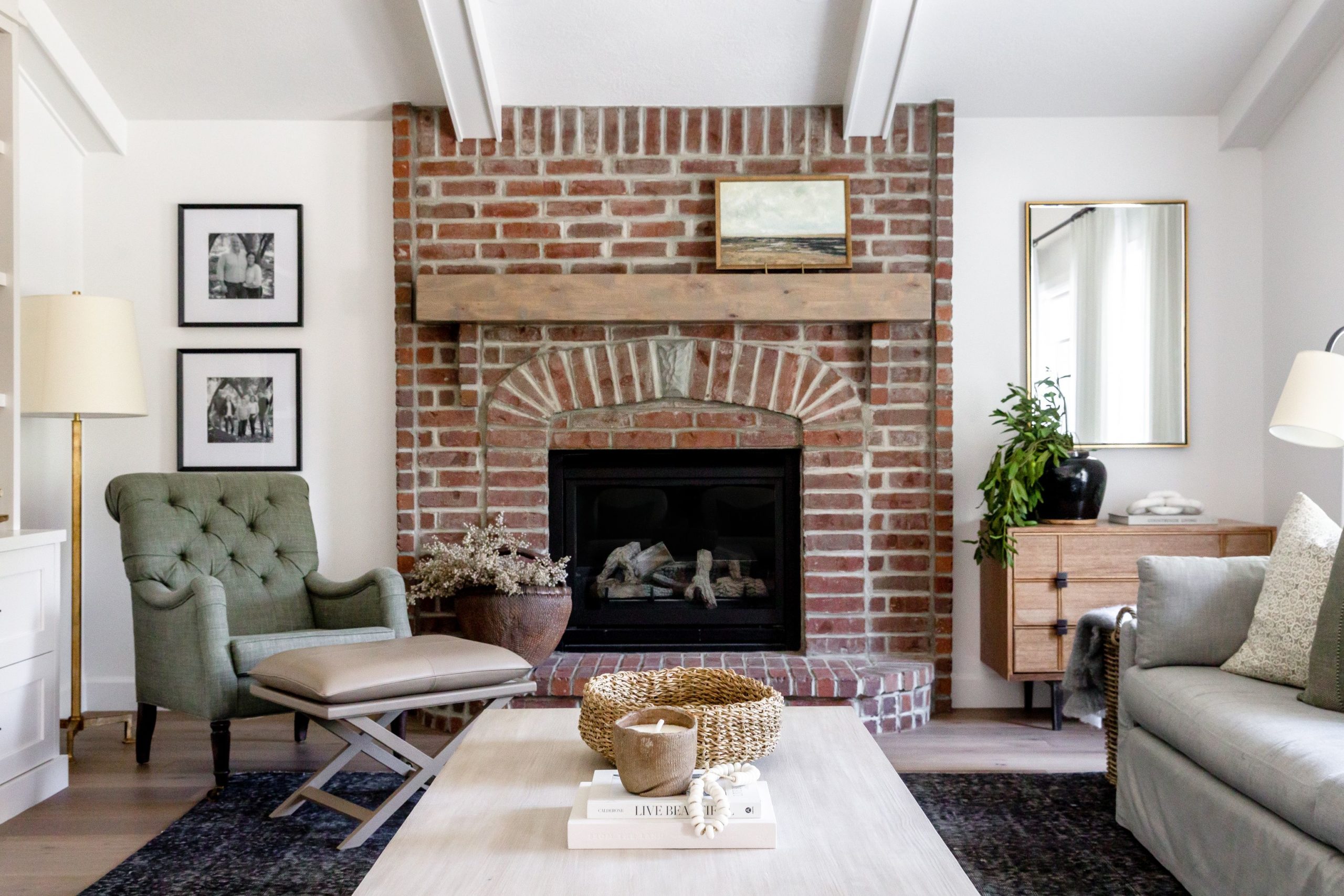
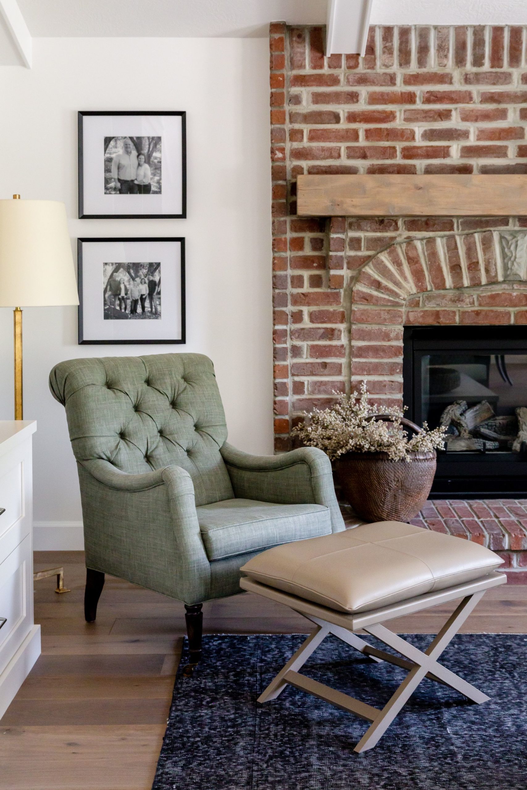
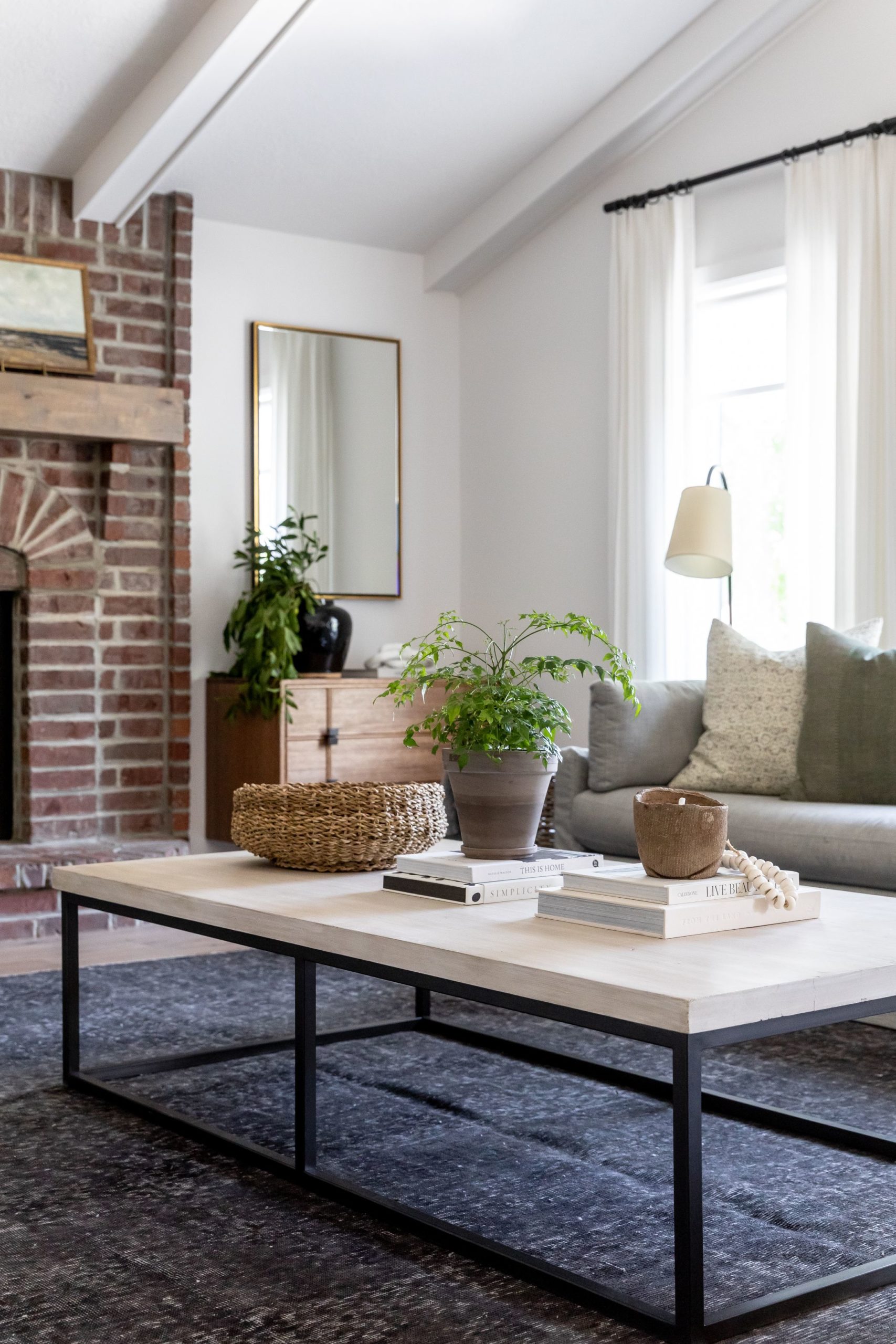
The family room was a great size and had a beautiful pitched ceiling. We accentuated the ceiling with white beams to bring in some architectural detail. The existing fireplace had great charm and coloring so we decided to keep it and add a wooden mantle to warm up the brick. The white walls match the ceiling to draw your eye up and create the illusion the walls are higher than they actually are. We brought in comfortable furniture so that they family can lounge and relax in this room room.
The Brielle Leather stool is the perfect addition adding a soft place to rest your feet. We love how the Adeline Coffee Table gives us so much room to decorate! It’s such a great scale and the light wood contrast nicely with the white walls.
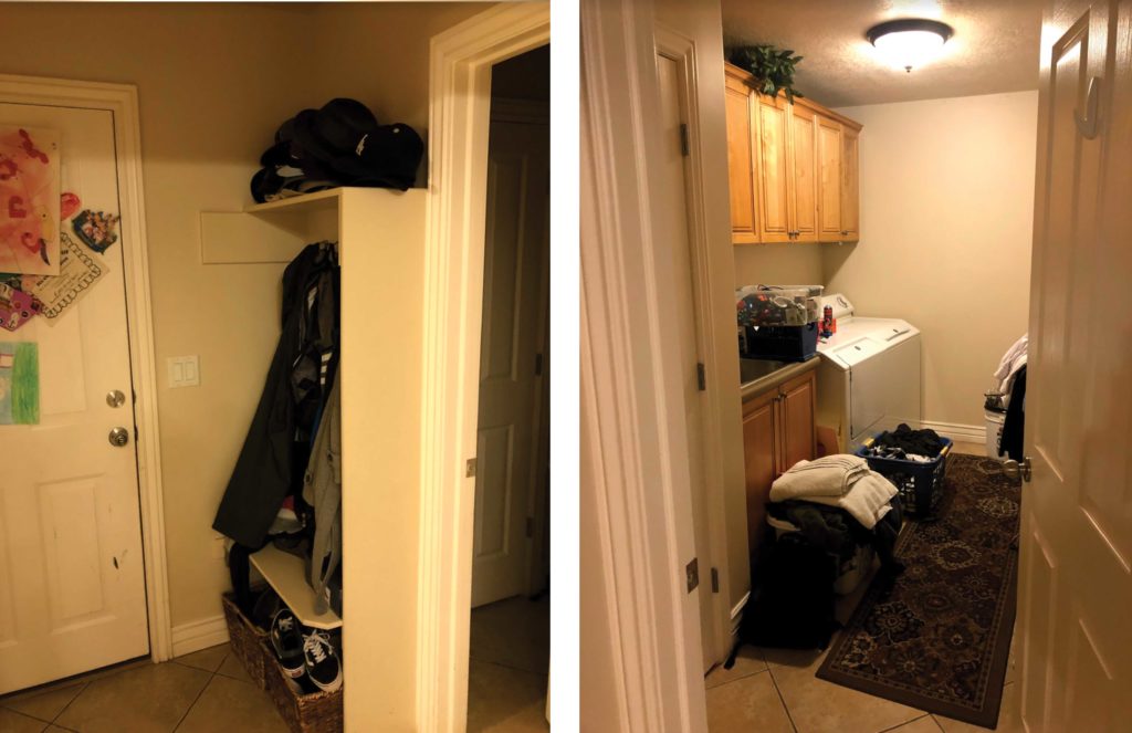
BEFORE: LAUNDRY + MUDROOM
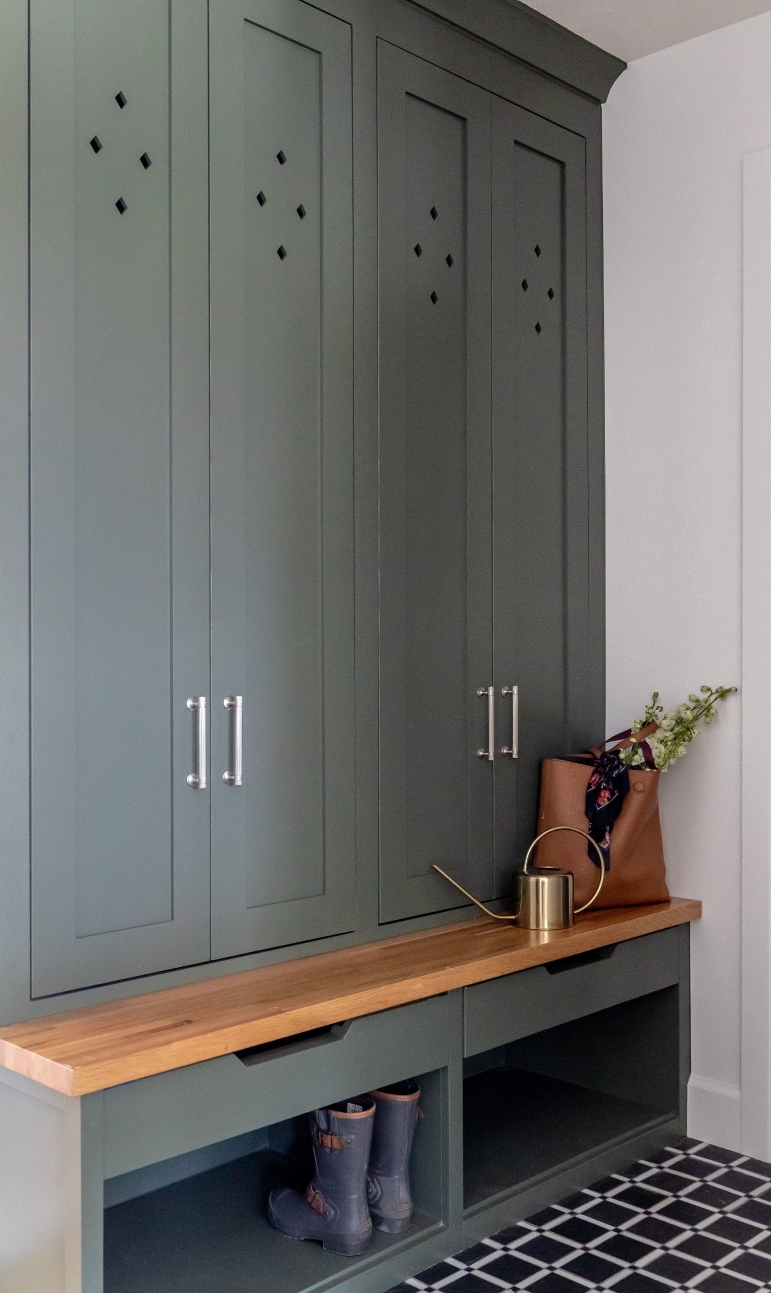
AFTER: LAUNDRY + MUDROOM
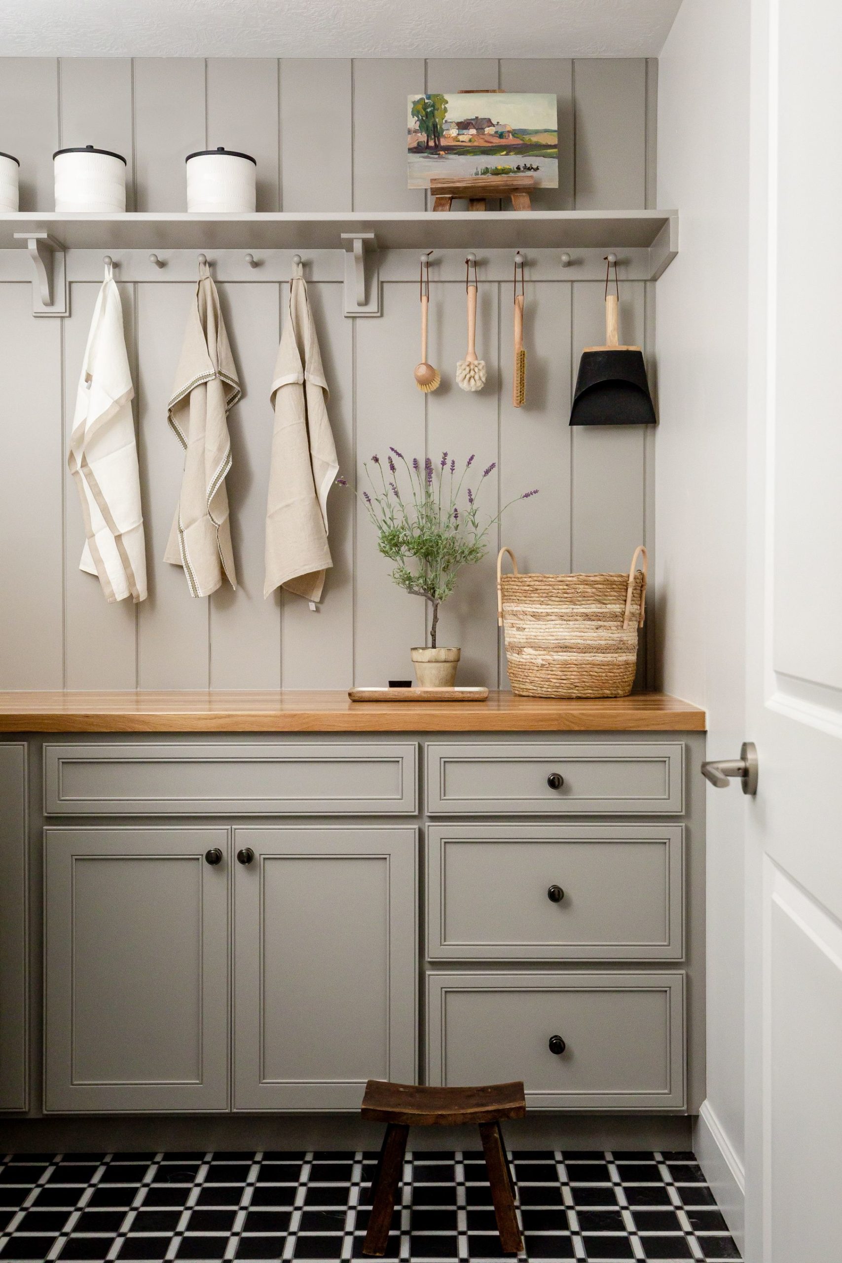
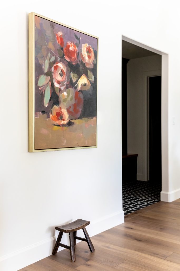
We added cabinetry in the mudroom and patterned mosaic tile to tie in with the other styles— matching the style of the previous spaces while remaining unique and special in its own way. This was important because you can peer into the mudroom when you’re in the living room and kitchen.
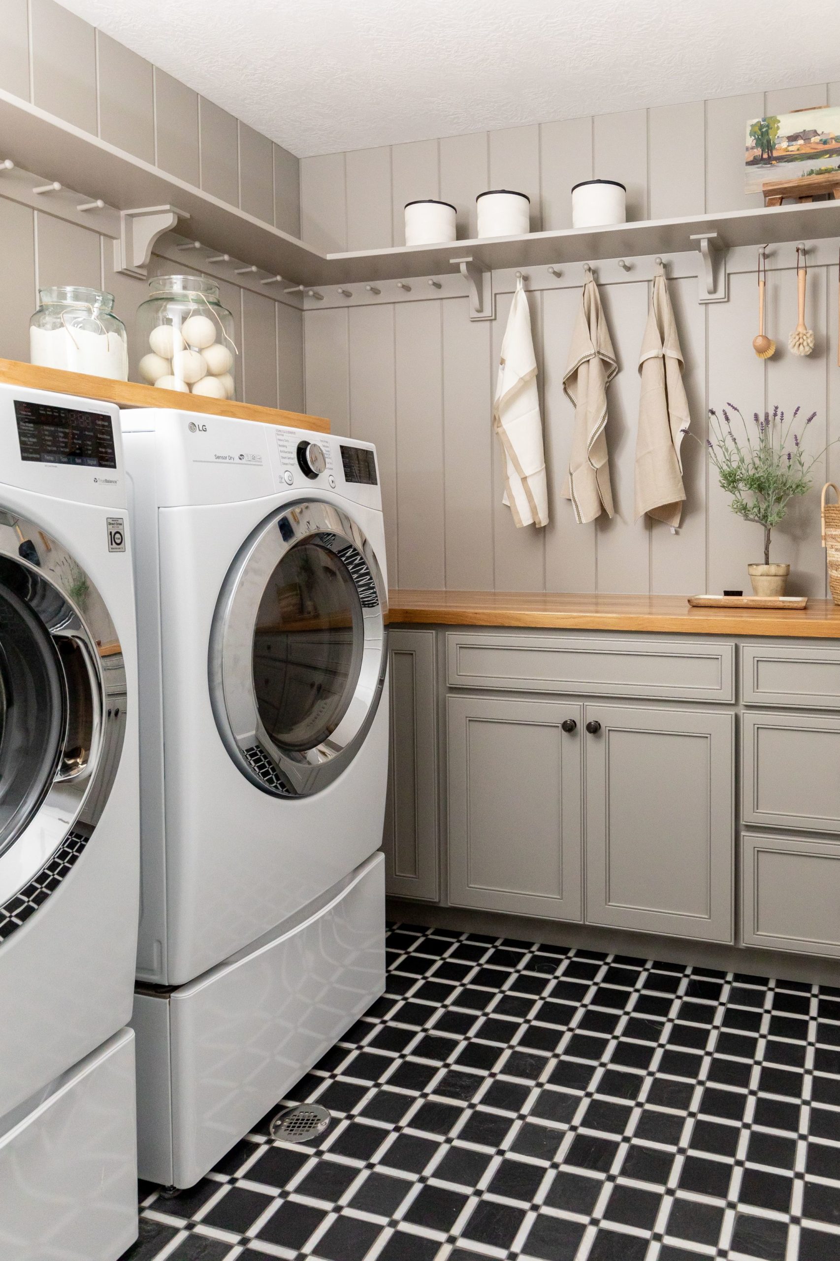
The laundry room has no windows, so we wanted it to be light and bright. This is why we painted the cabinetry light and chose a lighter wood for the butcher block countertop.
