We are so excited to share a project that many of our HOJ community has been asking about. You might remember that we teased this project in one of our latest Instagram reels.
For this remodel, our clients wanted to turn their unfinished basement into a modern oasis. With teenagers at home, they wanted it to be the perfect place for parties, but still have a level of sophistication where they could hold business meetings.
The Library & Office
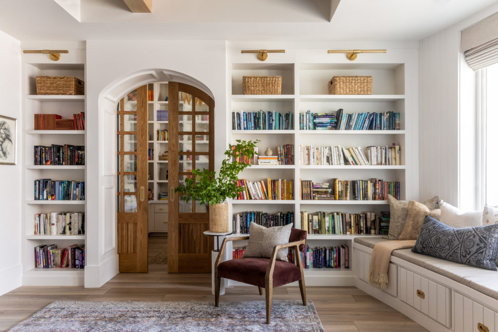
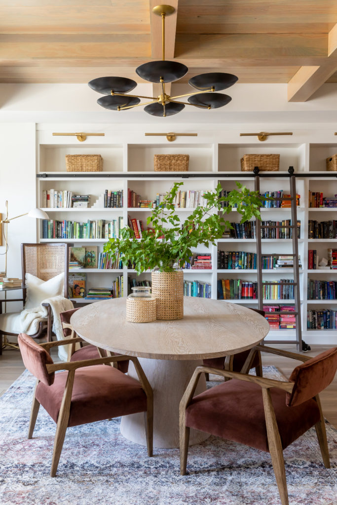
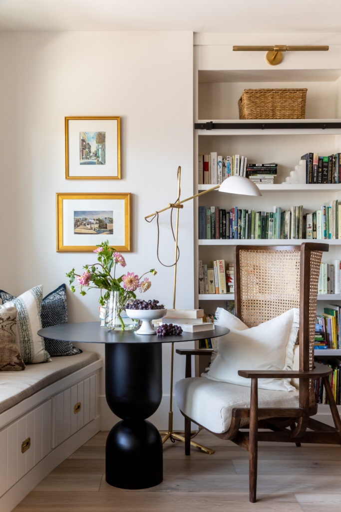
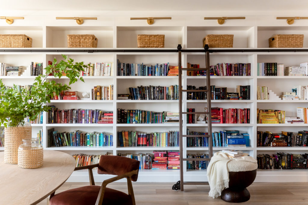
The star of the show here has to be the library. Because our client is an author, she had specific requests for her office and library space. She wanted it to be light and bright with all-white cabinetry. We asked her what colors were her favorite, and she told us the orange and teal. So when designing the furniture we used warmer rust/orange tones in the chairs, rug, and pillows. In her office, the rug and pillow brought in teal tones.
The Basement Kitchen & Dining Area
Surprisingly enough, for the design of the kitchen and dining room, the clients had very few requests. The client and designer relationship for this project was a dream. There was so much trust given to us to design and create amazing spaces, and that’s exactly what we did!
A few things that we did know:
1. The clients wanted the style of industrial/modern to be carried through each space.
2. The clients wanted there to be lots of seating for entertaining.
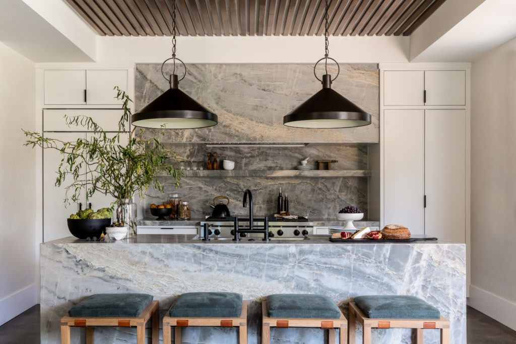
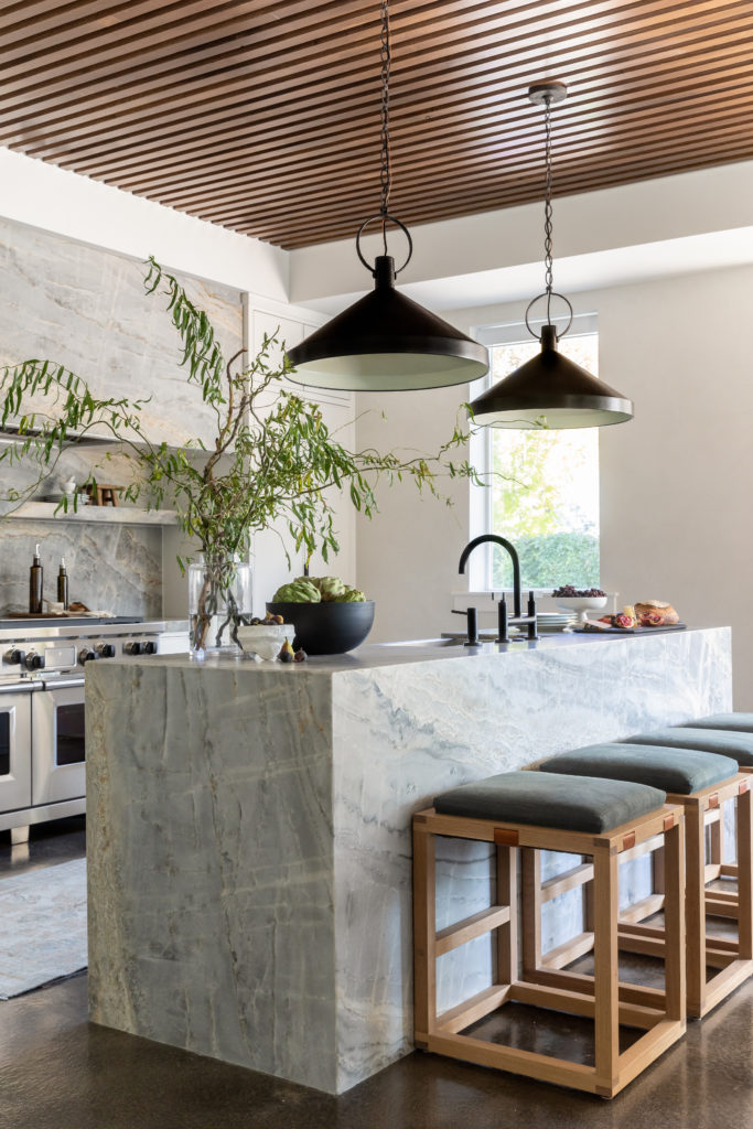
In order to for us to accomplish these requests, we started off with selecting sturdy/industrial materials. All the appliances are Wolf and Subzero. The look of these appliances added greatly to the aesthetic we were aiming for. Next, we wanted to incorporate some very organic lines to add interest to the space. We did this by selecting an incredibly veined quartzite. The quartzite slabs we landed on were the Beverly Blue Quartzite from Arizona Tile. As you can see, this natural stone is the real show stopper of the kitchen.
All the other elements in the kitchen work together to compliment this stone and make it shine. We didn’t want the kitchen to feel too cold, so we added a walnut slat detail to the ceiling to add that warm element to the space.
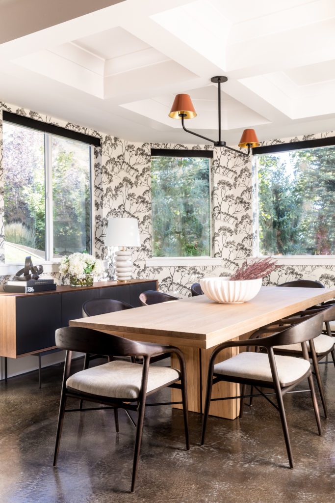
Over in the dining room, we carried the same color pallet from the kitchen but aimed to make it feel more formal/elevated. The Schumacher wallpaper on the walls did just the trick! Again, we wanted to make the space feel warm so we added a plethora of wood tones through the dining set. The adjustable dining table we selected also accomplished the need for ample seating for guests. If you ask us, the crowning jewel of the dining room is the Urban Electric Light that hangs above the table. Its rust-tone shades added just the splash of color that we needed to make the space feel complete.
Photography by Linsday Salazar
